About
Settings pages are mostly labels. Every switch is named by its visible text, so nothing is guessed by a screen reader.
Use it when
- A signed-in area has preferences.
Skip it when
- Settings need validation across fields: add your form library.
Install
- 1Add the VibeBox registry to
components.json:{ "registries": { "@vibebox": "https://motion.vibeboxph.com/r/{name}.json" } } - 2Add the component with the shadcn CLI:
npx shadcn@latest add @vibebox/settings-form - 3Use it:
import { SettingsForm } from "@/components/vibebox/settings-form";

<SettingsForm accent="#7c5cff" />
AI prompt
Everything an AI coding tool needs to rebuild this component the way it looks here: colours, fonts, the art it draws, props and rules.
Read the prompt
Build the VibeBox Motion component "Settings Form" (Forms) in a Next.js App Router project with Tailwind CSS v4.

What it is
- A settings panel with a text field and labelled switches with help text, and a Save button.
- A settings form: a heading, a labelled text field and a list of switches (role `switch`, labelled by their text and help) with a Save button in the accent. State is local; `onSave` receives the name and the switch states.

Install
- `npx shadcn@latest add @vibebox/settings-form`
- Registry: add `"@vibebox": "https://motion.vibeboxph.com/r/{name}.json"` to components.json, then run the command. The source lands in `components/vibebox/settings-form` and is yours to edit.

Visual spec
- Colours (the VibeBox spectrum, the same in light and dark):
    - --spectrum-1: #00c5fc (cyan)
    - --spectrum-2: #1d6ef0 (blue)
    - --spectrum-3: #5225ed (indigo)
    - --spectrum-4: #e434dc (magenta)
    - --spectrum-5: #fd3aa9 (pink)
    - --spectrum-6: #f98472 (coral)
    - --spectrum-7: #fcbe72 (amber)
- Ink surface (dark): background #05070c, card #0a0d15, text #f5f6fa, muted text #a3abbd, border rgba(255,255,255,0.08).
- Paper surface (light): background #f3f0ea, card #fbfaf7, text #0c0e14, muted text #4a4f5c, border rgba(12,14,20,0.12).
- Fonts:
    - Display and body: Figtree (400, 500, 600, 700), falling back to ui-sans-serif, system-ui.
    - Emphasis: Fraunces italic, for one or two words of a heading.
    - Labels and code: JetBrains Mono (400, 500), uppercase labels with 0.14em tracking.
- Shape: radius 8 to 12px on cards and panels; pills may be fully round. Hairline borders, soft glow instead of heavy shadow.
- Motion: animate transform and opacity only; fast ease-out (cubic-bezier(0.16, 1, 0.3, 1)), 140ms for micro-interactions, 320 to 520ms for reveals.

Art and media
- Built from HTML, CSS and inline SVG only; no image files or video.

Props
- `title`: `string` (default "Notifications"). The panel's heading.
- `name`: `string`. The initial value of the text field.
- `settings`: `{ id: string; label: string; help?: string; on?: boolean }[]`. The switches.
- `onSave`: `(values) => void`. Called with the name and the switch states when saved.
- `accent`: `string` (default "blue"). The accent colour: blue, violet, emerald, amber, rose, or any CSS colour. It sets --app-accent on the root, so a parent can set it once for a whole screen.
- `className`: `string`. Merged with cn(); give it a width.

Behaviour and access
- Reduced motion: Nothing animates on its own.
- Keyboard: Tab moves between the field, the switches and Save; Space toggles a switch.
- Screen readers: Semantic elements with accessible names; decorative marks are hidden.
- Touch: Targets are 36 px or larger; nothing depends on hover.
- Budget: about 2 KB of JavaScript, WebGL none, GPU none. It pauses while off screen.

Theming
Everything reads `--app-accent` (set by the `accent` prop, or by a parent) and the mode's tokens, so light and dark and any brand colour work without code changes. Pass a named accent or any CSS colour; Launchpad sets it once per app from the client's theme.

Usage
```tsx
import { SettingsForm } from "@/components/vibebox/settings-form";

<SettingsForm accent="#7c5cff" />
```

Notes
Add the VibeBox Motion Settings Form with `npx shadcn@latest add @vibebox/settings-form`. Pass your settings and persist in `onSave`. Set the brand colour once with `--app-accent` on a parent (or the `accent` prop). It follows light and dark through the tokens; keep the licence header.

Rules
- Keep the licence header on every installed file.
- Original code only: do not copy components from other libraries, and do not add GSAP.
- Use tokens for colour, type and radius; no hard-coded brand values.
- Server Components by default; `"use client"` only for the island.
Code
2 filescomponents/vibebox/settings-form/index.tsx
/**
 * VibeBox Motion · Settings Form
 * Copyright (c) 2026 VibeBox. Licensed under the VibeBox Motion Free License:
 * https://motion.vibeboxph.com/license
 * Use it in unlimited personal, commercial and client projects.
 * Do not sell or redistribute it as a component, kit, template or builder.
 */
export { SettingsForm, type SettingsFormProps } from "./settings-form.client";
components/vibebox/settings-form/settings-form.client.tsx
/**
 * VibeBox Motion · Settings Form
 * Copyright (c) 2026 VibeBox. Licensed under the VibeBox Motion Free License:
 * https://motion.vibeboxph.com/license
 * Use it in unlimited personal, commercial and client projects.
 * Do not sell or redistribute it as a component, kit, template or builder.
 */
"use client";

import { useId, useState } from "react";
import { cn } from "@/lib/utils";
import { accentStyle } from "@/lib/vibebox/app-accent";

export type Setting = { id: string; label: string; help?: string; on?: boolean };
export type SettingsFormProps = { title?: string; name?: string; settings?: Setting[]; onSave?: (values: { name: string; settings: Record<string, boolean> }) => void; accent?: string; className?: string };

const SAMPLE: Setting[] = [
  { id: "email", label: "Email me about new bookings", help: "One email per booking, never more.", on: true },
  { id: "sms", label: "Text reminders to clients", help: "Sent the day before.", on: true },
  { id: "digest", label: "Weekly summary", on: false },
];

/** A settings panel: a labelled text field and switches with help text; Save reports the values. */
export function SettingsForm({ title = "Notifications", name = "Casa Verde Studio", settings = SAMPLE, onSave, accent, className }: SettingsFormProps) {
  const [label, setLabel] = useState(name);
  const [state, setState] = useState<Record<string, boolean>>(() => Object.fromEntries(settings.map((s) => [s.id, Boolean(s.on)])));
  const uid = useId();
  return (
    <form
      data-vb="settings-form"
      style={accentStyle(accent)}
      className={cn("grid gap-4 rounded-xl border border-border bg-card p-5", className)}
      onSubmit={(event) => {
        event.preventDefault();
        onSave?.({ name: label, settings: state });
      }}
    >
      <h2 className="text-body font-semibold">{title}</h2>
      <label className="grid gap-1.5 text-small font-medium" htmlFor={`${uid}-name`}>
        Studio name
        <input id={`${uid}-name`} value={label} onChange={(e) => setLabel(e.target.value)} className="h-10 rounded-md border border-border bg-background px-3 text-[1rem] font-normal focus-visible:outline-2 focus-visible:outline-offset-1 focus-visible:outline-[var(--app-accent)]" />
      </label>
      <ul className="grid divide-y divide-border">
        {settings.map((s) => (
          <li key={s.id} className="flex items-start justify-between gap-4 py-3">
            <span id={`${uid}-${s.id}`} className="grid gap-0.5 text-small"><span className="font-medium">{s.label}</span>{s.help && <span className="text-muted-foreground">{s.help}</span>}</span>
            <button
              type="button"
              role="switch"
              aria-checked={state[s.id]}
              aria-labelledby={`${uid}-${s.id}`}
              onClick={() => setState((c) => ({ ...c, [s.id]: !c[s.id] }))}
              className="relative mt-0.5 h-6 w-10 shrink-0 rounded-full bg-muted transition-colors aria-checked:bg-[var(--app-accent)] focus-visible:outline-2 focus-visible:outline-offset-2 focus-visible:outline-ring"
            >
              <span className={cn("absolute top-0.5 left-0.5 size-5 rounded-full bg-white shadow transition-transform", state[s.id] && "translate-x-4")} />
            </button>
          </li>
        ))}
      </ul>
      <div className="flex justify-end">
        <button type="submit" className="h-10 rounded-md bg-[var(--app-accent)] px-4 text-small font-semibold text-[var(--app-accent-fg,#fff)] transition-opacity hover:opacity-90 focus-visible:outline-2 focus-visible:outline-offset-2 focus-visible:outline-ring">Save changes</button>
      </div>
    </form>
  );
}
Props
| Prop | Type | Default | Description |
|---|---|---|---|
| title | string | "Notifications" | The panel's heading. |
| name | string | — | The initial value of the text field. |
| settings | { id: string; label: string; help?: string; on?: boolean }[] | — | The switches. |
| onSave | (values) => void | — | Called with the name and the switch states when saved. |
| accent | string | "blue" | The accent colour: blue, violet, emerald, amber, rose, or any CSS colour. It sets --app-accent on the root, so a parent can set it once for a whole screen. |
| className | string | — | Merged with cn(); give it a width. |
Accessibility and motion
- Keyboard
- Tab moves between the field, the switches and Save; Space toggles a switch.
- Screen readers
- Semantic elements with accessible names; decorative marks are hidden.
- Touch
- Targets are 36 px or larger; nothing depends on hover.
- Reduced motion
- Nothing animates on its own.
Edge cases and limits
- The component keeps local state; remount it to reset.
Related
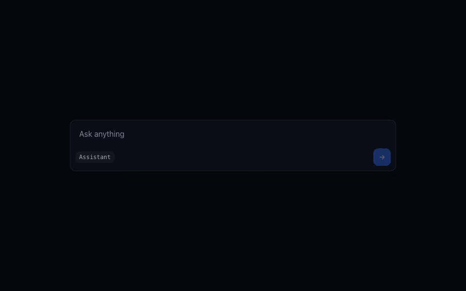
Prompt Composer
FreeA prompt box that grows with its text, with a model chip and a send button that wakes when there is text.
AI and agents · CSS
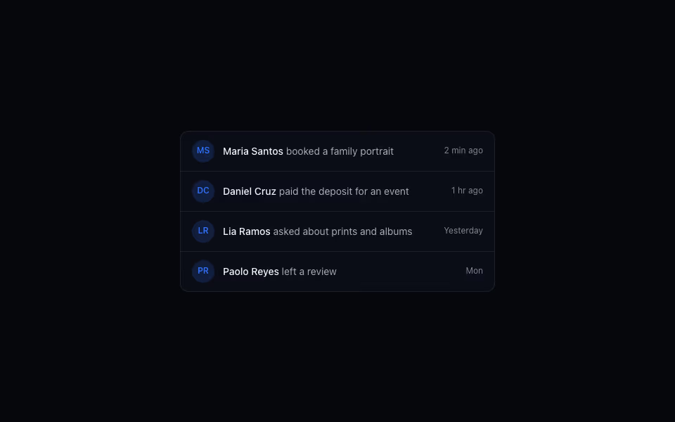
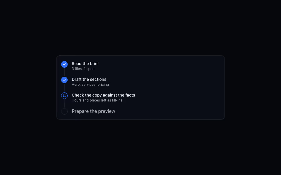
Agent Activity
FreeA timeline of what an agent is doing: done steps ticked, the running one spinning, the rest queued.
AI and agents · Server