About
A toast is a sentence and a close button. Position it with your own layout (fixed corner, for example).
Use it when
- Actions complete in the background.
Skip it when
- The message needs a decision: use a dialog.
Install
- 1Add the VibeBox registry to
components.json:{ "registries": { "@vibebox": "https://motion.vibeboxph.com/r/{name}.json" } } - 2Add the component with the shadcn CLI:
npx shadcn@latest add @vibebox/toast-stack - 3Use it:
import { ToastStack } from "@/components/vibebox/toast-stack";

<ToastStack accent="#7c5cff" />
AI prompt
Everything an AI coding tool needs to rebuild this component the way it looks here: colours, fonts, the art it draws, props and rules.
Read the prompt
Build the VibeBox Motion component "Toast Stack" (Overlays) in a Next.js App Router project with Tailwind CSS v4.

What it is
- A stack of dismissible notices in a polite live region, with an accent marker.
- A toast stack: notices with a title, an optional line and a dismiss button, in a polite live region so each is announced once. It renders inline (you place and animate it), keeping position and queue policy in your hands.

Install
- `npx shadcn@latest add @vibebox/toast-stack`
- Registry: add `"@vibebox": "https://motion.vibeboxph.com/r/{name}.json"` to components.json, then run the command. The source lands in `components/vibebox/toast-stack` and is yours to edit.

Visual spec
- Colours (the VibeBox spectrum, the same in light and dark):
    - --spectrum-1: #00c5fc (cyan)
    - --spectrum-2: #1d6ef0 (blue)
    - --spectrum-3: #5225ed (indigo)
    - --spectrum-4: #e434dc (magenta)
    - --spectrum-5: #fd3aa9 (pink)
    - --spectrum-6: #f98472 (coral)
    - --spectrum-7: #fcbe72 (amber)
- Ink surface (dark): background #05070c, card #0a0d15, text #f5f6fa, muted text #a3abbd, border rgba(255,255,255,0.08).
- Paper surface (light): background #f3f0ea, card #fbfaf7, text #0c0e14, muted text #4a4f5c, border rgba(12,14,20,0.12).
- Fonts:
    - Display and body: Figtree (400, 500, 600, 700), falling back to ui-sans-serif, system-ui.
    - Emphasis: Fraunces italic, for one or two words of a heading.
    - Labels and code: JetBrains Mono (400, 500), uppercase labels with 0.14em tracking.
- Shape: radius 8 to 12px on cards and panels; pills may be fully round. Hairline borders, soft glow instead of heavy shadow.
- Motion: animate transform and opacity only; fast ease-out (cubic-bezier(0.16, 1, 0.3, 1)), 140ms for micro-interactions, 320 to 520ms for reveals.

Art and media
- Built from HTML, CSS and inline SVG only; no image files or video.

Props
- `toasts`: `{ id: string; title: string; body?: string }[]`. The notices to show.
- `accent`: `string` (default "blue"). The accent colour: blue, violet, emerald, amber, rose, or any CSS colour. It sets --app-accent on the root, so a parent can set it once for a whole screen.
- `className`: `string`. Merged with cn(); give it a width.

Behaviour and access
- Reduced motion: Nothing animates on its own.
- Keyboard: Every control is a native element in reading order.
- Screen readers: Semantic elements with accessible names; decorative marks are hidden.
- Touch: Targets are 36 px or larger; nothing depends on hover.
- Budget: about 1 KB of JavaScript, WebGL none, GPU none. It pauses while off screen.

Theming
Everything reads `--app-accent` (set by the `accent` prop, or by a parent) and the mode's tokens, so light and dark and any brand colour work without code changes. Pass a named accent or any CSS colour; Launchpad sets it once per app from the client's theme.

Usage
```tsx
import { ToastStack } from "@/components/vibebox/toast-stack";

<ToastStack accent="#7c5cff" />
```

Notes
Add the VibeBox Motion Toast Stack with `npx shadcn@latest add @vibebox/toast-stack`. Keep the list in your state and pass it in. Set the brand colour once with `--app-accent` on a parent (or the `accent` prop). It follows light and dark through the tokens; keep the licence header.

Rules
- Keep the licence header on every installed file.
- Original code only: do not copy components from other libraries, and do not add GSAP.
- Use tokens for colour, type and radius; no hard-coded brand values.
- Server Components by default; `"use client"` only for the island.
Code
2 filescomponents/vibebox/toast-stack/index.tsx
/**
 * VibeBox Motion · Toast Stack
 * Copyright (c) 2026 VibeBox. Licensed under the VibeBox Motion Free License:
 * https://motion.vibeboxph.com/license
 * Use it in unlimited personal, commercial and client projects.
 * Do not sell or redistribute it as a component, kit, template or builder.
 */
export { ToastStack, type ToastStackProps } from "./toast-stack.client";
components/vibebox/toast-stack/toast-stack.client.tsx
/**
 * VibeBox Motion · Toast Stack
 * Copyright (c) 2026 VibeBox. Licensed under the VibeBox Motion Free License:
 * https://motion.vibeboxph.com/license
 * Use it in unlimited personal, commercial and client projects.
 * Do not sell or redistribute it as a component, kit, template or builder.
 */
"use client";

import { useState } from "react";
import { cn } from "@/lib/utils";
import { accentStyle } from "@/lib/vibebox/app-accent";

export type Toast = { id: string; title: string; body?: string };
export type ToastStackProps = { toasts?: Toast[]; accent?: string; className?: string };

const SAMPLE: Toast[] = [
  { id: "1", title: "Booking confirmed", body: "Maria Santos, Friday 2:15 pm." },
  { id: "2", title: "Reminder sent", body: "3 clients will get a text tomorrow." },
];

/** A stack of notices a visitor can dismiss; a polite live region, so each is announced once. */
export function ToastStack({ toasts = SAMPLE, accent, className }: ToastStackProps) {
  const [items, setItems] = useState(toasts);
  return (
    <div data-vb="toast-stack" style={accentStyle(accent)} role="status" aria-live="polite" className={cn("grid gap-2", className)}>
      {items.map((t) => (
        <div key={t.id} className="flex items-start gap-3 rounded-xl border border-border bg-popover p-3.5 pr-2.5 shadow-md">
          <span aria-hidden="true" className="mt-1 size-2 shrink-0 rounded-full bg-[var(--app-accent)]" />
          <div className="min-w-0 flex-1 text-small"><p className="font-medium">{t.title}</p>{t.body && <p className="text-muted-foreground">{t.body}</p>}</div>
          <button type="button" aria-label={`Dismiss: ${t.title}`} onClick={() => setItems((list) => list.filter((x) => x.id !== t.id))} className="inline-grid size-7 shrink-0 place-items-center rounded-md text-muted-foreground hover:bg-accent hover:text-foreground focus-visible:outline-2 focus-visible:outline-ring">
            <svg viewBox="0 0 24 24" aria-hidden="true" className="size-4" fill="none" stroke="currentColor" strokeWidth="2" strokeLinecap="round"><path d="M6 6l12 12M18 6 6 18" /></svg>
          </button>
        </div>
      ))}
    </div>
  );
}
Props
| Prop | Type | Default | Description |
|---|---|---|---|
| toasts | { id: string; title: string; body?: string }[] | — | The notices to show. |
| accent | string | "blue" | The accent colour: blue, violet, emerald, amber, rose, or any CSS colour. It sets --app-accent on the root, so a parent can set it once for a whole screen. |
| className | string | — | Merged with cn(); give it a width. |
Accessibility and motion
- Keyboard
- Every control is a native element in reading order.
- Screen readers
- Semantic elements with accessible names; decorative marks are hidden.
- Touch
- Targets are 36 px or larger; nothing depends on hover.
- Reduced motion
- Nothing animates on its own.
Edge cases and limits
- It does not auto-dismiss; add a timer where your design wants one.
Related

Confirm Dialog
FreeA confirmation on the native dialog: focus trapped, Escape closes, a clear cancel and a destructive confirm.
Overlays · CSS
Agent Activity
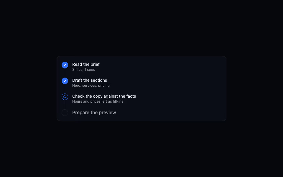
FreeA timeline of what an agent is doing: done steps ticked, the running one spinning, the rest queued.
AI and agents · Server