Gallery Masonry
Images at their own proportions in balanced columns, so portraits and landscapes sit together.
npx shadcn@latest add @vibebox/gallery-masonryControls
<GalleryMasonry />About
A free alternative to gallery-grid for photos of mixed shapes (portfolios, events).
Use it when
- Photos come in portrait and landscape.
Skip it when
- Order across rows matters (it reads down each column): use
gallery-grid.
Install
- 1Add the VibeBox registry to
components.json:{ "registries": { "@vibebox": "https://motion.vibeboxph.com/r/{name}.json" } } - 2Add the block with the shadcn CLI:
npx shadcn@latest add @vibebox/gallery-masonry - 3Use it:
import { GalleryMasonry } from "@/components/vibebox/gallery-masonry";
import { home } from "@/content/pages/home";

<GalleryMasonry content={home.gallery} variant="three-up" id="gallery" />
Code
2 filescomponents/vibebox/gallery-masonry/index.tsx
/**
 * VibeBox Motion · Gallery Masonry
 * Copyright (c) 2026 VibeBox. Licensed under the VibeBox Motion Free License:
 * https://motion.vibeboxph.com/license
 * Use it in unlimited personal, commercial and client projects.
 * Do not sell or redistribute it as a component, kit, template or builder.
 */
import { Container, headingId, Media, REVEAL, Section, SectionHead, SlotText, type BlockProps } from "@/lib/vibebox/block-kit";
import { cn } from "@/lib/utils";
import type { Content, Variant } from "./schema";

/*
 * Images at their own proportions in balanced columns (CSS columns, no script), so portraits and
 * landscapes sit together naturally. Placeholder scenes alternate tall and wide.
 */

const SCENE_RATIOS = ["4 / 5", "4 / 3", "1 / 1", "3 / 4", "16 / 10"];

export type GalleryMasonryProps = BlockProps<Content, Variant>;

export function GalleryMasonry({ content, variant = "three-up", id, tone, className }: GalleryMasonryProps) {
  return (
    <Section slug="gallery-masonry" variant={variant} id={id} tone={tone} labelledBy={headingId(id)} className={className}>
      <Container className="grid gap-[clamp(32px,4vw,56px)]">
        <SectionHead eyebrow={content.eyebrow} heading={content.heading} lead={content.lead} id={id} />
        <ul className={cn("columns-1 gap-4 sm:columns-2", variant === "three-up" && "lg:columns-3")}>
          {content.items.map((item, index) => {
            const scene = item.media.src.startsWith("scene:");
            const ratio = scene ? SCENE_RATIOS[index % SCENE_RATIOS.length] : `${item.media.width} / ${item.media.height}`;
            return (
              <li key={index} className={cn("mb-4 break-inside-avoid", REVEAL)}>
                <figure className="m-0 grid gap-2">
                  <div className="overflow-hidden rounded-xl ring-1 ring-border" style={{ aspectRatio: ratio }}>
                    <Media image={item.media} variant={index} sizes="(min-width: 1024px) 33vw, (min-width: 640px) 50vw, 100vw" />
                  </div>
                  <SlotText as="figcaption" value={item.caption} path={`items.${index}.caption`} className="text-small text-muted-foreground" />
                </figure>
              </li>
            );
          })}
        </ul>
      </Container>
    </Section>
  );
}
components/vibebox/gallery-masonry/schema.ts
/**
 * VibeBox Motion · Gallery Masonry
 * Copyright (c) 2026 VibeBox. Licensed under the VibeBox Motion Free License:
 * https://motion.vibeboxph.com/license
 * Use it in unlimited personal, commercial and client projects.
 * Do not sell or redistribute it as a component, kit, template or builder.
 */
import { sections, type z } from "@/lib/vibebox/content";

export const variants = ["three-up", "two-up"] as const;

export type Variant = (typeof variants)[number];

export const content = sections.gallery;

export type Content = z.infer<typeof content>;
Content
Typed slots from schema.ts. Facts (hours, prices, quotes, names) come only from the business; until then they render as fill-ins.
| Slot | Label | Type | Limit | Fact |
|---|---|---|---|---|
| eyebrow | Kicker | text | 32 chars | — |
| heading | Heading | text | 60 chars | — |
| lead | Intro | text | 160 chars | — |
| items | Images | list | up to 12 | — |
| items[].media | Image | image | — | — |
| items[].caption | Caption | text | 60 chars | Can be a fill-in |
Variants
Three columnsdefault
three-up
One column on phones, two on tablets, three on desktop.
Two columns
two-up
One column on phones, two from tablets.
Accessibility and motion
- Keyboard
- Nothing to focus.
- Screen readers
- A heading and a list of figures in reading order (top to bottom per column).
- Touch
- Nothing to touch.
- Reduced motion
- Images appear without their reveal.
Edge cases and limits
- Scenes alternate tall and wide so the columns look natural before photos arrive.
Related
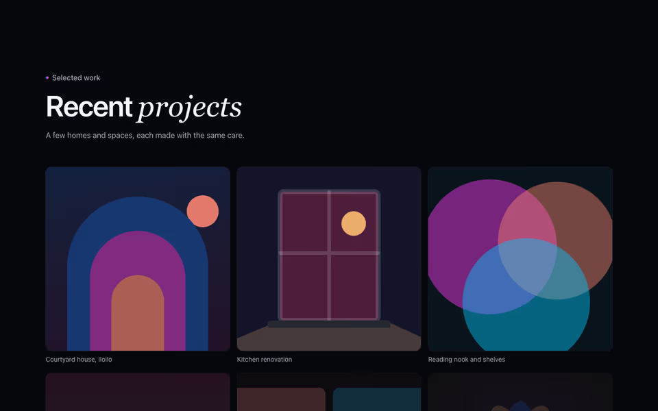
Gallery Grid
FreePhotos of the work or the place in an even grid or with the first image large, with captions.
Gallery block · Server
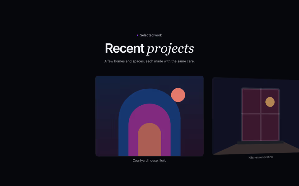
A swipeable row that snaps one photo at a time, each turning in 3D as it leaves the centre.
Gallery block · Server
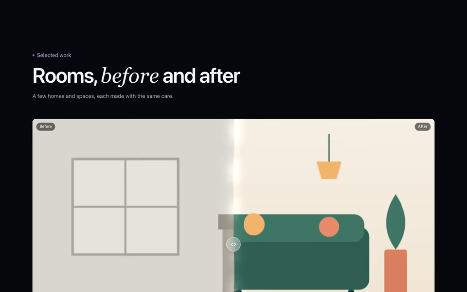
Before and after, compared by dragging a liquid seam across each photo, then the rest of the gallery.
Gallery block · WebGL2