Glass Bar Header
A sticky glass header with the brand, up to five links, one action and a phone menu that needs no JavaScript.
npx shadcn@latest add @vibebox/header-glass-barControls
<HeaderGlassBar />About
Rebuilds the Launchpad site kit's header layouts (bar, floating pill, centred brand, minimal) as one block. It is the free default header for every template. The phone menu is a native <details> disclosure rather than a script, so it works before hydration and in any app. header-island-nav (Pro) is the animated alternative.
Use it when
- Any site that needs a persistent way back to its pages.
- Sites with up to five top-level pages.
Skip it when
- The site needs a mega menu or more than five links: link a page of pages instead.
- The brand wants an animated menu: use
header-island-nav.
Install
- 1Add the VibeBox registry to
components.json:{ "registries": { "@vibebox": "https://motion.vibeboxph.com/r/{name}.json" } } - 2Add the block with the shadcn CLI:
npx shadcn@latest add @vibebox/header-glass-bar - 3Use it:
import { HeaderGlassBar } from "@/components/vibebox/header-glass-bar";
import { site } from "@/content/site";

<HeaderGlassBar content={site.header} variant="bar" />
Code
2 filescomponents/vibebox/header-glass-bar/index.tsx
/**
 * VibeBox Motion · Glass Bar Header
 * Copyright (c) 2026 VibeBox. Licensed under the VibeBox Motion Free License:
 * https://motion.vibeboxph.com/license
 * Use it in unlimited personal, commercial and client projects.
 * Do not sell or redistribute it as a component, kit, template or builder.
 */
import { ActionLink, BrandMark, Icon, Section, SiteLink, type BlockProps } from "@/lib/vibebox/block-kit";
import { hrefFor } from "@/lib/vibebox/content/runtime";
import { cn } from "@/lib/utils";
import type { CSSProperties } from "react";
import type { Content, Variant } from "./schema";

/*
 * A sticky glass header: the brand, up to five links and one action. The phone menu is a native
 * <details> disclosure, so it opens and closes without JavaScript and announces its state; its
 * toggle folds into a cross and its numbered links arrive in turn.
 */

const link =
  "rounded-md px-1 py-1 text-small font-medium text-muted-foreground transition-colors duration-(--vb-duration-micro) hover:text-foreground focus-visible:outline-2 focus-visible:outline-offset-2 focus-visible:outline-ring";

/* The phone menu's motion, CSS only: two bars that even out on hover and fold into a cross when
   open; the panel opens from the toggle's corner and its links arrive in turn. Instant with
   reduced motion or motion off. */
const MENU_STYLES = `
[data-vb="header-glass-bar"] [data-vb-toggle] > span { position: absolute; left: 50%; top: 50%; height: 1.5px; width: 18px; margin-left: -9px; border-radius: 2px; background: currentColor;
  transform-origin: center; transition: transform var(--vb-duration-reveal) var(--ease-expo-out), opacity var(--vb-duration-micro) linear; }
[data-vb="header-glass-bar"] [data-vb-toggle] > span:first-child { transform: translateY(-3.5px); }
[data-vb="header-glass-bar"] [data-vb-toggle] > span:last-child { transform: translate(4px, 3.5px) scaleX(0.55); }
[data-vb="header-glass-bar"] summary:hover [data-vb-toggle] > span:last-child { transform: translate(0, 3.5px) scaleX(1); }
[data-vb="header-glass-bar"] details[open] [data-vb-toggle] > span:first-child { transform: rotate(45deg); }
[data-vb="header-glass-bar"] details[open] [data-vb-toggle] > span:last-child { transform: rotate(-45deg) scaleX(1); }
[data-vb="header-glass-bar"] [data-vb-menu] { transform-origin: top right; transition: opacity var(--vb-duration-reveal) var(--ease-expo-out), transform var(--vb-duration-reveal) var(--ease-expo-out); }
[data-vb="header-glass-bar"] [data-vb-menu] li { transition: opacity var(--vb-duration-reveal) var(--ease-expo-out), translate var(--vb-duration-reveal) var(--ease-expo-out); transition-delay: calc(var(--i, 0) * 45ms + 60ms); }
@starting-style {
  [data-vb="header-glass-bar"] details[open] [data-vb-menu] { opacity: 0; transform: scale(0.96) translateY(-6px); }
  [data-vb="header-glass-bar"] details[open] [data-vb-menu] li { opacity: 0; translate: 0 8px; }
}
@media (prefers-reduced-motion: reduce) { [data-vb="header-glass-bar"] :is([data-vb-toggle] > span, [data-vb-menu], [data-vb-menu] li) { transition: none; } }
[data-motion="0"] [data-vb="header-glass-bar"] :is([data-vb-toggle] > span, [data-vb-menu], [data-vb-menu] li) { transition: none; }
`;

function PhoneMenu({ content, always }: { content: Content; always: boolean }) {
  return (
    <details className={cn("group/menu relative", !always && "lg:hidden")}>
      <style href="vb-header-menu" precedence="vb">
        {MENU_STYLES}
      </style>
      <summary className="flex size-11 cursor-pointer list-none items-center justify-center rounded-md border border-border text-foreground transition-colors hover:bg-accent focus-visible:outline-2 focus-visible:outline-offset-2 focus-visible:outline-ring [&::-webkit-details-marker]:hidden">
        <span className="sr-only">Menu</span>
        <span data-vb-toggle="" aria-hidden="true" className="relative block size-6">
          <span />
          <span />
        </span>
      </summary>
      <div data-vb-menu="" className="absolute top-[calc(100%+10px)] right-0 grid w-[min(320px,calc(100vw-2rem))] gap-1 rounded-xl border border-border bg-popover p-2 text-popover-foreground shadow-sm">
        {content.links.length > 0 && (
          <nav aria-label="Menu">
            <ul className="grid">
              {content.links.map((item, index) => (
                <li key={index} style={{ "--i": index } as CSSProperties}>
                  <SiteLink
                    href={hrefFor(item.href)}
                    className="group/link flex min-h-11 items-center gap-3 rounded-md px-3 py-3 text-body font-medium hover:bg-accent focus-visible:outline-2 focus-visible:outline-ring"
                  >
                    <span aria-hidden="true" className="font-mono text-caption text-subtle-foreground tabular-nums">
                      {String(index + 1).padStart(2, "0")}
                    </span>
                    <span data-slot={`links.${index}.label`} className="flex-1">
                      {item.label}
                    </span>
                    <Icon name="arrow-right" className="size-4 text-muted-foreground transition-transform duration-(--vb-duration-micro) group-hover/link:translate-x-0.5" />
                  </SiteLink>
                </li>
              ))}
            </ul>
          </nav>
        )}
        {content.action && <ActionLink action={content.action} path="action" className="mt-1 w-full" />}
      </div>
    </details>
  );
}

export type HeaderGlassBarProps = BlockProps<Content, Variant>;

export function HeaderGlassBar({ content, variant = "bar", id, tone, className }: HeaderGlassBarProps) {
  const pill = variant === "pill";
  const centered = variant === "centered";
  const minimal = variant === "minimal";
  const brand = (
    <SiteLink href="/" className="min-w-0 rounded-md focus-visible:outline-2 focus-visible:outline-offset-4 focus-visible:outline-ring">
      <BrandMark brand={content.brand} className="max-w-[min(16rem,60vw)]" />
    </SiteLink>
  );
  const nav = content.links.length > 0 && !minimal && (
    <nav aria-label="Main" className={cn("hidden min-w-0 lg:block", centered ? "lg:col-span-3 lg:row-start-2" : "flex-1")}>
      <ul className={cn("flex flex-wrap items-center gap-x-6 gap-y-1", centered ? "justify-center" : "justify-center")}>
        {content.links.map((item, index) => (
          <li key={index}>
            <SiteLink href={hrefFor(item.href)} className={link}>
              <span data-slot={`links.${index}.label`}>{item.label}</span>
            </SiteLink>
          </li>
        ))}
      </ul>
    </nav>
  );
  const end = (
    <div className={cn("ml-auto flex shrink-0 items-center gap-2", centered && "lg:col-start-3 lg:row-start-1 lg:justify-self-end")}>
      {content.action && <ActionLink action={content.action} path="action" size="sm" className={cn("hidden sm:inline-flex", minimal && "sm:inline-flex")} />}
      {(content.links.length > 0 || content.action) && <PhoneMenu content={content} always={minimal} />}
    </div>
  );
  return (
    <Section
      as="header"
      slug="header-glass-bar"
      variant={variant}
      id={id}
      tone={tone}
      spacing={false}
      className={cn(
        "sticky top-0 z-(--vb-z-header)",
        pill ? "px-gutter pt-3" : "border-b border-border bg-background/75 backdrop-blur-md backdrop-saturate-150",
        className,
      )}
    >
      <div
        className={cn(
          "mx-auto flex min-h-16 w-full items-center gap-6",
          pill ? "max-w-5xl rounded-xl border border-border bg-background/75 py-2 pr-2 pl-4 shadow-sm backdrop-blur-md backdrop-saturate-150" : "max-w-site px-gutter sm:px-8 lg:px-10",
          centered && "lg:grid lg:grid-cols-[1fr_auto_1fr] lg:gap-y-3 lg:py-4",
        )}
      >
        {centered ? <div className="hidden lg:block" aria-hidden="true" /> : null}
        <div className={cn(centered && "lg:col-start-2 lg:row-start-1 lg:justify-self-center")}>{brand}</div>
        {nav}
        {end}
      </div>
    </Section>
  );
}
components/vibebox/header-glass-bar/schema.ts
/**
 * VibeBox Motion · Glass Bar Header
 * Copyright (c) 2026 VibeBox. Licensed under the VibeBox Motion Free License:
 * https://motion.vibeboxph.com/license
 * Use it in unlimited personal, commercial and client projects.
 * Do not sell or redistribute it as a component, kit, template or builder.
 */
import { sections, type z } from "@/lib/vibebox/content";

export const variants = ["bar", "pill", "centered", "minimal"] as const;

export type Variant = (typeof variants)[number];

export const content = sections.header;

export type Content = z.infer<typeof content>;
Content
Typed slots from schema.ts. Facts (hours, prices, quotes, names) come only from the business; until then they render as fill-ins.
| Slot | Label | Type | Limit | Fact |
|---|---|---|---|---|
| brand.name | Business name | text | 40 chars | — |
| brand.descriptor | Trade line | text | 32 chars | — |
| brand.logo | Logo | image | — | — |
| brand.mark.shape | Mark shape | choice | — | — |
| brand.mark.content | Mark content | choice | — | — |
| brand.mark.glyph | Mark glyph | choice | — | — |
| brand.mark.initial | Mark initial | text | 2 chars | — |
| brand.mark.ring | Mark ring | flag | — | — |
| links | Menu | list | up to 5 | — |
| links[] | Menu link | link | 18 chars | — |
| action | Header button | action | 24 chars | — |
Variants
Bardefault
bar
Brand left, links in the middle, action and menu right, edge to edge.
Floating pill
pill
The same row on a rounded glass pill inset from the edges.
Centred brand
centered
On desktop the brand sits centred with the action at the right and the links in a row beneath.
Minimal
minimal
Brand and action only; the links always live in the menu.
Accessibility and motion
- Keyboard
- Brand link, then the links, the action and the menu button (Enter or Space opens it); the menu's links follow in order.
- Screen readers
- A header with a named navigation; the menu button is a native disclosure that reports expanded or collapsed.
- Touch
- The menu button is 40 px square; menu rows are 48 px tall.
- Reduced motion
- Nothing moves; the menu opens without a transition.
Edge cases and limits
- A 40-character name truncates on narrow phones; the full name stays in the markup.
- No links and no action: the menu button is not rendered.
- A logo image replaces the monogram; the name stays for screen readers.
Related
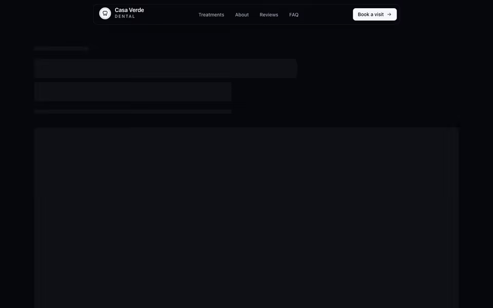
Floating glass islands that tighten on scroll, with a full-screen phone menu whose links rise in turn.
Headers block · CSS
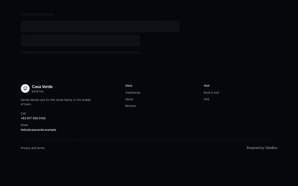
Column Footer
FreeLinks, contact details and legal pages: the brand and a line with link columns, or one compact row.
Footers block · Server
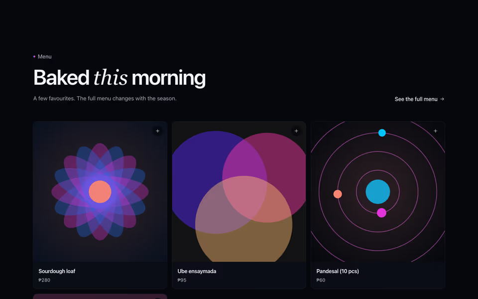
Menu cards that turn over: photo, name and price in front; the description and tag behind.
Menus block · CSS