Bento Hero
The promise beside a three-tile mosaic: a tall photo, a second image and a card of what the business offers.
npx shadcn@latest add @vibebox/hero-bentoControls
<HeroBento />About
Rebuilds the site kit's bento hero. Good for businesses with several things to show at once: a studio, a shop, a wellness brand. It differs from hero-split-stage (one photo with floating UI cards).
Use it when
- There are two photos worth showing, or none yet.
- The offer is a short list (classes, departments, menus).
Skip it when
- One hero photo says it all: use
hero-centered.
Install
- 1Add the VibeBox registry to
components.json:{ "registries": { "@vibebox": "https://motion.vibeboxph.com/r/{name}.json" } } - 2Add the block with the shadcn CLI:
npx shadcn@latest add @vibebox/hero-bento - 3Use it:
import { HeroBento } from "@/components/vibebox/hero-bento";
import { home } from "@/content/pages/home";

<HeroBento content={home.hero} variant="mosaic-right" id="top" />
Code
2 filescomponents/vibebox/hero-bento/index.tsx
/**
 * VibeBox Motion · Bento Hero
 * Copyright (c) 2026 VibeBox. Licensed under the VibeBox Motion Free License:
 * https://motion.vibeboxph.com/license
 * Use it in unlimited personal, commercial and client projects.
 * Do not sell or redistribute it as a component, kit, template or builder.
 */
import { Actions, Container, Eyebrow, headingId, Media, REVEAL, Section, SlotText, type BlockProps } from "@/lib/vibebox/block-kit";
import type { Image } from "@/lib/vibebox/content";
import { cn } from "@/lib/utils";
import type { Content, Variant } from "./schema";

/*
 * The copy beside (or above) a three-tile mosaic: a tall photo, a second image and a card listing
 * what the business offers. Tiles reveal one after another as the hero scrolls in.
 */

const FALLBACK: Image = { src: "scene:blocks", alt: "", width: 900, height: 1200 };
const FALLBACK_SECOND: Image = { src: "scene:bloom", alt: "", width: 900, height: 900 };

export type HeroBentoProps = BlockProps<Content, Variant>;

export function HeroBento({ content, variant = "mosaic-right", id, tone, className }: HeroBentoProps) {
  const right = variant === "mosaic-right";
  const tile = "overflow-hidden rounded-xl ring-1 ring-border";
  return (
    <Section
      slug="hero-bento"
      variant={variant}
      id={id}
      tone={tone}
      labelledBy={headingId(id)}
      spacing={false}
      className={cn("overflow-clip py-[clamp(48px,8vw,112px)]", className)}
    >
      <Container className={cn("grid grid-cols-[minmax(0,1fr)] items-center gap-[clamp(36px,5vw,72px)]", right && "lg:grid-cols-[minmax(0,1fr)_minmax(0,1fr)]")}>
        <div className={cn("grid gap-6", !right && "lg:grid-cols-[minmax(0,1.2fr)_minmax(0,0.8fr)] lg:items-end lg:gap-14")}>
          <div className="grid gap-6">
            <Eyebrow value={content.eyebrow} />
            <SlotText as="h1" value={content.heading} path="heading" id={headingId(id)} reveal className="font-display text-h1 font-semibold tracking-[-0.04em] text-balance" />
          </div>
          <div className="grid gap-6">
            <SlotText as="p" value={content.lead} path="lead" className="max-w-[54ch] text-[clamp(1.05rem,1.3vw,1.25rem)] leading-relaxed text-pretty text-muted-foreground" />
            <Actions primary={content.primaryAction} secondary={content.secondaryAction} size="lg" />
          </div>
        </div>
        <div className={cn("grid grid-cols-2 gap-3 sm:gap-4", right ? "grid-rows-[auto_auto]" : "sm:grid-cols-[1.2fr_1fr_1fr]")}>
          <div className={cn(tile, right ? "row-span-2 min-h-full" : "col-span-2 aspect-[16/10] sm:col-span-1 sm:aspect-auto sm:min-h-[260px]", REVEAL)}>
            <Media image={content.media ?? FALLBACK} priority sizes="(min-width: 1024px) 25vw, 50vw" />
          </div>
          <div className={cn(tile, "aspect-square", REVEAL)}>
            <Media image={content.secondaryMedia ?? FALLBACK_SECOND} sizes="(min-width: 1024px) 20vw, 50vw" />
          </div>
          <div className={cn("grid content-start gap-3 rounded-xl bg-card p-4 text-card-foreground ring-1 ring-border sm:p-5", REVEAL)}>
            <SlotText value={content.list.label} path="list.label" className="text-label font-medium text-muted-foreground" />
            <ul className="grid gap-2">
              {content.list.items.map((item, index) => (
                <li key={index} className="flex min-w-0 items-baseline gap-2 font-medium">
                  <span aria-hidden="true" className="size-1.5 shrink-0 translate-y-[-2px] rounded-[2px] bg-spectrum-3" />
                  <span data-slot={`list.items.${index}`} className="min-w-0 break-words">
                    {item}
                  </span>
                </li>
              ))}
            </ul>
          </div>
        </div>
      </Container>
    </Section>
  );
}
components/vibebox/hero-bento/schema.ts
/**
 * VibeBox Motion · Bento Hero
 * Copyright (c) 2026 VibeBox. Licensed under the VibeBox Motion Free License:
 * https://motion.vibeboxph.com/license
 * Use it in unlimited personal, commercial and client projects.
 * Do not sell or redistribute it as a component, kit, template or builder.
 */
import { image, list, sections, text, z } from "@/lib/vibebox/content";

export const variants = ["mosaic-right", "mosaic-below"] as const;

export type Variant = (typeof variants)[number];

export const content = sections.hero.extend({
  secondaryMedia: image({ role: "Second image" }).optional(),
  list: z.strictObject({
    label: text({ role: "List label", max: 24 }),
    items: list(text({ role: "List item", max: 28 }), { role: "List items", min: 2, max: 5 }),
  }),
});

export type Content = z.infer<typeof content>;
Content
Typed slots from schema.ts. Facts (hours, prices, quotes, names) come only from the business; until then they render as fill-ins.
| Slot | Label | Type | Limit | Fact |
|---|---|---|---|---|
| eyebrow | Kicker | text | 32 chars | — |
| heading | Headline | text | 80 chars | — |
| lead | Intro | text | 160 chars | — |
| primaryAction | Main button | action | 24 chars | — |
| secondaryAction | Second button | action | 24 chars | — |
| media | Image | image | — | — |
| secondaryMedia | Second image | image | — | — |
| list.label | List label | text | 24 chars | — |
| list.items | List items | list | up to 5 | — |
| list.items[] | List item | text | 28 chars | — |
Variants
Mosaic rightdefault
mosaic-right
Copy left, the mosaic right on desktop.
Mosaic below
mosaic-below
Headline and intro in two columns, the mosaic as a row beneath.
Accessibility and motion
- Keyboard
- The actions, in reading order.
- Screen readers
- One h1, the intro, the actions, then the images and the list.
- Touch
- Nothing depends on hover.
- Reduced motion
- The tiles appear without their reveal.
Edge cases and limits
- Five 28-character list items wrap inside the card.
- No images: placeholder scenes.
Related
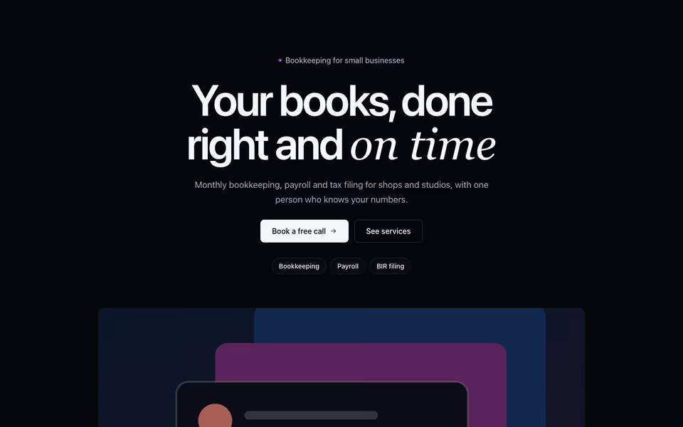
Centered Hero
FreeOne centred promise with its actions and highlights, the image below, on a plain, haloed or gradient panel ground.
Heroes block · Server
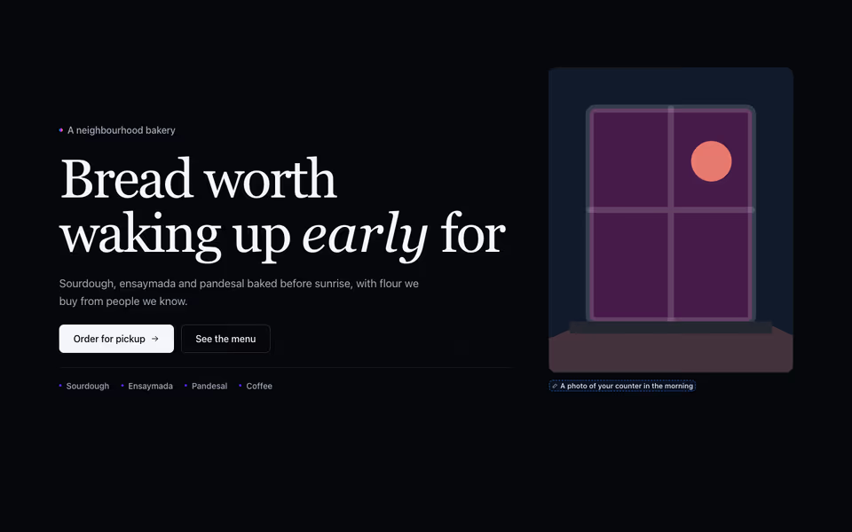
Editorial Hero
FreeA magazine opening: a large serif headline, the intro and actions, tags, and the photo framed tall or set as a band.
Heroes block · Server
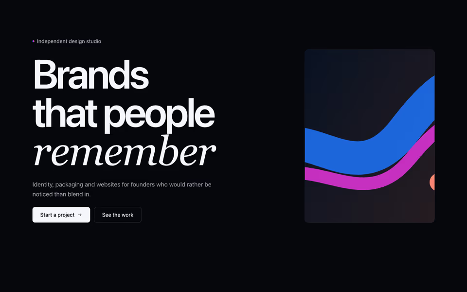
Poster-size type that rises word by word on load, with the photo in a corner or set wide beneath.
Heroes block · Server