Icon Grid Services
Three to six services as cards with icons, an index of numbered rows, or hairline columns.
npx shadcn@latest add @vibebox/services-icon-gridControls
<ServicesIconGrid />About
Rebuilds three of the site kit's feature layouts (icon grid, icon list, comparison strip) as variants of one block, with the library's own line icons. It is the free default for features and services.
Use it when
- Three to six services or features of equal weight.
- Software features with icons.
Skip it when
- One service should lead: use
services-bento.
Install
- 1Add the VibeBox registry to
components.json:{ "registries": { "@vibebox": "https://motion.vibeboxph.com/r/{name}.json" } } - 2Add the block with the shadcn CLI:
npx shadcn@latest add @vibebox/services-icon-grid - 3Use it:
import { ServicesIconGrid } from "@/components/vibebox/services-icon-grid";
import { home } from "@/content/pages/home";

<ServicesIconGrid content={home.services} variant="cards" id="services" />
Code
2 filescomponents/vibebox/services-icon-grid/index.tsx
/**
 * VibeBox Motion · Icon Grid Services
 * Copyright (c) 2026 VibeBox. Licensed under the VibeBox Motion Free License:
 * https://motion.vibeboxph.com/license
 * Use it in unlimited personal, commercial and client projects.
 * Do not sell or redistribute it as a component, kit, template or builder.
 */
import { Container, headingId, Icon, REVEAL, Section, SectionHead, SlotText, TextLink, type BlockProps } from "@/lib/vibebox/block-kit";
import { cn } from "@/lib/utils";
import type { Content, Variant } from "./schema";

/*
 * Three to six services as cards (the first one leads), as an index of numbered rows, or as
 * plain columns divided by hairlines.
 */

const pad = (n: number) => String(n).padStart(2, "0");

type Item = Content["items"][number];

function Mark({ item, n }: { item: Item; n: number }) {
  return item.icon ? (
    <span className="inline-grid size-11 place-items-center rounded-md bg-[color-mix(in_oklab,var(--spectrum-2)_12%,var(--card))] text-foreground ring-1 ring-border">
      <Icon name={item.icon} />
    </span>
  ) : (
    <span aria-hidden="true" className="font-mono text-small font-medium text-muted-foreground tabular-nums">
      {pad(n)}
    </span>
  );
}

export type ServicesIconGridProps = BlockProps<Content, Variant>;

export function ServicesIconGrid({ content, variant = "cards", id, tone, className }: ServicesIconGridProps) {
  const count = content.items.length;
  return (
    <Section slug="services-icon-grid" variant={variant} id={id} tone={tone} labelledBy={headingId(id)} className={className}>
      <Container className="grid gap-[clamp(32px,4vw,56px)]">
        <div className={cn("grid gap-6", variant === "index" && "lg:grid-cols-[minmax(0,1fr)_auto] lg:items-end")}>
          <SectionHead eyebrow={content.eyebrow} heading={content.heading} lead={content.lead} id={id} />
          {content.action && <TextLink link={content.action} path="action" className="justify-self-start lg:justify-self-end" />}
        </div>
        {variant === "index" ? (
          <ol className="grid border-t border-border">
            {content.items.map((item, index) => (
              <li
                key={index}
                className={cn("grid gap-2 border-b border-border py-6 md:grid-cols-[80px_minmax(0,0.9fr)_minmax(0,1.1fr)] md:items-baseline md:gap-7", REVEAL)}
              >
                <Mark item={item} n={index + 1} />
                <SlotText as="h3" value={item.title} path={`items.${index}.title`} className="font-display text-[clamp(1.35rem,1rem+1.2vw,2rem)] leading-tight font-semibold tracking-[-0.02em]" />
                <SlotText as="p" value={item.body} path={`items.${index}.body`} className="text-pretty text-muted-foreground" />
              </li>
            ))}
          </ol>
        ) : variant === "columns" ? (
          <ul className={cn("grid gap-x-8 gap-y-10 sm:grid-cols-2", count === 3 && "lg:grid-cols-3", count >= 4 && "lg:grid-cols-4", count >= 5 && "xl:grid-cols-[repeat(var(--vb-count),minmax(0,1fr))]")} style={{ ["--vb-count" as string]: count }}>
            {content.items.map((item, index) => (
              <li key={index} className={cn("grid content-start gap-3 border-t border-border-strong pt-5", REVEAL)}>
                <Mark item={item} n={index + 1} />
                <SlotText as="h3" value={item.title} path={`items.${index}.title`} className="text-h3 font-semibold tracking-tight" />
                <SlotText as="p" value={item.body} path={`items.${index}.body`} className="text-small text-pretty text-muted-foreground" />
              </li>
            ))}
          </ul>
        ) : (
          <ul className="grid gap-4 sm:grid-cols-2 lg:grid-cols-3">
            {content.items.map((item, index) => (
              <li
                key={index}
                className={cn(
                  "relative grid content-start gap-3 overflow-hidden rounded-xl bg-card p-6 text-card-foreground ring-1 ring-border sm:p-7",
                  index === 0 && "content-end bg-[linear-gradient(160deg,color-mix(in_oklab,var(--spectrum-2)_16%,var(--card)),var(--card))] pt-28 lg:row-span-2 lg:min-h-[320px]",
                  index === 0 && count === 6 && "lg:row-span-1",
                  REVEAL,
                )}
              >
                {/* The lead card's numeral, set large in outline, so its open top reads as composed. */}
                {index === 0 && (
                  <span
                    aria-hidden="true"
                    className="pointer-events-none absolute top-4 right-6 font-serif text-[clamp(4.5rem,3.5rem+3vw,7rem)] leading-none text-transparent italic [-webkit-text-stroke:1px_color-mix(in_oklab,var(--foreground)_28%,transparent)]"
                  >
                    01
                  </span>
                )}
                {(index > 0 || item.icon) && <Mark item={item} n={index + 1} />}
                <SlotText
                  as="h3"
                  value={item.title}
                  path={`items.${index}.title`}
                  className={cn("font-semibold tracking-tight", index === 0 && count !== 6 ? "font-display text-[clamp(1.5rem,1.1rem+1.2vw,2.2rem)] leading-tight" : "text-h3")}
                />
                <SlotText as="p" value={item.body} path={`items.${index}.body`} className="text-small text-pretty text-muted-foreground" />
              </li>
            ))}
          </ul>
        )}
      </Container>
    </Section>
  );
}
components/vibebox/services-icon-grid/schema.ts
/**
 * VibeBox Motion · Icon Grid Services
 * Copyright (c) 2026 VibeBox. Licensed under the VibeBox Motion Free License:
 * https://motion.vibeboxph.com/license
 * Use it in unlimited personal, commercial and client projects.
 * Do not sell or redistribute it as a component, kit, template or builder.
 */
import { sections, type z } from "@/lib/vibebox/content";

export const variants = ["cards", "index", "columns"] as const;

export type Variant = (typeof variants)[number];

export const content = sections.services;

export type Content = z.infer<typeof content>;
Content
Typed slots from schema.ts. Facts (hours, prices, quotes, names) come only from the business; until then they render as fill-ins.
| Slot | Label | Type | Limit | Fact |
|---|---|---|---|---|
| eyebrow | Kicker | text | 32 chars | — |
| heading | Heading | text | 60 chars | — |
| lead | Intro | text | 160 chars | — |
| items | Services | list | up to 6 | — |
| items[].title | Title | text | 40 chars | — |
| items[].body | Description | text | 140 chars | — |
| items[].icon | Icon | icon | — | — |
| items[].media | Image | image | — | — |
| action | Button | action | 24 chars | — |
Variants
Cardsdefault
cards
A grid of cards, the first taller with a soft gradient.
Index
index
Numbered rows: number, title, description.
Columns
columns
Columns under hairlines, no cards.
Accessibility and motion
- Keyboard
- The optional action link.
- Screen readers
- A heading, then each service as a heading and a paragraph; icons are hidden.
- Touch
- Nothing depends on hover.
- Reduced motion
- Cards appear without their reveal.
Edge cases and limits
- An item without an icon shows its number.
- Six long items: the first card stops spanning two rows.
Related
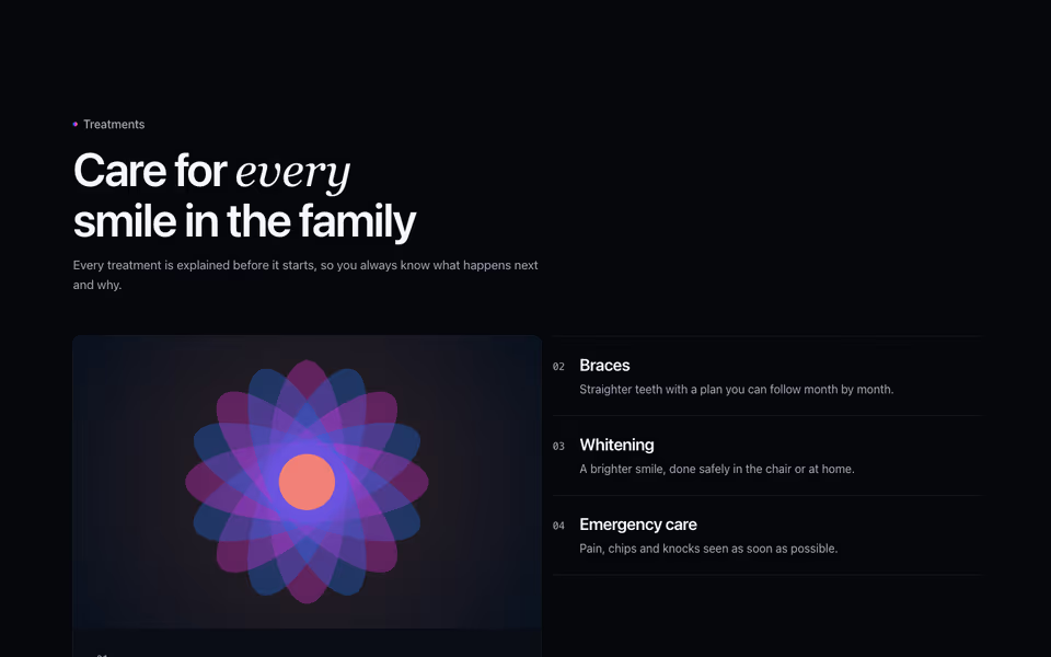
Services Bento
FreeThe lead service as a large image card, the rest as a numbered list beside it or as cards beneath.
Services block · Server
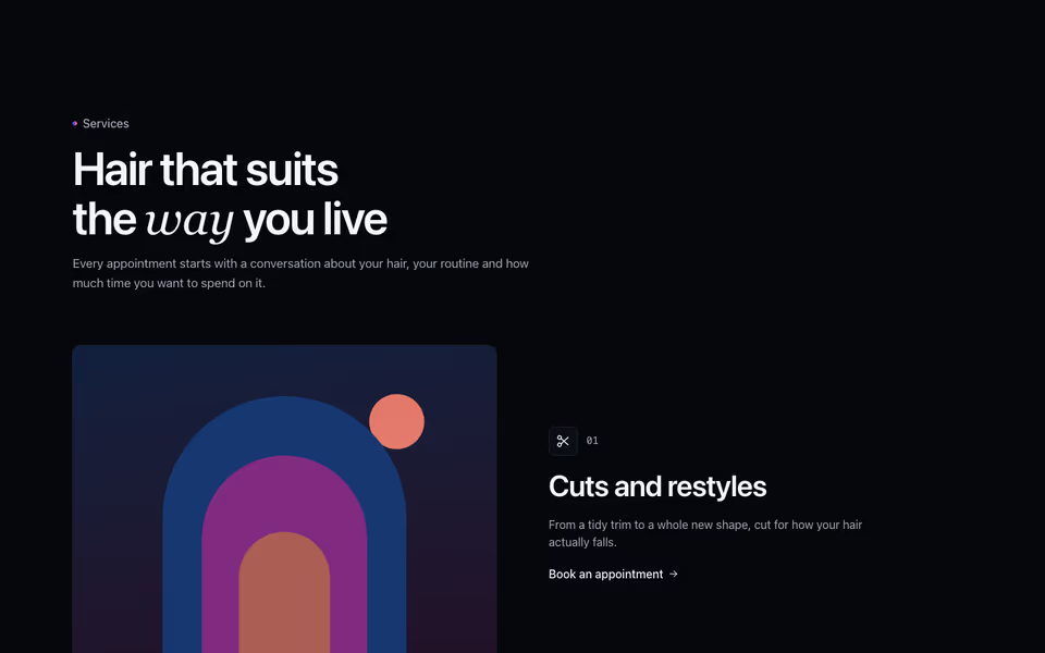
Zigzag Services
FreeOne row per service with its own photo, alternating sides; placeholder scenes until photos arrive.
Services block · Server
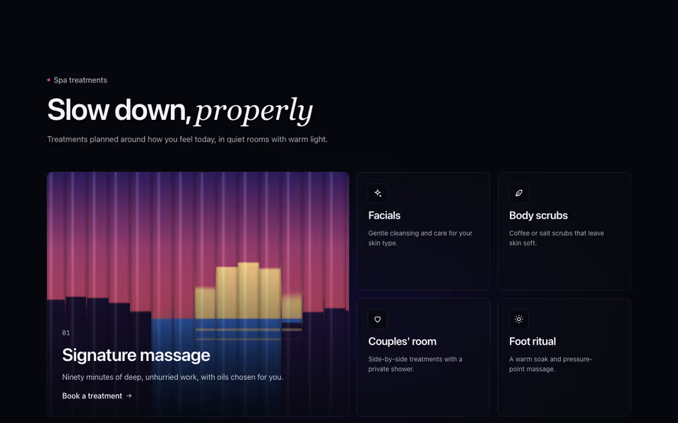
The lead service behind reeded glass that clears under the pointer, the rest on frosted cards over a glow.
Services block · WebGL2