Equalizer Menu Toggle
A menu button whose three spectrum bars idle like a level meter and fold into an X when the menu opens.
npx shadcn@latest add @vibebox/equalizer-menu-toggleControls
<EqualizerMenuToggle />About
The phone menu button for headers. Three bars of uneven length, each a slice of the spectrum, pulse gently like an audio level meter while the menu is closed, so the button reads as alive without demanding attention. When the menu opens they fold into a crisp X in the foreground colour. It replaces the plain three-line hamburger on sites that use the spectrum as their accent. Ported from the VibeBox site header.
Use it when
- A header needs a menu button on phones and tablets.
- The site uses the spectrum (or a client's ramp) as its accent.
Skip it when
- The header already has a strong animated element next to it; one moving thing per view is enough. Pass
className="[&_[data-vb-emt-bar]]:animate-none"or use a plain button.
Install
- 1Add the VibeBox registry to
components.json:{ "registries": { "@vibebox": "https://motion.vibeboxph.com/r/{name}.json" } } - 2Add the component with the shadcn CLI:
npx shadcn@latest add @vibebox/equalizer-menu-toggle - 3Use it:
"use client";
import { useState } from "react";
import { EqualizerMenuToggle } from "@/components/vibebox/equalizer-menu-toggle";

export function MobileNav() {
  const [open, setOpen] = useState(false);
  return (
    <>
      <EqualizerMenuToggle open={open} onToggle={() => setOpen((v) => !v)} controls="site-menu" className="md:hidden" />
      <nav id="site-menu" hidden={!open}>{/* links */}</nav>
    </>
  );
}
Code
2 filescomponents/vibebox/equalizer-menu-toggle/equalizer-menu-toggle.client.tsx
/**
 * VibeBox Motion · Equalizer Menu Toggle
 * Copyright (c) 2026 VibeBox. Licensed under the VibeBox Motion Free License:
 * https://motion.vibeboxph.com/license
 * Use it in unlimited personal, commercial and client projects.
 * Do not sell or redistribute it as a component, kit, template or builder.
 */
"use client";

import { forwardRef, type ButtonHTMLAttributes } from "react";
import { cn } from "@/lib/utils";

/* Three spectrum bars idle like a level meter, then fold into an X when the menu opens.
   Transform-only animation; the bars hold still under reduced motion. */

const CSS = `
@keyframes vb-emt-level { 0%, 100% { transform: scaleX(1); } 50% { transform: scaleX(0.55); } }
[data-vb-emt-bar] {
  transform-origin: left center;
  transition: transform 380ms var(--ease-expo-out, cubic-bezier(0.16, 1, 0.3, 1)), background 300ms var(--ease-expo-out, cubic-bezier(0.16, 1, 0.3, 1)), opacity 200ms ease;
}
@media (prefers-reduced-motion: no-preference) {
  [data-vb="equalizer-menu-toggle"][aria-expanded="false"] [data-vb-emt-bar] { animation: vb-emt-level 2.4s var(--ease-expo-out, cubic-bezier(0.16, 1, 0.3, 1)) infinite; }
  [data-vb="equalizer-menu-toggle"][aria-expanded="false"] [data-vb-emt-bar="2"] { animation-delay: 0.4s; }
  [data-vb="equalizer-menu-toggle"][aria-expanded="false"] [data-vb-emt-bar="3"] { animation-delay: 0.8s; }
  [data-vb="equalizer-menu-toggle"][aria-expanded="false"]:hover [data-vb-emt-bar] { animation-duration: 0.9s; }
}
@media (prefers-reduced-motion: reduce) { [data-vb-emt-bar] { transition: none; } }
[data-vb="equalizer-menu-toggle"][aria-expanded="true"] [data-vb-emt-bar] { left: 50%; width: 20px; margin-left: -10px; background: currentColor; transform-origin: center; }
[data-vb="equalizer-menu-toggle"][aria-expanded="true"] [data-vb-emt-bar="1"] { transform: translateY(6px) rotate(45deg); }
[data-vb="equalizer-menu-toggle"][aria-expanded="true"] [data-vb-emt-bar="2"] { opacity: 0; transform: scaleX(0); }
[data-vb="equalizer-menu-toggle"][aria-expanded="true"] [data-vb-emt-bar="3"] { transform: translateY(-6px) rotate(-45deg); }
`;

const BARS = [
  { top: 0, width: 20, from: "var(--spectrum-1)", to: "var(--spectrum-2)" },
  { top: 6, width: 14, from: "var(--spectrum-3)", to: "var(--spectrum-4)" },
  { top: 12, width: 17, from: "var(--spectrum-5)", to: "var(--spectrum-7)" },
] as const;

export type EqualizerMenuToggleProps = Omit<ButtonHTMLAttributes<HTMLButtonElement>, "onClick" | "children"> & {
  /** Whether the menu it controls is open. */
  open: boolean;
  onToggle: () => void;
  /** Id of the menu element, for aria-controls. */
  controls?: string;
  /** Accessible names for each state. */
  openLabel?: string;
  closeLabel?: string;
};

export const EqualizerMenuToggle = forwardRef<HTMLButtonElement, EqualizerMenuToggleProps>(function EqualizerMenuToggle(
  { open, onToggle, controls, openLabel = "Open menu", closeLabel = "Close menu", className, ...rest },
  ref,
) {
  return (
    <button
      ref={ref}
      type="button"
      data-vb="equalizer-menu-toggle"
      aria-label={open ? closeLabel : openLabel}
      aria-expanded={open}
      aria-controls={controls}
      onClick={onToggle}
      className={cn(
        "relative inline-grid size-11 shrink-0 cursor-pointer place-items-center rounded-lg border border-border-strong bg-muted text-foreground",
        "transition-colors duration-200 ease-expo-out hover:bg-accent aria-expanded:bg-accent",
        "focus-visible:ring-2 focus-visible:ring-ring focus-visible:ring-offset-2 focus-visible:ring-offset-background focus-visible:outline-none",
        className,
      )}
      {...rest}
    >
      <style href="vb-equalizer-menu-toggle" precedence="vb">
        {CSS}
      </style>
      <span className="relative h-3.5 w-5" aria-hidden="true">
        {BARS.map((bar, index) => (
          <i
            key={bar.top}
            data-vb-emt-bar={index + 1}
            className="absolute left-0 h-0.5 rounded-full"
            style={{ top: bar.top, width: bar.width, background: `linear-gradient(90deg, ${bar.from}, ${bar.to})` }}
          />
        ))}
      </span>
    </button>
  );
});
components/vibebox/equalizer-menu-toggle/index.tsx
/**
 * VibeBox Motion · Equalizer Menu Toggle
 * Copyright (c) 2026 VibeBox. Licensed under the VibeBox Motion Free License:
 * https://motion.vibeboxph.com/license
 * Use it in unlimited personal, commercial and client projects.
 * Do not sell or redistribute it as a component, kit, template or builder.
 */
export { EqualizerMenuToggle, type EqualizerMenuToggleProps } from "./equalizer-menu-toggle.client";
Props
| Prop | Type | Default | Description |
|---|---|---|---|
| open * | boolean | — | Whether the menu it controls is open. |
| onToggle * | () => void | — | Called on click. |
| controls | string | — | Id of the menu element (aria-controls). |
| openLabel | string | "Open menu" | Accessible name while closed. |
| closeLabel | string | "Close menu" | Accessible name while open. |
| className | string | — | Merged with cn(). |
Accessibility and motion
- Keyboard
- A native button: Tab to focus, Enter or Space to toggle; the focus ring uses the ring token.
- Screen readers
- Named "Open menu" or "Close menu", with aria-expanded and aria-controls pointing at the menu.
- Touch
- Tap toggles; the faster pulse on hover is a mouse-only extra.
- Reduced motion
- Three still bars; the fold to an X is instant.
Edge cases and limits
- Inside a light header on a dark page, the bars still read because they carry their own colour.
- Long labels never show; they are accessible names only.
Related
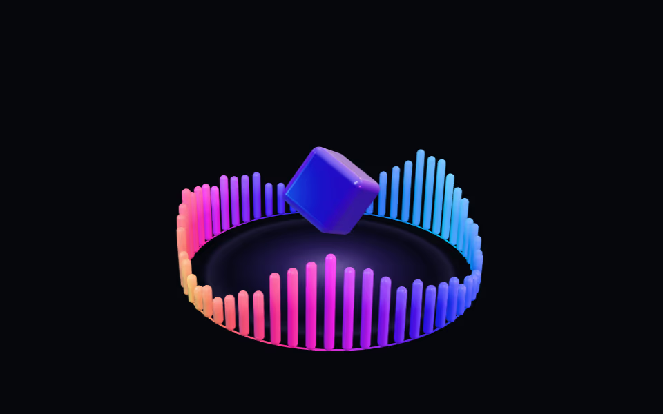
Equalizer Ring
FreeA crown of light bars pulsing like a visualizer around a floating glass box; bars rise toward the pointer.
3D · three.js
A header wordmark whose leading letters bounce like equalizer bars with scroll speed, with a spectrum tint on hover.
Brand and proof · Motion
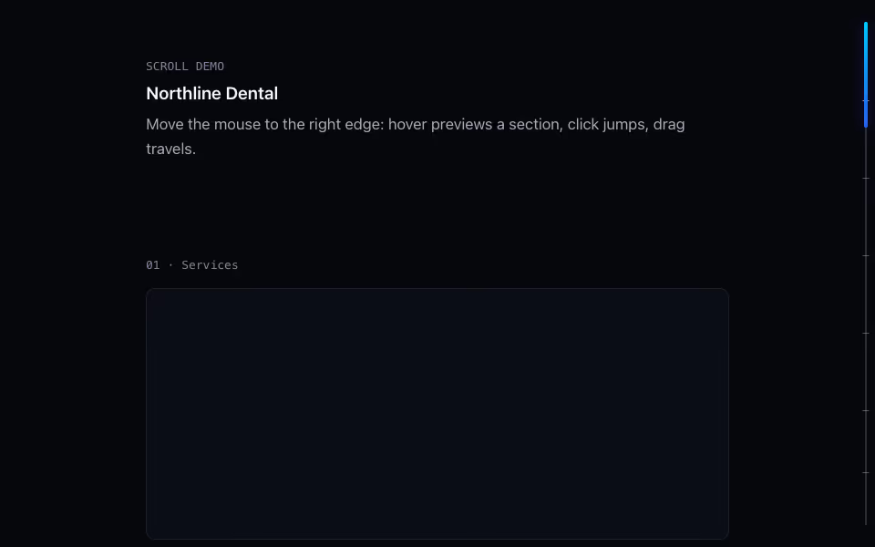
Scroll Rail
FreeThe page scrollbar redrawn: a spectrum thumb, section ticks, and a readout that names where you are.
Scroll · Motion