Split Bloom Contact
The split contact section with a Contact Bloom button that opens the phone and chat apps the business uses.
npx shadcn@latest add @vibebox/contact-split-bloomControls
<ContactSplitBloom />About
Built on the library's Contact Bloom for businesses whose customers prefer chat apps (common in the Philippines). It differs from contact-split by the bloom.
Use it when
- Customers message more than they email.
Skip it when
- The business has no phone or chat channels: use
contact-split.
Install
- 1Add the VibeBox registry to
components.json:{ "registries": { "@vibebox": "https://motion.vibeboxph.com/r/{name}.json" } } - 2Add the block with the shadcn CLI:
npx shadcn@latest add @vibebox/contact-split-bloom - 3Use it:
import { ContactSplitBloom } from "@/components/vibebox/contact-split-bloom";
import { home } from "@/content/pages/home";

<ContactSplitBloom content={home.contact} variant="form-right" id="contact" />
Code
2 filescomponents/vibebox/contact-split-bloom/index.tsx
/**
 * VibeBox Motion · Split Bloom Contact
 * Copyright (c) 2026 VibeBox. Licensed under the VibeBox Motion Free License:
 * https://motion.vibeboxph.com/license
 * Use it in unlimited personal, commercial and client projects.
 * Do not sell or redistribute it as a component, kit, template or builder.
 */
import { ChannelList, Container, headingId, InquiryForm, Media, REVEAL, Section, SectionHead, type BlockProps } from "@/lib/vibebox/block-kit";
import { ContactBloom, type ContactChannels } from "@/components/vibebox/contact-bloom";
import { isFillIn } from "@/lib/vibebox/content/runtime";
import { cn } from "@/lib/utils";
import type { Content, Variant } from "./schema";

/*
 * The split contact section with a quick way out: beside the channels, a Contact Bloom button
 * opens the phone, text and chat apps the business uses. It shows once at least one of those
 * channels is a real value, never for fill-ins.
 */

const BLOOM_KINDS = ["phone", "sms", "viber", "messenger", "whatsapp", "email"] as const;

function bloomChannels(channels: Content["channels"]): ContactChannels {
  const found: ContactChannels = {};
  for (const channel of channels) {
    const kind = BLOOM_KINDS.find((candidate) => candidate === channel.kind);
    if (kind && !isFillIn(channel.value) && !found[kind]) found[kind] = channel.value;
  }
  return found;
}

export type ContactSplitBloomProps = BlockProps<Content, Variant> & {
  /** Where the form posts (assembled apps handle /api/inquiries). */
  formAction?: string;
};

export function ContactSplitBloom({ content, variant = "form-right", id, tone, preview, formAction, className }: ContactSplitBloomProps) {
  const quick = bloomChannels(content.channels);
  return (
    <Section slug="contact-split-bloom" variant={variant} id={id} tone={tone} labelledBy={headingId(id)} className={className}>
      <Container className="grid grid-cols-[minmax(0,1fr)] gap-[clamp(36px,5vw,72px)] lg:grid-cols-2">
        <div className={cn("grid content-start gap-8", variant === "form-left" && "lg:order-2")}>
          <SectionHead eyebrow={content.eyebrow} heading={content.heading} lead={content.lead} id={id} />
          {content.media && (
            <div className={cn("aspect-[21/9] overflow-hidden rounded-xl ring-1 ring-border", REVEAL)}>
              <Media image={content.media} sizes="(min-width: 1024px) 45vw, 100vw" />
            </div>
          )}
          <ChannelList channels={content.channels} columns className={REVEAL} />
          <div data-slot="bloomLabel" className={cn("justify-self-start", REVEAL)}>
            {Object.keys(quick).length > 0 ? (
              <ContactBloom channels={quick} label={content.bloomLabel} direction="down" />
            ) : (
              <span className="inline-flex h-11 items-center rounded-full border border-dashed border-border-strong px-5 text-small text-muted-foreground">{content.bloomLabel}</span>
            )}
          </div>
        </div>
        {content.form && (
          <div className={cn("self-start rounded-xl bg-card p-6 text-card-foreground ring-1 ring-border sm:p-8", REVEAL)}>
            <InquiryForm form={content.form} action={formAction} preview={preview} source={id} />
          </div>
        )}
      </Container>
    </Section>
  );
}
components/vibebox/contact-split-bloom/schema.ts
/**
 * VibeBox Motion · Split Bloom Contact
 * Copyright (c) 2026 VibeBox. Licensed under the VibeBox Motion Free License:
 * https://motion.vibeboxph.com/license
 * Use it in unlimited personal, commercial and client projects.
 * Do not sell or redistribute it as a component, kit, template or builder.
 */
import { sections, text, type z } from "@/lib/vibebox/content";

export const variants = ["form-right", "form-left"] as const;

export type Variant = (typeof variants)[number];

export const content = sections.contact.extend({
  bloomLabel: text({ role: "Quick contact button", max: 24 }),
});

export type Content = z.infer<typeof content>;
Content
Typed slots from schema.ts. Facts (hours, prices, quotes, names) come only from the business; until then they render as fill-ins.
| Slot | Label | Type | Limit | Fact |
|---|---|---|---|---|
| eyebrow | Kicker | text | 32 chars | — |
| heading | Heading | text | 60 chars | — |
| lead | Intro | text | 160 chars | — |
| channels | Ways to reach you | list | up to 6 | — |
| channels[].kind | Channel | choice | — | — |
| channels[].label | Label | text | 24 chars | — |
| channels[].value | Value | fact | 120 chars | Yes, a fill-in until given |
| form.nameLabel | Name field | text | 24 chars | — |
| form.emailLabel | Email field | text | 24 chars | — |
| form.messageLabel | Message field | text | 40 chars | — |
| form.submitLabel | Send button | text | 24 chars | — |
| form.note | Form note | text | 120 chars | — |
| media | Map or photo | image | — | — |
| bloomLabel | Quick contact button | text | 24 chars | — |
Variants
Form rightdefault
form-right
Channels and bloom left, the form right.
Form left
form-left
The form left, channels and bloom right on desktop.
Accessibility and motion
- Keyboard
- Channel links, the bloom button (Enter opens, Escape closes), then the form.
- Screen readers
- The bloom is a disclosure button with a list of channel links; the form has visible labels.
- Touch
- The bloom opens by tap; its items are 44 px tall.
- Reduced motion
- The bloom opens without its spring.
Edge cases and limits
- Only fill-ins for phone and chat: the bloom shows as a dashed placeholder.
- The bloom opens downward so it never covers the heading.
Related
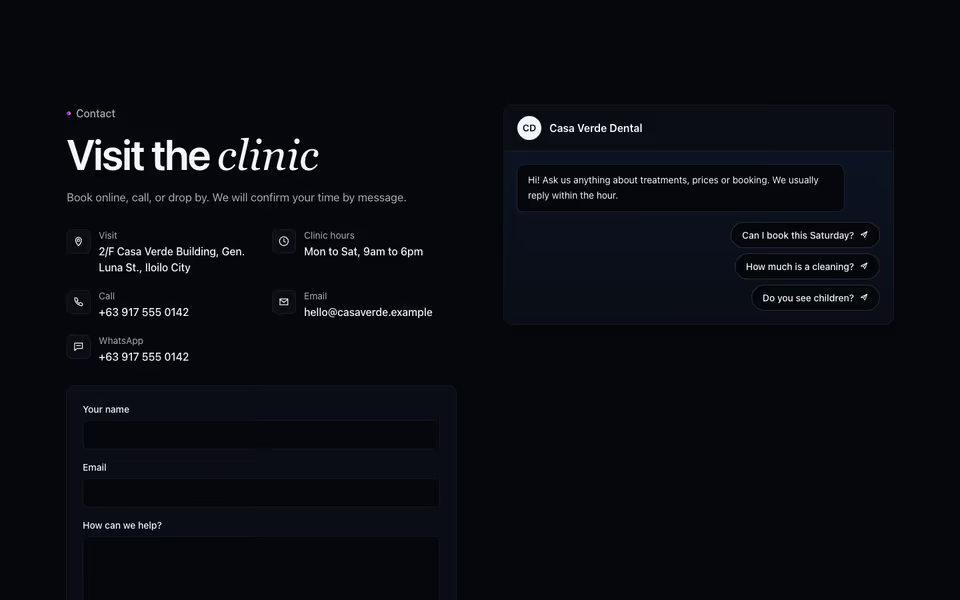
Contact as a conversation: a chat panel whose quick questions open the business's chat app, prefilled.
Contact block · Server
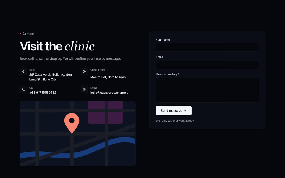
Split Contact
FreeEvery way to reach the business beside an inquiry form that works without JavaScript; facts are fill-ins until given.
Contact block · Server
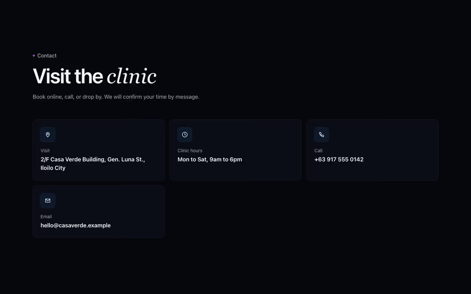
Contact Cards
FreeOne card per way to reach the business (call, visit, message), or a list of rows; facts until given.
Contact block · Server