CTA Band
The last nudge before the footer: one line and one action, as big type, a panel with art, or a quiet row.
npx shadcn@latest add @vibebox/cta-bandControls
<CtaBand />About
Rebuilds the site kit's centre band, split panel and minimal inline calls to action. The free default cta in every template; cta-spectrum-mesh (Pro) adds a shader backdrop.
Use it when
- Every page that should end with an action.
Skip it when
- The page ends in a contact form already: skip the CTA.
Install
- 1Add the VibeBox registry to
components.json:{ "registries": { "@vibebox": "https://motion.vibeboxph.com/r/{name}.json" } } - 2Add the block with the shadcn CLI:
npx shadcn@latest add @vibebox/cta-band - 3Use it:
import { CtaBand } from "@/components/vibebox/cta-band";
import { home } from "@/content/pages/home";

<CtaBand content={home.cta} variant="band" id="start" />
Code
2 filescomponents/vibebox/cta-band/index.tsx
/**
 * VibeBox Motion · CTA Band
 * Copyright (c) 2026 VibeBox. Licensed under the VibeBox Motion Free License:
 * https://motion.vibeboxph.com/license
 * Use it in unlimited personal, commercial and client projects.
 * Do not sell or redistribute it as a component, kit, template or builder.
 */
import { Actions, Container, Eyebrow, headingId, Media, REVEAL, Section, SlotText, type BlockProps } from "@/lib/vibebox/block-kit";
import type { Image } from "@/lib/vibebox/content";
import { cn } from "@/lib/utils";
import type { Content, Variant } from "./schema";

/*
 * The last nudge before the footer: one line and one action, as a band of large type, a panel
 * with art beside the copy, or a single quiet row.
 */

const FALLBACK: Image = { src: "scene:orbit", alt: "", width: 1200, height: 900 };

export type CtaBandProps = BlockProps<Content, Variant>;

export function CtaBand({ content, variant = "band", id, tone, className }: CtaBandProps) {
  const heading = (size: string) => (
    <SlotText as="h2" value={content.heading} path="heading" id={headingId(id)} className={cn("font-display font-semibold tracking-[-0.035em] text-balance", size)} />
  );
  const lead = <SlotText as="p" value={content.lead} path="lead" className="max-w-[48ch] text-pretty text-muted-foreground" />;
  const actions = <Actions primary={content.primaryAction} secondary={content.secondaryAction} size="lg" />;
  return (
    <Section slug="cta-band" variant={variant} id={id} tone={tone} labelledBy={headingId(id)} spacing={false} className={cn("py-[clamp(56px,9vw,128px)]", variant === "inline" && "py-[clamp(40px,6vw,72px)]", className)}>
      <Container>
        {variant === "panel" ? (
          <div className={cn("grid overflow-hidden rounded-xl bg-card text-card-foreground ring-1 ring-border md:grid-cols-[minmax(0,1.15fr)_minmax(0,0.85fr)]", REVEAL)}>
            <div className="grid content-center gap-5 p-6 sm:p-10 lg:p-14">
              <Eyebrow value={content.eyebrow} />
              {heading("text-h2")}
              {lead}
              {actions}
            </div>
            <div className="relative min-h-56 md:min-h-full">
              <div className="absolute inset-0">
                <Media image={content.media ?? FALLBACK} sizes="(min-width: 768px) 40vw, 100vw" />
              </div>
            </div>
          </div>
        ) : variant === "inline" ? (
          <div className={cn("grid items-center gap-6 border-y border-border py-8 md:grid-cols-[auto_minmax(0,1fr)_auto] md:gap-8", REVEAL)}>
            <div className="size-16 overflow-hidden rounded-lg ring-1 ring-border">
              <Media image={content.media ?? FALLBACK} sizes="64px" />
            </div>
            <div className="grid gap-2">
              <Eyebrow value={content.eyebrow} />
              {heading("text-[clamp(1.5rem,1.1rem+1.4vw,2.25rem)] leading-tight")}
              {lead}
            </div>
            {actions}
          </div>
        ) : (
          <div className={cn("relative isolate grid gap-8 lg:grid-cols-[minmax(0,1.4fr)_minmax(0,0.8fr)] lg:items-end lg:gap-16", REVEAL)}>
            {content.media && (
              <div aria-hidden="true" className="absolute -top-10 right-0 -z-10 hidden size-40 overflow-hidden rounded-full opacity-70 blur-2xl lg:block">
                <Media image={{ ...content.media, alt: "" }} sizes="160px" />
              </div>
            )}
            <div className="grid gap-5">
              <Eyebrow value={content.eyebrow} />
              {heading("text-[clamp(2.6rem,1.2rem+5vw,6rem)] leading-[0.98]")}
            </div>
            <div className="grid gap-6">
              {lead}
              {actions}
            </div>
          </div>
        )}
      </Container>
    </Section>
  );
}
components/vibebox/cta-band/schema.ts
/**
 * VibeBox Motion · CTA Band
 * Copyright (c) 2026 VibeBox. Licensed under the VibeBox Motion Free License:
 * https://motion.vibeboxph.com/license
 * Use it in unlimited personal, commercial and client projects.
 * Do not sell or redistribute it as a component, kit, template or builder.
 */
import { image, sections, type z } from "@/lib/vibebox/content";

export const variants = ["band", "panel", "inline"] as const;

export type Variant = (typeof variants)[number];

export const content = sections.cta.extend({
  media: image({ role: "Image" }).optional(),
});

export type Content = z.infer<typeof content>;
Content
Typed slots from schema.ts. Facts (hours, prices, quotes, names) come only from the business; until then they render as fill-ins.
| Slot | Label | Type | Limit | Fact |
|---|---|---|---|---|
| eyebrow | Kicker | text | 32 chars | — |
| heading | Heading | text | 60 chars | — |
| lead | Intro | text | 160 chars | — |
| primaryAction | Main button | action | 24 chars | — |
| secondaryAction | Second button | action | 24 chars | — |
| media | Image | image | — | — |
Variants
Banddefault
band
Large type left, the line and actions right on desktop.
Panel
panel
A card with the copy and actions left, art right.
Inline
inline
One row: a small image, the heading and line, the actions.
Accessibility and motion
- Keyboard
- The actions.
- Screen readers
- A heading, a line and the actions; the art is decorative unless it has alt text.
- Touch
- Nothing depends on hover.
- Reduced motion
- The band appears without its reveal.
Edge cases and limits
- A 60-character heading in
bandwraps to three lines on phones.
Related
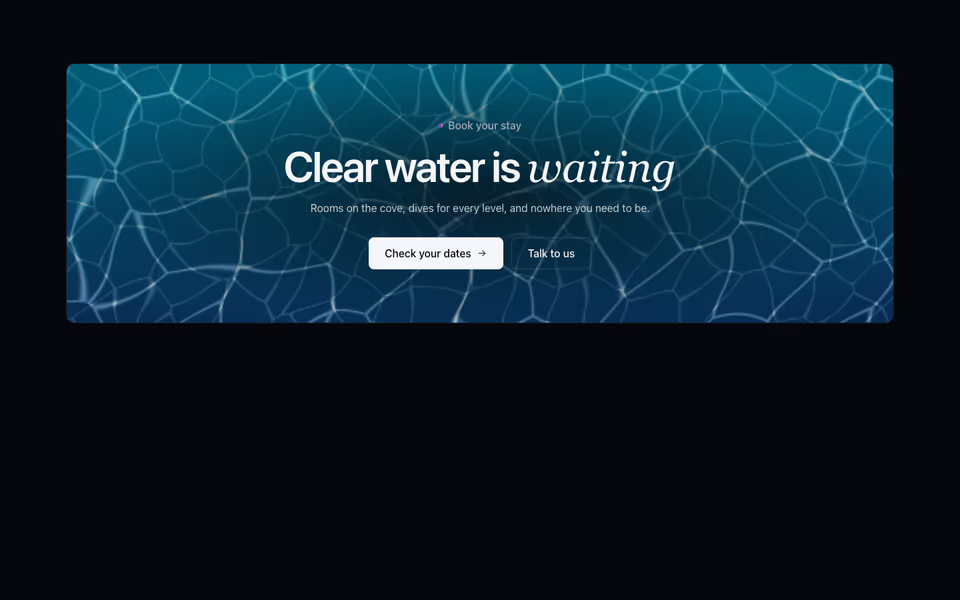
Caustics CTA
ProA closing call to action on light moving through water, for resorts, pools, spas and swim schools.
Calls to action block · WebGL2
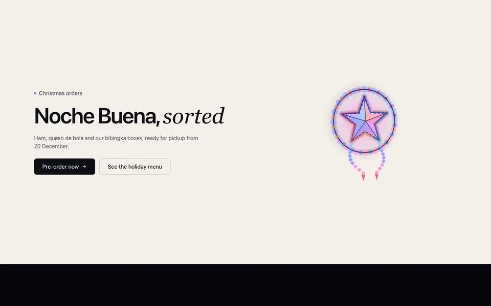
Parol CTA
ProA seasonal call to action: a capiz parol builds itself in 3D, lights chasing round its rays, beside the offer.
Calls to action block · three.js
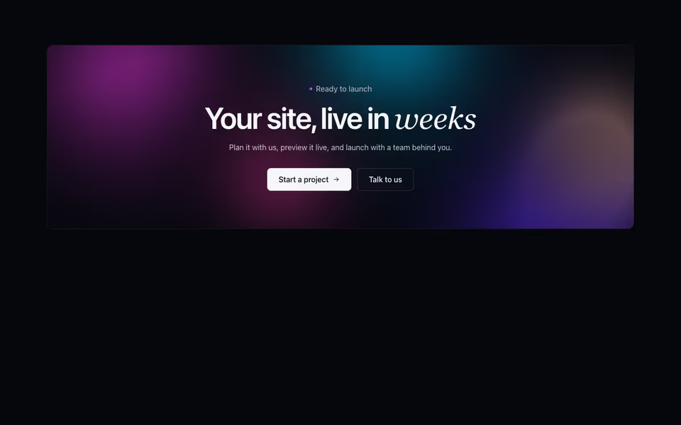
A closing call to action on a band of the brand's colours drifting slowly as a mesh gradient.
Calls to action block · WebGL2