Split Stage Hero
The promise beside a stage: your photo or a scene with two floating cards that show what booking or ordering looks like.
npx shadcn@latest add @vibebox/hero-split-stageControls
<HeroSplitStage />About
The default hero for service businesses (clinics, salons, home services, studios) and for software that wants a product-like stage. It rebuilds the Launchpad site kit's split hero ("split mockup" and "left dashboard" layouts): the headline, intro, two actions and up to three details on one side; on the other, a stage with the client's photo (or a placeholder scene) and two floating cards, a booking or order card and a short list of what the business offers. It differs from hero-centered (stacked, centred) and hero-bento (a tile mosaic).
Use it when
- The business sells a visit, a booking or an order, and the hero should show what that looks like.
- There is one good photo, or none yet (the scene stands in).
Skip it when
- The headline is long and editorial: use
hero-editorial. - The brand wants a 3D or shader centrepiece: use a Pro hero (
hero-sculpture,hero-shader).
Install
- 1Add the VibeBox registry to
components.json:{ "registries": { "@vibebox": "https://motion.vibeboxph.com/r/{name}.json" } } - 2Add the block with the shadcn CLI:
npx shadcn@latest add @vibebox/hero-split-stage - 3Use it:
import { HeroSplitStage } from "@/components/vibebox/hero-split-stage";
import { home } from "@/content/pages/home";

<HeroSplitStage content={home.hero} variant="media-right" id="top" />
Code
3 filescomponents/vibebox/hero-split-stage/hero-split-stage.client.tsx
/**
 * VibeBox Motion · Split Stage Hero
 * Copyright (c) 2026 VibeBox. Licensed under the VibeBox Motion Free License:
 * https://motion.vibeboxph.com/license
 * Use it in unlimited personal, commercial and client projects.
 * Do not sell or redistribute it as a component, kit, template or builder.
 */
"use client";

import { useEffect, useRef, useState } from "react";
import type { ObjectName } from "@/lib/vibebox/content/runtime";

/*
 * The stage's 3D object. three.js loads only when the stage is near the screen, the stage renders
 * on demand (engine/three/objects), and the object wears the page's spectrum and mode. Reduced
 * motion and motion level 0 get one still frame of the object built and at rest. Without WebGL the
 * drawn disc and ring stay as the stage. Restarts when the page's theme changes (the Launchpad
 * preview swaps it in place).
 */

type Level = 0 | 1 | 2 | 3;

function readTheme(node: HTMLElement) {
  const style = getComputedStyle(node);
  // The token sheet always defines the spectrum; "gray" only guards a page without it.
  const stop = (index: number) => style.getPropertyValue(`--spectrum-${index}`).trim() || "gray";
  const root = document.documentElement;
  const reduced = window.matchMedia("(prefers-reduced-motion: reduce)").matches;
  const raw = Number(node.closest<HTMLElement>("[data-motion]")?.dataset.motion ?? 2);
  const level = (reduced ? 0 : Math.min(3, Math.max(0, Number.isFinite(raw) ? raw : 2))) as Level;
  return {
    palette: { primary: stop(2), secondary: stop(4), accent: stop(6), brand: stop(2), brandName: "" },
    dark: Boolean(node.closest(".dark")) || root.classList.contains("dark"),
    level,
  };
}

export function StageObject({ object, className }: { object: ObjectName; className?: string }) {
  const host = useRef<HTMLDivElement>(null);
  const [ready, setReady] = useState(false);
  const [version, setVersion] = useState(0);

  // The preview changes the theme in place: restart the stage when the document's look changes.
  useEffect(() => {
    let timer = 0;
    const observer = new MutationObserver(() => {
      window.clearTimeout(timer);
      timer = window.setTimeout(() => setVersion((current) => current + 1), 120);
    });
    observer.observe(document.documentElement, { attributes: true, attributeFilter: ["class", "style", "data-motion"] });
    return () => {
      window.clearTimeout(timer);
      observer.disconnect();
    };
  }, []);

  useEffect(() => {
    const node = host.current;
    if (!node) return;
    let handle: { dispose(): void } | null = null;
    let cancelled = false;
    const start = async () => {
      const { createObjectStage } = await import("@/lib/vibebox/engine/three/objects");
      if (cancelled) return;
      const theme = readTheme(node);
      handle = createObjectStage(node, {
        motif: object,
        palette: theme.palette,
        dark: theme.dark,
        motion: theme.level,
        onReady: () => setReady(true),
        onFail: () => setReady(false),
      });
    };
    const seen = new IntersectionObserver(
      ([entry]) => {
        if (entry?.isIntersecting) {
          seen.disconnect();
          void start();
        }
      },
      { rootMargin: "200px" },
    );
    seen.observe(node);
    return () => {
      cancelled = true;
      seen.disconnect();
      handle?.dispose();
      setReady(false);
    };
  }, [object, version]);

  return <div ref={host} data-vb-object={object} data-state={ready ? "ready" : "waiting"} aria-hidden="true" className={className} />;
}
components/vibebox/hero-split-stage/index.tsx
/**
 * VibeBox Motion · Split Stage Hero
 * Copyright (c) 2026 VibeBox. Licensed under the VibeBox Motion Free License:
 * https://motion.vibeboxph.com/license
 * Use it in unlimited personal, commercial and client projects.
 * Do not sell or redistribute it as a component, kit, template or builder.
 */
import { Actions, Container, Eyebrow, headingId, Media, REVEAL, Section, SlotText, type BlockProps } from "@/lib/vibebox/block-kit";
import type { Image } from "@/lib/vibebox/content";
import { cn } from "@/lib/utils";
import type { CSSProperties } from "react";
import { StageObject } from "./hero-split-stage.client";
import type { Content, Variant } from "./schema";

/*
 * The promise on one side and a stage on the other: the business's photo (or a placeholder
 * scene), or a 3D object for the kind of business on a disc, with two floating UI cards that show
 * what a visit or an order looks like. Server rendered; only the object is an island (three.js,
 * loaded near the screen). The cards drift in CSS at motion level 2 and up, and rest under
 * reduced motion.
 */

const STYLES = `
@keyframes vb-split-stage-float { to { transform: translate3d(0, -8px, 0); } }
@media (prefers-reduced-motion: no-preference) {
  [data-vb="hero-split-stage"] [data-vb-float] { animation: vb-split-stage-float 6s var(--ease-expo-in-out) infinite alternate; }
  [data-vb="hero-split-stage"] [data-vb-float="late"] { animation-delay: -3s; }
}
:where([data-motion="0"], [data-motion="1"]) [data-vb="hero-split-stage"] [data-vb-float] { animation: none; }
`;

/* The object's disc: the brand colour softened toward the card, lit from the top left. */
const DISC = "radial-gradient(circle at 32% 28%, color-mix(in oklab, var(--spectrum-2) 26%, var(--card)) 0%, transparent 62%), color-mix(in oklab, var(--spectrum-2) 16%, var(--muted))";

const FALLBACK_MEDIA: Image = { src: "scene:arches", alt: "", width: 1200, height: 1100 };

export type HeroSplitStageProps = BlockProps<Content, Variant>;

export function HeroSplitStage({ content, variant = "media-right", id, tone, className }: HeroSplitStageProps) {
  const { stage } = content;
  return (
    <Section
      slug="hero-split-stage"
      variant={variant}
      id={id}
      tone={tone}
      labelledBy={headingId(id)}
      spacing={false}
      className={cn("overflow-clip py-[clamp(40px,7vw,112px)]", className)}
    >
      <style href="vb-hero-split-stage" precedence="vb">
        {STYLES}
      </style>
      {/* Phones read headline, stage, then the rest, so the artwork is in the first screen: the copy
          column dissolves (display: contents) and its parts take their order around the stage. */}
      <Container className="grid grid-cols-[minmax(0,1fr)] items-center gap-6 lg:grid-cols-[minmax(0,1.05fr)_minmax(0,1fr)] lg:gap-[clamp(40px,6vw,88px)]">
        <div className={cn("contents lg:grid lg:content-center lg:gap-6", variant === "media-left" && "lg:order-2")}>
          {/* The opening sequence: the eyebrow first, the headline word by word, then the rest. */}
          <div data-vb-after="" className="order-1 lg:order-none" style={{ "--vb-after": "0ms" } as CSSProperties}>
            <Eyebrow value={content.eyebrow} />
          </div>
          <SlotText
            as="h1"
            value={content.heading}
            path="heading"
            id={headingId(id)}
            reveal
            className="order-2 font-display text-h1 font-semibold tracking-[-0.04em] text-balance lg:order-none"
          />
          <div data-vb-after="" className="order-4 lg:order-none">
            <SlotText as="p" value={content.lead} path="lead" className="max-w-[54ch] text-[clamp(1.05rem,1.3vw,1.25rem)] leading-relaxed text-pretty text-muted-foreground" />
          </div>
          <div data-vb-after="" className="order-5 lg:order-none" style={{ "--vb-after": "860ms" } as CSSProperties}>
            <Actions primary={content.primaryAction} secondary={content.secondaryAction} size="lg" className="mt-1" />
          </div>
          {content.details.length > 0 && (
            <dl data-vb-after="" style={{ "--vb-after": "960ms" } as CSSProperties} className="order-6 mt-2 flex flex-wrap gap-x-10 gap-y-4 border-t border-border pt-6 lg:order-none">
              {content.details.map((detail, index) => (
                <div key={index} className="grid min-w-0 gap-1">
                  <SlotText as="dt" value={detail.label} path={`details.${index}.label`} className="text-small text-muted-foreground" />
                  <SlotText as="dd" value={detail.value} path={`details.${index}.value`} className="font-medium" />
                </div>
              ))}
            </dl>
          )}
        </div>

        {/* Phones: the photo, then the two cards side by side, tucked under its edge. From sm up the
            cards float over the photo's corners. */}
        <div className={cn("relative order-3 mx-auto my-3 w-full max-w-[580px] sm:aspect-[1/0.92] lg:my-0", variant === "media-left" ? "lg:order-1" : "lg:order-none", REVEAL)}>
          {stage?.object ? (
            <div className="relative aspect-[1/0.86] sm:absolute sm:inset-[3%_2%_7%_6%] sm:aspect-auto">
              <span aria-hidden="true" className="absolute inset-[6%_4%_10%] rounded-full" style={{ background: DISC }} />
              <span aria-hidden="true" className="absolute inset-[2%_0_6%] rounded-full border border-border" />
              <StageObject
                object={stage.object}
                className="absolute inset-[0_4%] opacity-0 transition-opacity duration-700 ease-expo-out data-[state=ready]:opacity-100"
              />
              {stage.hint && (
                <p className="absolute top-[4%] left-[4%] m-0 flex items-center gap-1.5 font-mono text-caption text-muted-foreground">
                  <svg aria-hidden="true" viewBox="0 0 16 16" className="size-3.5" fill="none" stroke="currentColor" strokeWidth="1.4" strokeLinecap="round">
                    <path d="M13 8a5 5 0 1 1-1.5-3.6M13 2.5v2.4h-2.4" />
                  </svg>
                  <SlotText value={stage.hint} path="stage.hint" />
                </p>
              )}
            </div>
          ) : (
            <div className="relative aspect-[4/3] overflow-hidden rounded-xl ring-1 ring-border sm:absolute sm:inset-[7%_3%_6%_8%] sm:aspect-auto">
              <Media image={content.media ?? FALLBACK_MEDIA} priority sizes="(min-width: 1024px) 45vw, 100vw" />
            </div>
          )}
          {stage && (
            <div className="relative -mt-12 grid grid-cols-2 items-start gap-3 px-3 sm:contents">
              <div
                data-vb-float=""
                className="grid gap-2.5 rounded-lg bg-card p-3.5 text-card-foreground shadow-sm ring-1 ring-border sm:absolute sm:bottom-0 sm:left-0 sm:w-[min(244px,60%)] sm:p-4"
              >
                <SlotText value={stage.card.title} path="stage.card.title" className="font-semibold leading-snug" />
                <SlotText value={stage.card.meta} path="stage.card.meta" className="text-small text-muted-foreground" />
                {stage.card.chips.length > 0 && (
                  <ul className="flex flex-wrap gap-1.5">
                    {stage.card.chips.map((chip, index) => (
                      <li
                        key={index}
                        data-slot={`stage.card.chips.${index}`}
                        className={cn(
                          "rounded-sm px-2 py-1 text-xs font-medium",
                          index === 0 ? "bg-primary text-primary-foreground" : "ring-1 ring-border-strong ring-inset",
                        )}
                      >
                        {chip}
                      </li>
                    ))}
                  </ul>
                )}
                <SlotText
                  value={stage.card.action}
                  path="stage.card.action"
                  className="mt-0.5 rounded-sm bg-foreground px-3 py-2 text-center text-xs font-semibold text-background"
                />
              </div>
              <div
                data-vb-float="late"
                className="grid gap-3 rounded-lg bg-card p-3.5 text-card-foreground shadow-sm ring-1 ring-border sm:absolute sm:top-0 sm:right-0 sm:w-[min(212px,50%)] sm:p-4"
              >
                <p className="flex min-w-0 items-center gap-2.5">
                  <span aria-hidden="true" className="size-7 shrink-0 rounded-md bg-spectrum" />
                  <SlotText value={stage.list.title} path="stage.list.title" className="min-w-0 font-semibold leading-snug" />
                </p>
                <ul className="grid gap-1.5">
                  {stage.list.items.map((item, index) => (
                    <li key={index} className="flex min-w-0 items-baseline gap-2 text-small font-medium">
                      <span aria-hidden="true" className="size-1.5 shrink-0 translate-y-[-1px] rounded-[2px] bg-spectrum-3" />
                      <span data-slot={`stage.list.items.${index}`} className="min-w-0 break-words">
                        {item}
                      </span>
                    </li>
                  ))}
                </ul>
              </div>
            </div>
          )}
        </div>
      </Container>
    </Section>
  );
}
components/vibebox/hero-split-stage/schema.ts
/**
 * VibeBox Motion · Split Stage Hero
 * Copyright (c) 2026 VibeBox. Licensed under the VibeBox Motion Free License:
 * https://motion.vibeboxph.com/license
 * Use it in unlimited personal, commercial and client projects.
 * Do not sell or redistribute it as a component, kit, template or builder.
 */
import { choice, list, OBJECT_NAMES, sections, text, z } from "@/lib/vibebox/content";

export const variants = ["media-right", "media-left"] as const;

export type Variant = (typeof variants)[number];

export const content = sections.hero.extend({
  details: list(
    z.strictObject({
      label: text({ role: "Label", max: 24 }),
      value: text({ role: "Value", max: 48, fillIn: true }),
    }),
    { role: "Details", min: 0, max: 3 },
  ),
  stage: z
    .strictObject({
      /** A 3D object for the kind of business, on a disc, in place of the photo. */
      object: choice(OBJECT_NAMES, { role: "Stage object" }).optional(),
      /** A few words that invite people to play with the object ("Drag to turn it"). */
      hint: text({ role: "Stage hint", max: 32 }).optional(),
      card: z.strictObject({
        title: text({ role: "Card title", max: 32 }),
        meta: text({ role: "Card detail", max: 32, fillIn: true }),
        chips: list(text({ role: "Option", max: 10 }), { role: "Options", min: 0, max: 4 }),
        action: text({ role: "Card button", max: 20 }),
      }),
      list: z.strictObject({
        title: text({ role: "List title", max: 24 }),
        items: list(text({ role: "List item", max: 28 }), { role: "List items", min: 2, max: 5 }),
      }),
    })
    .optional(),
});

export type Content = z.infer<typeof content>;
Content
Typed slots from schema.ts. Facts (hours, prices, quotes, names) come only from the business; until then they render as fill-ins.
| Slot | Label | Type | Limit | Fact |
|---|---|---|---|---|
| eyebrow | Kicker | text | 32 chars | — |
| heading | Headline | text | 80 chars | — |
| lead | Intro | text | 160 chars | — |
| primaryAction | Main button | action | 24 chars | — |
| secondaryAction | Second button | action | 24 chars | — |
| media | Image | image | — | — |
| details | Details | list | up to 3 | — |
| details[].label | Label | text | 24 chars | — |
| details[].value | Value | text | 48 chars | Can be a fill-in |
| stage.object | Stage object | choice | — | — |
| stage.hint | Stage hint | text | 32 chars | — |
| stage.card.title | Card title | text | 32 chars | — |
| stage.card.meta | Card detail | text | 32 chars | Can be a fill-in |
| stage.card.chips | Options | list | up to 4 | — |
| stage.card.chips[] | Option | text | 10 chars | — |
| stage.card.action | Card button | text | 20 chars | — |
| stage.list.title | List title | text | 24 chars | — |
| stage.list.items | List items | list | up to 5 | — |
| stage.list.items[] | List item | text | 28 chars | — |
Variants
Stage on the rightdefault
media-right
Copy first, the stage on the right; on phones the stage follows the copy.
Stage on the left
media-left
The stage first on desktop, for a dashboard-like look; on phones the copy still comes first.
Accessibility and motion
- Keyboard
- The two actions are links in reading order; the stage cards are illustrations and hold no controls.
- Screen readers
- One h1, the intro, the actions and a description list of details; the cards are read as plain text after them.
- Touch
- Nothing depends on hover.
- Reduced motion
- The cards rest in place, the stage appears without its reveal, and a stage object is one still frame, built and at rest.
Edge cases and limits
- No stage: the media fills the stage alone. No media: a placeholder scene.
- The long fixture (every slot at its limit) fits at 390 and 1440 px without overflow.
- A logo-like image works but crops; prefer a photo or a scene.
Related
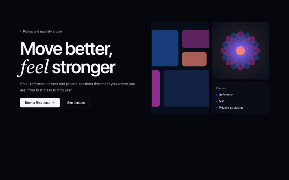
Bento Hero
FreeThe promise beside a three-tile mosaic: a tall photo, a second image and a card of what the business offers.
Heroes block · Server
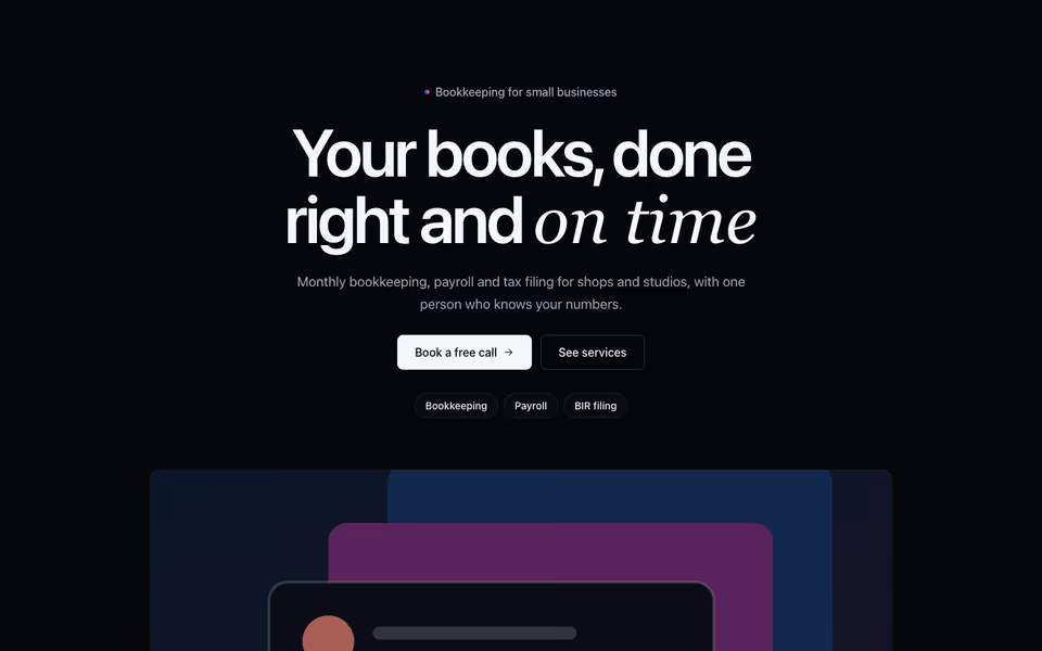
Centered Hero
FreeOne centred promise with its actions and highlights, the image below, on a plain, haloed or gradient panel ground.
Heroes block · Server
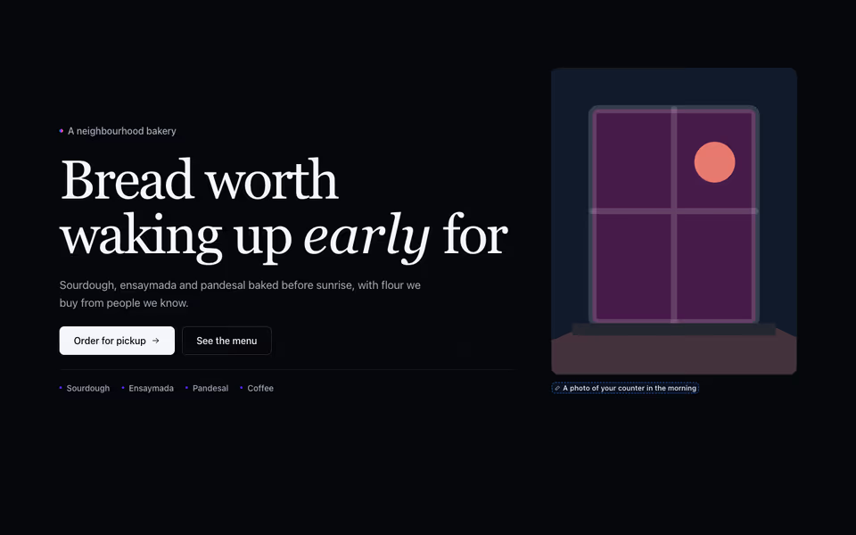
Editorial Hero
FreeA magazine opening: a large serif headline, the intro and actions, tags, and the photo framed tall or set as a band.
Heroes block · Server