FreeIn reviewv1.0.0
Phone Frame
A phone that shows a mobile layout, scrolls through the full page, and tilts toward the cursor.
npx shadcn@latest add @vibebox/phone-frameControls
Scroll
<PhoneFrame />About
The frame for mobile layouts: phone screenshots in case studies, "how it looks on a phone" moments, and app previews. A graphite phone with a dynamic-island notch holds any content. The screen pans through tall content on hover and keyboard focus (scroll="hover"), or drifts on a loop (scroll="auto"), with CSS alone. With tilt, the phone leans up to 8 degrees toward a mouse or pen and a soft glare follows it. Ported from the VibeBox site's work frames, adding real scrolling and the tilt the catalogue asked for.
Use it when
- Showing a mobile layout or a mobile screenshot.
- A desktop frame and a phone appear side by side (pair it with Browser Frame).
Skip it when
- The content is not a phone screen.
- Several phones sit in a row with tilt on all of them; tilt one, or none.
Install
- 1Add the VibeBox registry to
components.json:{ "registries": { "@vibebox": "https://motion.vibeboxph.com/r/{name}.json" } } - 2Add the component with the shadcn CLI:
npx shadcn@latest add @vibebox/phone-frame - 3Use it:
import Image from "next/image";
import { PhoneFrame } from "@/components/vibebox/phone-frame";

<PhoneFrame scroll="hover" tilt label="Northline Dental on a phone" className="w-[300px]">
  <Image src="/work/northline-mobile.webp" alt="Northline Dental mobile home page" width={390} height={4200} />
</PhoneFrame>
Code
2 filescomponents/vibebox/phone-frame/index.tsx
/**
 * VibeBox Motion · Phone Frame
 * Copyright (c) 2026 VibeBox. Licensed under the VibeBox Motion Free License:
 * https://motion.vibeboxph.com/license
 * Use it in unlimited personal, commercial and client projects.
 * Do not sell or redistribute it as a component, kit, template or builder.
 */
import type { CSSProperties, ReactNode } from "react";
import { cn } from "@/lib/utils";
import { PhoneTilt } from "./phone-frame.client";

/* A phone to show mobile layouts. The screen can pan tall content on hover or focus, or drift
   on a loop, with CSS alone (the screen is a size container); touch screens and reduced motion
   get a natively scrollable screen. The body depicts hardware, so its radius and graphite
   finish follow the device, not the UI scale; override them with --vb-pf-body. */

const CSS = `
[data-vb-pf-screen] { container-type: size; }
[data-vb-pf-track] { transform: translate3d(0, 0, 0); }
@media (hover: hover) and (prefers-reduced-motion: no-preference) {
  [data-vb-pf-screen][data-scroll="hover"] [data-vb-pf-track] { transition: transform 1.1s var(--ease-expo-out, cubic-bezier(0.16, 1, 0.3, 1)); }
  [data-vb-pf-screen][data-scroll="hover"]:hover [data-vb-pf-track],
  [data-vb-pf-screen][data-scroll="hover"]:focus-within [data-vb-pf-track] {
    transform: translate3d(0, min(0px, calc(100cqh - 100%)), 0);
    transition: transform var(--vb-pf-duration, 7s) var(--ease-expo-in-out, cubic-bezier(0.65, 0, 0.35, 1));
  }
}
@keyframes vb-pf-pan { 0%, 8% { transform: translate3d(0, 0, 0); } 92%, 100% { transform: translate3d(0, min(0px, calc(100cqh - 100%)), 0); } }
@media (prefers-reduced-motion: no-preference) {
  [data-vb-pf-screen][data-scroll="auto"] [data-vb-pf-track] { animation: vb-pf-pan var(--vb-pf-duration, 16s) var(--ease-expo-in-out, cubic-bezier(0.65, 0, 0.35, 1)) infinite alternate; }
}
@media (hover: none), (prefers-reduced-motion: reduce) {
  [data-vb-pf-screen][data-scroll="hover"], [data-vb-pf-screen][data-scroll="auto"] { overflow-y: auto; overscroll-behavior: contain; }
  [data-vb-pf-screen][data-scroll] [data-vb-pf-track] { transform: none; animation: none; }
}
`;

export type PhoneFrameProps = {
  /** What the screen shows: usually a full-page mobile screenshot. */
  children: ReactNode;
  /** Pan tall content: on hover and keyboard focus, on a slow loop, or not at all. */
  scroll?: "none" | "hover" | "auto";
  /** Seconds for one pan from top to bottom. */
  scrollSeconds?: number;
  /** Tilt toward the pointer (mouse and pen only, off with reduced motion). */
  tilt?: boolean;
  /** Screen aspect ratio. */
  ratio?: string;
  /** Accessible name for the device, e.g. "Northline Dental on a phone". */
  label?: string;
  className?: string;
};

export function PhoneFrame({ children, scroll = "none", scrollSeconds, tilt = false, ratio = "9 / 19.5", label, className }: PhoneFrameProps) {
  const pans = scroll !== "none";
  const device = (
    <figure
      data-vb="phone-frame"
      aria-label={label}
      className={cn(
        "relative m-0 rounded-[30px] p-[7px]",
        "shadow-[inset_0_0_0_1px_rgba(255,255,255,0.08),0_40px_80px_-24px_rgba(0,0,0,0.7)]",
        !tilt && className,
      )}
      style={{ background: "var(--vb-pf-body, linear-gradient(160deg, #2a2f3d, #0d1018 40%, #1b1f2b))" }}
    >
      {pans && (
        <style href="vb-phone-frame" precedence="vb">
          {CSS}
        </style>
      )}
      <div
        data-vb-pf-screen=""
        data-scroll={scroll}
        tabIndex={scroll === "hover" ? 0 : undefined}
        className="relative overflow-hidden rounded-[23px] bg-background focus-visible:outline-2 focus-visible:-outline-offset-2 focus-visible:outline-ring"
        style={{ aspectRatio: ratio, ...(scrollSeconds ? ({ "--vb-pf-duration": `${scrollSeconds}s` } as CSSProperties) : null) }}
      >
        <span aria-hidden="true" className="absolute top-3.5 left-1/2 z-10 h-4 w-[28%] -translate-x-1/2 rounded-full bg-[#05070c]" />
        <div data-vb-pf-track="" className="[&_img]:block [&_img]:h-auto [&_img]:w-full">
          {children}
        </div>
      </div>
    </figure>
  );
  return tilt ? (
    <div className={className}>
      <PhoneTilt>{device}</PhoneTilt>
    </div>
  ) : (
    device
  );
}
components/vibebox/phone-frame/phone-frame.client.tsx
/**
 * VibeBox Motion · Phone Frame
 * Copyright (c) 2026 VibeBox. Licensed under the VibeBox Motion Free License:
 * https://motion.vibeboxph.com/license
 * Use it in unlimited personal, commercial and client projects.
 * Do not sell or redistribute it as a component, kit, template or builder.
 */
"use client";

import { LazyMotion, domAnimation, m, useMotionTemplate, useSpring } from "motion/react";
import { useRef, type PointerEvent, type ReactNode } from "react";
import { useFinePointer, useReducedMotion } from "@/lib/vibebox/hooks";

/* Pointer tilt for the phone: up to 8 degrees toward the cursor, with a glare that follows it.
   Mouse and pen only; touch and reduced motion keep the phone flat. */

const MAX_TILT = 8;
const SPRING = { stiffness: 180, damping: 26, mass: 1 };

export function PhoneTilt({ children }: { children: ReactNode }) {
  const ref = useRef<HTMLDivElement>(null);
  const fine = useFinePointer();
  const reduced = useReducedMotion();
  const enabled = fine && !reduced;
  const rotateX = useSpring(0, SPRING);
  const rotateY = useSpring(0, SPRING);
  const glareX = useSpring(50, SPRING);
  const glareY = useSpring(30, SPRING);
  const glare = useSpring(0, SPRING);
  const glareBackground = useMotionTemplate`radial-gradient(circle at ${glareX}% ${glareY}%, rgba(255, 255, 255, 0.45), transparent 55%)`;

  const onMove = (event: PointerEvent<HTMLDivElement>) => {
    if (!enabled || event.pointerType === "touch" || !ref.current) return;
    const rect = ref.current.getBoundingClientRect();
    const x = (event.clientX - rect.left) / rect.width - 0.5;
    const y = (event.clientY - rect.top) / rect.height - 0.5;
    rotateY.set(x * MAX_TILT * 2);
    rotateX.set(-y * MAX_TILT * 2);
    glareX.set((x + 0.5) * 100);
    glareY.set((y + 0.5) * 100);
    glare.set(1);
  };
  const onLeave = () => {
    rotateX.set(0);
    rotateY.set(0);
    glare.set(0);
  };

  return (
    <LazyMotion features={domAnimation} strict>
      <m.div
        ref={ref}
        data-vb-pf-tilt={enabled ? "on" : "off"}
        onPointerMove={onMove}
        onPointerLeave={onLeave}
        className="relative [transform-style:preserve-3d]"
        style={{ rotateX, rotateY, transformPerspective: 900 }}
      >
        {children}
        <m.span
          aria-hidden="true"
          className="pointer-events-none absolute inset-0 rounded-[30px] mix-blend-soft-light"
          style={{ opacity: glare, background: glareBackground }}
        />
      </m.div>
    </LazyMotion>
  );
}
Props
| Prop | Type | Default | Description |
|---|---|---|---|
| children * | ReactNode | — | What the screen shows, usually a full-page mobile screenshot. |
| scroll | "none" | "hover" | "auto" | "none" | Pan tall content on hover and focus, on a slow loop, or not at all. |
| scrollSeconds | number | — | Seconds for one pan (7 on hover, 16 on a loop). |
| tilt | boolean | false | Lean toward the pointer (mouse and pen only, off with reduced motion). |
| ratio | string | "9 / 19.5" | Screen aspect ratio. |
| label | string | — | Accessible name for the device. |
| className | string | — | Merged with cn(); set the width with it. |
Accessibility and motion
- Keyboard
- With scroll="hover" the screen takes focus (Tab) and pans while focused.
- Screen readers
- A figure named by
label; give the screenshot its own alt text. - Touch
- Touch screens swipe-scroll the screen; tilt is mouse and pen only.
- Reduced motion
- A flat phone at the top of the page; the screen scrolls natively.
Edge cases and limits
- Content shorter than the screen never pans.
- The tilt wrapper takes
className, so layout classes still apply whentiltis on. - Browsers without container query units show the top of the page only.
Related
Browser Frame
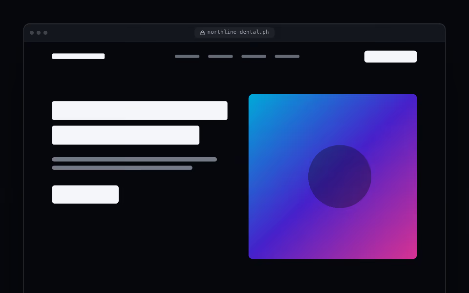
FreeA browser window that frames a site and pans through the full page on hover, on focus, or on a slow loop.
Devices · Server