About
A header that floats over the hero. On phones only the wordmark and the call to action show; pair it with your menu.
Use it when
- Marketing sites with a hero image, video or 3D background.
Skip it when
- Dense apps with many nav items.
Install
- 1Add the VibeBox registry to
components.json:{ "registries": { "@vibebox": "https://motion.vibeboxph.com/r/{name}.json" } } - 2Add the component with the shadcn CLI:
npx shadcn@latest add @vibebox/glass-nav
AI prompt
Everything an AI coding tool needs to rebuild this component the way it looks here: colours, fonts, the art it draws, props and rules.
Read the prompt
Build the VibeBox Motion component "Glass Nav" (Liquid glass) in a Next.js App Router project with Tailwind CSS v4.

What it is
- A floating pill header on glass with a highlight that glides between links.
- A site header as a glass pill: wordmark, links and a call to action; a highlight glides to the link under the pointer or focus and rests on the current page.

Install
- `npx shadcn@latest add @vibebox/glass-nav`
- Registry: add `"@vibebox": "https://motion.vibeboxph.com/r/{name}.json"` to components.json, then run the command. The source lands in `components/vibebox/glass-nav` and is yours to edit.

Visual spec
- Colours (the VibeBox spectrum, the same in light and dark):
    - --spectrum-1: #00c5fc (cyan)
    - --spectrum-2: #1d6ef0 (blue)
    - --spectrum-3: #5225ed (indigo)
    - --spectrum-4: #e434dc (magenta)
    - --spectrum-5: #fd3aa9 (pink)
    - --spectrum-6: #f98472 (coral)
    - --spectrum-7: #fcbe72 (amber)
- Ink surface (dark): background #05070c, card #0a0d15, text #f5f6fa, muted text #a3abbd, border rgba(255,255,255,0.08).
- Paper surface (light): background #f3f0ea, card #fbfaf7, text #0c0e14, muted text #4a4f5c, border rgba(12,14,20,0.12).
- Fonts:
    - Display and body: Figtree (400, 500, 600, 700), falling back to ui-sans-serif, system-ui.
    - Emphasis: Fraunces italic, for one or two words of a heading.
    - Labels and code: JetBrains Mono (400, 500), uppercase labels with 0.14em tracking.
- Shape: radius 8 to 12px on cards and panels; pills may be fully round. Hairline borders, soft glow instead of heavy shadow.
- Motion: animate transform and opacity only; fast ease-out (cubic-bezier(0.16, 1, 0.3, 1)), 140ms for micro-interactions, 320 to 520ms for reveals.

Art and media
- Built from HTML, CSS and inline SVG only; no image files or video.

Props
- `brand`: `string` (default "Atelier"). The wordmark.
- `links`: `{ label: string; href: string }[]`. Navigation links.
- `cta`: `{ label: string; href: string }`. The call to action.
- `current`: `string`. The current page's href.
- `tone`: `"auto" | "dark" | "light"` (default "auto"). Tints the glass and sets the text colour for the page behind it.
- `className`: `string`. Merged with cn(); sets the width and margins.

Behaviour and access
- Reduced motion: The pointer sheen and sliding are off; state changes are instant.
- Keyboard: Links are native; the highlight follows focus.
- Screen readers: A header with a nav landmark named Main; the current link has aria-current.
- Touch: Links hide under 640 px; the call to action stays (pair with the mobile menu).
- Budget: about 3 KB of JavaScript, WebGL none, GPU low. It pauses while off screen.

Theming
The surface reads `--g-tint`, `--g-edge`, `--g-ink`, `--g-blur` and `--g-radius` from its root; the demo backdrop uses `--spectrum-*`.

Notes
Add the VibeBox Motion Glass Nav with `npx shadcn@latest add @vibebox/glass-nav`. Make it the page header, position it sticky or fixed near the top, pass `brand`, `links`, a `cta` and `current`, and add a menu button for phones. Keep the gliding highlight and the reduced-motion fallback.

Rules
- Keep the licence header on every installed file.
- Original code only: do not copy components from other libraries, and do not add GSAP.
- Use tokens for colour, type and radius; no hard-coded brand values.
- Server Components by default; `"use client"` only for the island.
Code
2 filescomponents/vibebox/glass-nav/glass-nav.client.tsx
/**
 * VibeBox Motion · Glass Nav
 * Copyright (c) 2026 VibeBox. Licensed under the VibeBox Motion Free License:
 * https://motion.vibeboxph.com/license
 * Use it in unlimited personal, commercial and client projects.
 * Do not sell or redistribute it as a component, kit, template or builder.
 */
"use client";

import { useRef, useState } from "react";
import { cn } from "@/lib/utils";
import { Glass } from "@/lib/vibebox/glass";

export type GlassNavProps = {
  /** The wordmark or logo on the left. */
  brand?: string;
  links?: { label: string; href: string }[];
  /** The call to action on the right. */
  cta?: { label: string; href: string };
  /** The current page's href, marked with aria-current. */
  current?: string;
  tone?: "auto" | "dark" | "light";
  className?: string;
};

const LINKS = [
  { label: "Work", href: "#work" },
  { label: "Studio", href: "#studio" },
  { label: "Journal", href: "#journal" },
  { label: "Contact", href: "#contact" },
];

/**
 * A floating site header on glass, as a pill. A highlight glides to the link under the pointer or
 * keyboard focus (one `translateX` and `scaleX`), and rests on the current page.
 */
export function GlassNav({ brand = "Atelier", links = LINKS, cta = { label: "Book a call", href: "#contact" }, current, tone, className }: GlassNavProps) {
  const list = useRef<HTMLUListElement>(null);
  const [pill, setPill] = useState<{ x: number; w: number } | null>(null);

  const move = (target: HTMLElement | null) => {
    const root = list.current;
    if (!root || !target) return setPill(null);
    const a = root.getBoundingClientRect();
    const b = target.getBoundingClientRect();
    setPill({ x: b.left - a.left, w: b.width });
  };

  return (
    <Glass as="header" data-vb="glass-nav" tone={tone} radius={999} still className={cn("flex w-full max-w-[40rem] items-center gap-2 py-1.5 pr-1.5 pl-5", className)}>
      <a href="#top" className="mr-2 text-[0.98rem] font-semibold tracking-tight focus-visible:outline-2 focus-visible:outline-offset-2 focus-visible:outline-ring">
        {brand}
      </a>
      <nav aria-label="Main" className="ml-auto hidden sm:block">
        <ul ref={list} className="relative flex items-center" onPointerLeave={() => move(null)} onBlur={() => move(null)}>
          <span
            aria-hidden="true"
            className={cn(
              "pointer-events-none absolute top-0 left-0 h-full rounded-full border border-white/25 bg-white/20 transition-[transform,opacity] duration-300 ease-[cubic-bezier(0.34,1.3,0.5,1)] motion-reduce:transition-none",
              pill ? "opacity-100" : "opacity-0",
            )}
            style={{ width: pill?.w ?? 0, transform: `translateX(${pill?.x ?? 0}px)` }}
          />
          {links.map((link) => (
            <li key={link.href}>
              <a
                href={link.href}
                aria-current={current === link.href ? "page" : undefined}
                onPointerEnter={(event) => move(event.currentTarget)}
                onFocus={(event) => move(event.currentTarget)}
                className="relative block rounded-full px-3.5 py-2 text-[0.86rem] font-medium opacity-80 transition-opacity hover:opacity-100 focus-visible:opacity-100 focus-visible:outline-2 focus-visible:outline-ring aria-[current=page]:opacity-100"
              >
                {link.label}
              </a>
            </li>
          ))}
        </ul>
      </nav>
      <a
        href={cta.href}
        className="ml-auto inline-flex h-9 items-center rounded-full bg-white px-4 text-[0.84rem] font-semibold text-[#101521] transition-transform hover:scale-[1.03] focus-visible:outline-2 focus-visible:outline-offset-2 focus-visible:outline-ring sm:ml-1"
      >
        {cta.label}
      </a>
    </Glass>
  );
}
components/vibebox/glass-nav/index.tsx
/**
 * VibeBox Motion · Glass Nav
 * Copyright (c) 2026 VibeBox. Licensed under the VibeBox Motion Free License:
 * https://motion.vibeboxph.com/license
 * Use it in unlimited personal, commercial and client projects.
 * Do not sell or redistribute it as a component, kit, template or builder.
 */
export * from "./glass-nav.client";
Props
| Prop | Type | Default | Description |
|---|---|---|---|
| brand | string | "Atelier" | The wordmark. |
| links | { label: string; href: string }[] | Navigation links. | |
| cta | { label: string; href: string } | The call to action. | |
| current | string | The current page's href. | |
| tone | "auto" | "dark" | "light" | "auto" | Tints the glass and sets the text colour for the page behind it. |
| className | string | — | Merged with cn(); sets the width and margins. |
Accessibility and motion
- Keyboard
- Links are native; the highlight follows focus.
- Screen readers
- A header with a nav landmark named Main; the current link has aria-current.
- Touch
- Links hide under 640 px; the call to action stays (pair with the mobile menu).
- Reduced motion
- The pointer sheen and sliding are off; state changes are instant.
Related
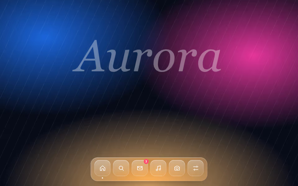
Glass Dock
FreeA floating dock of glass icons that swell toward the pointer, with labels and badges.
Liquid glass · CSS
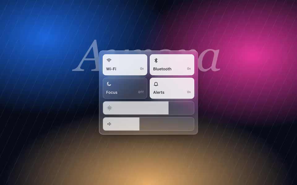
Glass Controls
FreeA control-centre panel: glass toggle tiles and sliders that are real range inputs.
Liquid glass · CSS
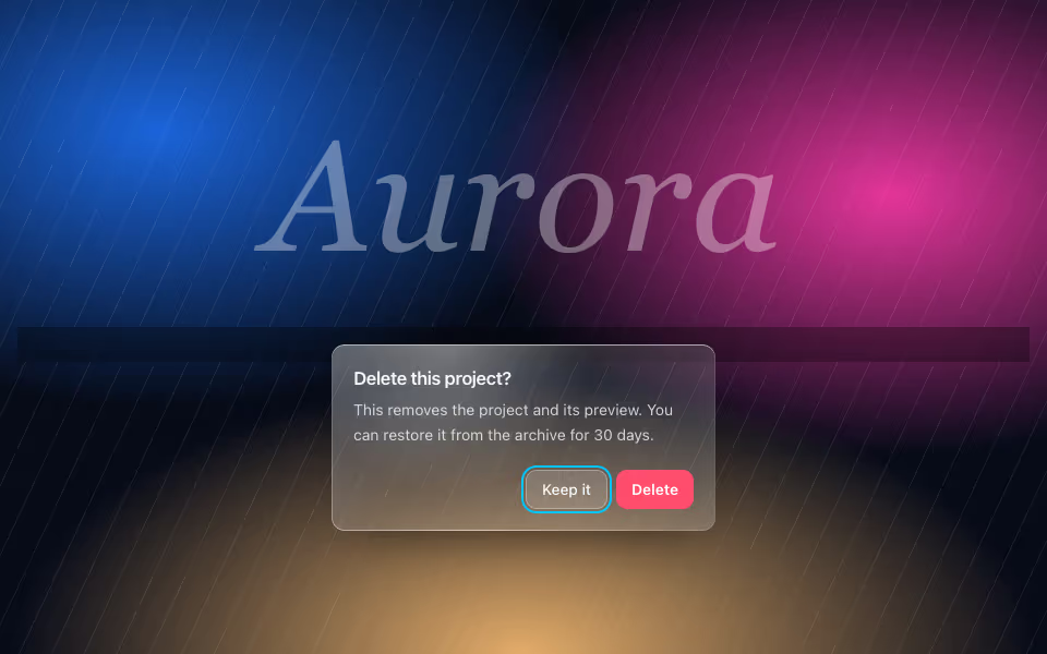
Glass Dialog
FreeA confirmation dialog on glass over a dimmed scrim, with focus kept inside and Escape to cancel.
Liquid glass · CSS