About
Notices that look like they belong to a device. Good for product tours, device mock-ups and onboarding.
Use it when
- Showing what a product's alerts feel like.
Skip it when
- Real alerting: use the Toast Stack, which has a live region.
Install
- 1Add the VibeBox registry to
components.json:{ "registries": { "@vibebox": "https://motion.vibeboxph.com/r/{name}.json" } } - 2Add the component with the shadcn CLI:
npx shadcn@latest add @vibebox/glass-notifications
AI prompt
Everything an AI coding tool needs to rebuild this component the way it looks here: colours, fonts, the art it draws, props and rules.
Read the prompt
Build the VibeBox Motion component "Glass Notifications" (Liquid glass) in a Next.js App Router project with Tailwind CSS v4.

What it is
- A lock-screen notification stack on glass that fans out into a list and dismisses one by one.
- Notices on glass: the newest in front with two layers peeking behind, a tap fans them into a list, each card can be dismissed. Transform and opacity only.

Install
- `npx shadcn@latest add @vibebox/glass-notifications`
- Registry: add `"@vibebox": "https://motion.vibeboxph.com/r/{name}.json"` to components.json, then run the command. The source lands in `components/vibebox/glass-notifications` and is yours to edit.

Visual spec
- Colours (the VibeBox spectrum, the same in light and dark):
    - --spectrum-1: #00c5fc (cyan)
    - --spectrum-2: #1d6ef0 (blue)
    - --spectrum-3: #5225ed (indigo)
    - --spectrum-4: #e434dc (magenta)
    - --spectrum-5: #fd3aa9 (pink)
    - --spectrum-6: #f98472 (coral)
    - --spectrum-7: #fcbe72 (amber)
- Ink surface (dark): background #05070c, card #0a0d15, text #f5f6fa, muted text #a3abbd, border rgba(255,255,255,0.08).
- Paper surface (light): background #f3f0ea, card #fbfaf7, text #0c0e14, muted text #4a4f5c, border rgba(12,14,20,0.12).
- Fonts:
    - Display and body: Figtree (400, 500, 600, 700), falling back to ui-sans-serif, system-ui.
    - Emphasis: Fraunces italic, for one or two words of a heading.
    - Labels and code: JetBrains Mono (400, 500), uppercase labels with 0.14em tracking.
- Shape: radius 8 to 12px on cards and panels; pills may be fully round. Hairline borders, soft glow instead of heavy shadow.
- Motion: animate transform and opacity only; fast ease-out (cubic-bezier(0.16, 1, 0.3, 1)), 140ms for micro-interactions, 320 to 520ms for reveals.

Art and media
- Built from HTML, CSS and inline SVG only; no image files or video.

Props
- `notices`: `{ id: string; app: string; title: string; body?: string; time?: string; glyph?: GlassGlyph }[]`. The notices, newest first.
- `expanded`: `boolean` (default false). Start fanned out.
- `tone`: `"auto" | "dark" | "light"` (default "auto"). Tints the glass and sets the text colour for the page behind it.
- `className`: `string`. Merged with cn(); sets the width and margins.

Behaviour and access
- Reduced motion: The pointer sheen and sliding are off; state changes are instant.
- Keyboard: Show all and each dismiss button are native buttons.
- Screen readers: A labelled section with a list; dismiss buttons name their notice.
- Touch: Dismiss targets are 28 px with padding; the stack toggle is a button.
- Budget: about 3 KB of JavaScript, WebGL none, GPU low. It pauses while off screen.

Theming
The surface reads `--g-tint`, `--g-edge`, `--g-ink`, `--g-blur` and `--g-radius` from its root; the demo backdrop uses `--spectrum-*`.

Notes
Add the VibeBox Motion Glass Notifications with `npx shadcn@latest add @vibebox/glass-notifications`. Pass `notices` newest first with an app name, title, optional body, time and a glyph; keep the stacked peek and the fan-out, and keep dismissal as real buttons.

Rules
- Keep the licence header on every installed file.
- Original code only: do not copy components from other libraries, and do not add GSAP.
- Use tokens for colour, type and radius; no hard-coded brand values.
- Server Components by default; `"use client"` only for the island.
Code
2 filescomponents/vibebox/glass-notifications/glass-notifications.client.tsx
/**
 * VibeBox Motion · Glass Notifications
 * Copyright (c) 2026 VibeBox. Licensed under the VibeBox Motion Free License:
 * https://motion.vibeboxph.com/license
 * Use it in unlimited personal, commercial and client projects.
 * Do not sell or redistribute it as a component, kit, template or builder.
 */
"use client";

import { useState } from "react";
import { cn } from "@/lib/utils";
import { Glass, GlassGlyphIcon, type GlassGlyph } from "@/lib/vibebox/glass";

export type GlassNotice = { id: string; app: string; title: string; body?: string; time?: string; glyph?: GlassGlyph };

export type GlassNotificationsProps = {
  notices?: GlassNotice[];
  /** Start expanded instead of as a stack. */
  expanded?: boolean;
  tone?: "auto" | "dark" | "light";
  className?: string;
};

const NOTICES: GlassNotice[] = [
  { id: "1", app: "Calendar", title: "Design review at 3:00", body: "Room 4, with the brand team.", time: "now", glyph: "calendar" },
  { id: "2", app: "Messages", title: "Ana sent you a photo", body: "The prototype looks great on a phone.", time: "2m", glyph: "chat" },
  { id: "3", app: "Mail", title: "Invoice 0142 paid", body: "A deposit arrived this morning.", time: "1h", glyph: "mail" },
  { id: "4", app: "Music", title: "New release from Luna Park", time: "3h", glyph: "music" },
];

/**
 * A lock-screen notification stack: the newest card in front with two layers peeking behind it;
 * a tap fans them out into a list, and each can be dismissed. Transforms and opacity only.
 */
export function GlassNotifications({ notices = NOTICES, expanded: startOpen = false, tone, className }: GlassNotificationsProps) {
  const [list, setList] = useState(notices);
  const [open, setOpen] = useState(startOpen);
  const dismiss = (id: string) => setList((value) => value.filter((notice) => notice.id !== id));
  const stacked = !open && list.length > 1;

  return (
    <section data-vb="glass-notifications" aria-label="Notifications" className={cn("w-full max-w-[22rem] min-w-0", className)}>
      <div className="mb-2 flex items-center justify-between px-1 text-[0.8rem] text-current">
        <span className="font-medium opacity-90">Notifications</span>
        {list.length > 1 && (
          <button type="button" onClick={() => setOpen((value) => !value)} aria-expanded={open} className="rounded-md px-1.5 py-0.5 opacity-75 transition-opacity hover:opacity-100 focus-visible:outline-2 focus-visible:outline-ring">
            {open ? "Show less" : `Show all ${list.length}`}
          </button>
        )}
      </div>
      <ul className={cn("min-w-0", stacked ? "relative grid pb-3" : "flex flex-col gap-1.5")}>
        {list.map((notice, index) => {
          const peek = stacked ? index : 0;
          if (stacked && index > 2) return null;
          return (
            <li
              key={notice.id}
              className={cn("min-w-0", stacked && "col-start-1 row-start-1 transition-[transform,opacity] duration-500 ease-out motion-reduce:transition-none")}
              style={stacked ? { transform: `translateY(${peek * 10}px) scale(${1 - peek * 0.045})`, opacity: 1 - peek * 0.28, zIndex: 10 - peek } : undefined}
            >
              <Glass tone={tone} still aria-hidden={stacked && peek > 0 ? true : undefined} className={cn("flex min-w-0 items-start gap-2.5 p-2.5", stacked && peek > 0 && "[&>*]:invisible")}>
                <span className="grid size-7 flex-none place-items-center rounded-md border border-white/25 bg-white/15">
                  <GlassGlyphIcon name={notice.glyph ?? "bell"} className="size-[0.95rem]" />
                </span>
                <div className="min-w-0 flex-1">
                  <p className="flex items-center justify-between gap-2 font-mono text-[0.58rem] tracking-wide uppercase opacity-65">
                    <span>{notice.app}</span>
                    <span>{notice.time}</span>
                  </p>
                  <p className="mt-0.5 line-clamp-2 text-[0.8rem] leading-tight font-semibold">{notice.title}</p>
                  {notice.body && <p className="mt-0.5 line-clamp-2 text-[0.72rem] leading-snug opacity-75">{notice.body}</p>}
                </div>
                <button
                  type="button"
                  aria-label={`Dismiss ${notice.title}`}
                  onClick={() => dismiss(notice.id)}
                  className="-mt-0.5 -mr-0.5 grid size-6 flex-none place-items-center rounded-full opacity-60 transition hover:bg-white/15 hover:opacity-100 focus-visible:outline-2 focus-visible:outline-ring"
                >
                  <svg viewBox="0 0 16 16" aria-hidden="true" className="size-3" fill="none" stroke="currentColor" strokeWidth="1.8" strokeLinecap="round">
                    <path d="m4 4 8 8M12 4l-8 8" />
                  </svg>
                </button>
              </Glass>
            </li>
          );
        })}
      </ul>
      {list.length === 0 && <p className="px-1 py-6 text-center text-[0.85rem] opacity-70">You are all caught up.</p>}
    </section>
  );
}
components/vibebox/glass-notifications/index.tsx
/**
 * VibeBox Motion · Glass Notifications
 * Copyright (c) 2026 VibeBox. Licensed under the VibeBox Motion Free License:
 * https://motion.vibeboxph.com/license
 * Use it in unlimited personal, commercial and client projects.
 * Do not sell or redistribute it as a component, kit, template or builder.
 */
export * from "./glass-notifications.client";
Props
| Prop | Type | Default | Description |
|---|---|---|---|
| notices | { id: string; app: string; title: string; body?: string; time?: string; glyph?: GlassGlyph }[] | The notices, newest first. | |
| expanded | boolean | false | Start fanned out. |
| tone | "auto" | "dark" | "light" | "auto" | Tints the glass and sets the text colour for the page behind it. |
| className | string | — | Merged with cn(); sets the width and margins. |
Accessibility and motion
- Keyboard
- Show all and each dismiss button are native buttons.
- Screen readers
- A labelled section with a list; dismiss buttons name their notice.
- Touch
- Dismiss targets are 28 px with padding; the stack toggle is a button.
- Reduced motion
- The pointer sheen and sliding are off; state changes are instant.
Related
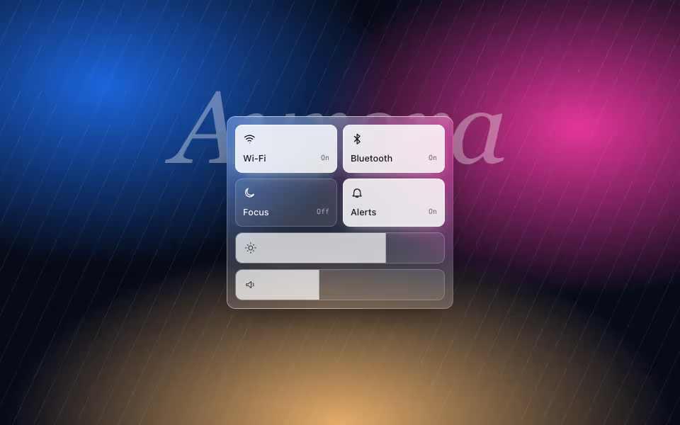
Glass Controls
FreeA control-centre panel: glass toggle tiles and sliders that are real range inputs.
Liquid glass · CSS
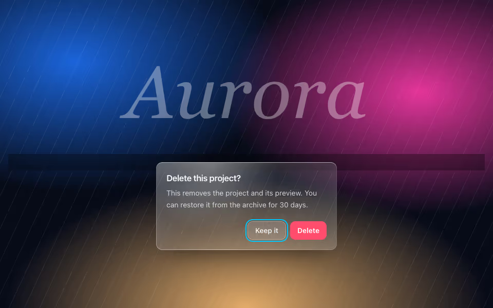
Glass Dialog
FreeA confirmation dialog on glass over a dimmed scrim, with focus kept inside and Escape to cancel.
Liquid glass · CSS
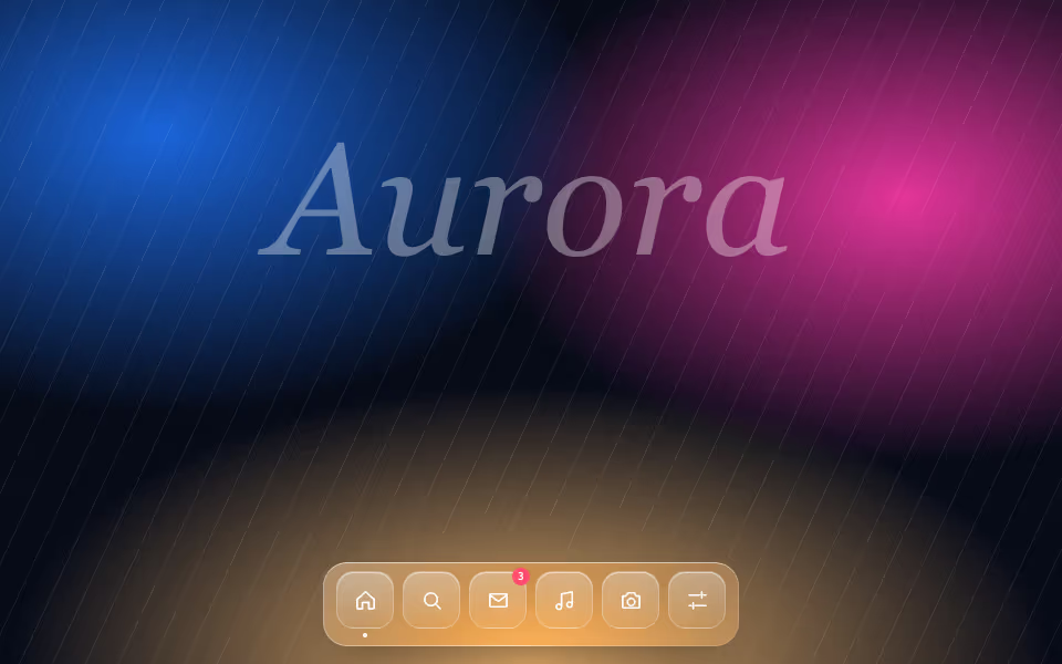
Glass Dock
FreeA floating dock of glass icons that swell toward the pointer, with labels and badges.
Liquid glass · CSS