About
The base of the liquid glass family: one surface that every other glass piece sits on. It layers a backdrop blur, a chromatic edge, an inner highlight, a conic specular rim and a sheen that follows the pointer.
Use it when
- Cards, panels and sheets over imagery, video or 3D backgrounds.
- A hero where text must sit on a busy picture.
Skip it when
- Over a flat colour: glass needs something behind it to bend.
- Dozens at once; keep a view to about six.
Install
- 1Add the VibeBox registry to
components.json:{ "registries": { "@vibebox": "https://motion.vibeboxph.com/r/{name}.json" } } - 2Add the component with the shadcn CLI:
npx shadcn@latest add @vibebox/glass-panel
AI prompt
Everything an AI coding tool needs to rebuild this component the way it looks here: colours, fonts, the art it draws, props and rules.
Read the prompt
Build the VibeBox Motion component "Glass Panel" (Liquid glass) in a Next.js App Router project with Tailwind CSS v4.

What it is
- The base liquid glass surface: blurred, rimmed and sheened, as a titled card.
- A card on liquid glass: a blurred and saturated body, a chromatic edge, a conic specular rim and a pointer-following sheen.

Install
- `npx shadcn@latest add @vibebox/glass-panel`
- Registry: add `"@vibebox": "https://motion.vibeboxph.com/r/{name}.json"` to components.json, then run the command. The source lands in `components/vibebox/glass-panel` and is yours to edit.

Visual spec
- Colours (the VibeBox spectrum, the same in light and dark):
    - --spectrum-1: #00c5fc (cyan)
    - --spectrum-2: #1d6ef0 (blue)
    - --spectrum-3: #5225ed (indigo)
    - --spectrum-4: #e434dc (magenta)
    - --spectrum-5: #fd3aa9 (pink)
    - --spectrum-6: #f98472 (coral)
    - --spectrum-7: #fcbe72 (amber)
- Ink surface (dark): background #05070c, card #0a0d15, text #f5f6fa, muted text #a3abbd, border rgba(255,255,255,0.08).
- Paper surface (light): background #f3f0ea, card #fbfaf7, text #0c0e14, muted text #4a4f5c, border rgba(12,14,20,0.12).
- Fonts:
    - Display and body: Figtree (400, 500, 600, 700), falling back to ui-sans-serif, system-ui.
    - Emphasis: Fraunces italic, for one or two words of a heading.
    - Labels and code: JetBrains Mono (400, 500), uppercase labels with 0.14em tracking.
- Shape: radius 8 to 12px on cards and panels; pills may be fully round. Hairline borders, soft glow instead of heavy shadow.
- Motion: animate transform and opacity only; fast ease-out (cubic-bezier(0.16, 1, 0.3, 1)), 140ms for micro-interactions, 320 to 520ms for reveals.

Art and media
- Built from HTML, CSS and inline SVG only; no image files or video.

Props
- `eyebrow`: `string`. A small mono label above the title.
- `title`: `string`. The panel's heading.
- `children`: `ReactNode`. The panel's body.
- `footer`: `ReactNode`. A row of actions at the foot.
- `tone`: `"auto" | "dark" | "light"` (default "auto"). Tints the glass and sets the text colour for the page behind it.
- `blur`: `number` (default 16). Backdrop blur in pixels.
- `radius`: `number` (default 12). Corner radius in pixels.
- `still`: `boolean` (default false). Turn off the pointer sheen and rim.
- `className`: `string`. Merged with cn(); sets the width and margins.

Behaviour and access
- Reduced motion: The pointer sheen and sliding are off; state changes are instant.
- Keyboard: Not interactive itself; actions inside it are native buttons and links.
- Screen readers: A section element; the eyebrow and title are plain text.
- Touch: No hover-only content; the sheen is decoration.
- Budget: about 3 KB of JavaScript, WebGL none, GPU low. It pauses while off screen.

Theming
The surface reads `--g-tint`, `--g-edge`, `--g-ink`, `--g-blur` and `--g-radius` from its root; the demo backdrop uses `--spectrum-*`.

Notes
Add the VibeBox Motion Glass Panel with `npx shadcn@latest add @vibebox/glass-panel`. Use it as a card over a photo or a 3D background: set `tone` to `dark` over bright art and `light` over dark art, keep `radius` at 12 or less, and give it an `eyebrow`, `title` and body copy. Keep the SVG refraction filter, the conic rim and the reduced-motion fallback, and do not stack more than six glass surfaces in one view.

Rules
- Keep the licence header on every installed file.
- Original code only: do not copy components from other libraries, and do not add GSAP.
- Use tokens for colour, type and radius; no hard-coded brand values.
- Server Components by default; `"use client"` only for the island.
Code
2 filescomponents/vibebox/glass-panel/glass-panel.client.tsx
/**
 * VibeBox Motion · Glass Panel
 * Copyright (c) 2026 VibeBox. Licensed under the VibeBox Motion Free License:
 * https://motion.vibeboxph.com/license
 * Use it in unlimited personal, commercial and client projects.
 * Do not sell or redistribute it as a component, kit, template or builder.
 */
"use client";

import type { ReactNode } from "react";
import { cn } from "@/lib/utils";
import { Glass, type GlassProps } from "@/lib/vibebox/glass";

export type GlassPanelProps = {
  /** A small label above the title. */
  eyebrow?: string;
  /** The panel's heading. */
  title?: string;
  /** What sits in the panel. */
  children?: ReactNode;
  /** A row at the foot, usually actions. */
  footer?: ReactNode;
  className?: string;
} & Pick<GlassProps, "tone" | "blur" | "radius" | "still">;

/** The base liquid glass surface as a card: blurred, with a specular rim and a pointer sheen. */
export function GlassPanel({ eyebrow, title, children, footer, tone, blur, radius, still, className }: GlassPanelProps) {
  return (
    <Glass as="section" data-vb="glass-panel" tone={tone} blur={blur} radius={radius} still={still} className={cn("p-5", className)}>
      {eyebrow && <p className="font-mono text-[0.68rem] tracking-[0.14em] uppercase opacity-70">{eyebrow}</p>}
      {title && <h3 className="mt-1.5 text-[1.15rem] leading-snug font-semibold tracking-tight">{title}</h3>}
      {children && <div className="mt-2 text-[0.92rem] leading-relaxed opacity-85">{children}</div>}
      {footer && <div className="mt-4 flex flex-wrap items-center gap-2">{footer}</div>}
    </Glass>
  );
}
components/vibebox/glass-panel/index.tsx
/**
 * VibeBox Motion · Glass Panel
 * Copyright (c) 2026 VibeBox. Licensed under the VibeBox Motion Free License:
 * https://motion.vibeboxph.com/license
 * Use it in unlimited personal, commercial and client projects.
 * Do not sell or redistribute it as a component, kit, template or builder.
 */
export * from "./glass-panel.client";
Props
| Prop | Type | Default | Description |
|---|---|---|---|
| eyebrow | string | A small mono label above the title. | |
| title | string | The panel's heading. | |
| children | ReactNode | The panel's body. | |
| footer | ReactNode | A row of actions at the foot. | |
| tone | "auto" | "dark" | "light" | "auto" | Tints the glass and sets the text colour for the page behind it. |
| blur | number | 16 | Backdrop blur in pixels. |
| radius | number | 12 | Corner radius in pixels. |
| still | boolean | false | Turn off the pointer sheen and rim. |
| className | string | — | Merged with cn(); sets the width and margins. |
Accessibility and motion
- Keyboard
- Not interactive itself; actions inside it are native buttons and links.
- Screen readers
- A section element; the eyebrow and title are plain text.
- Touch
- No hover-only content; the sheen is decoration.
- Reduced motion
- The pointer sheen and sliding are off; state changes are instant.
Related
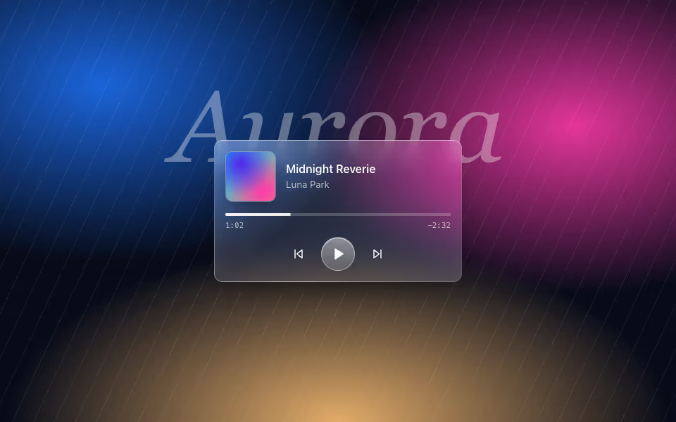
Glass Player
FreeA now-playing card on glass with art, a progress bar and play, back and forward controls.
Liquid glass · CSS
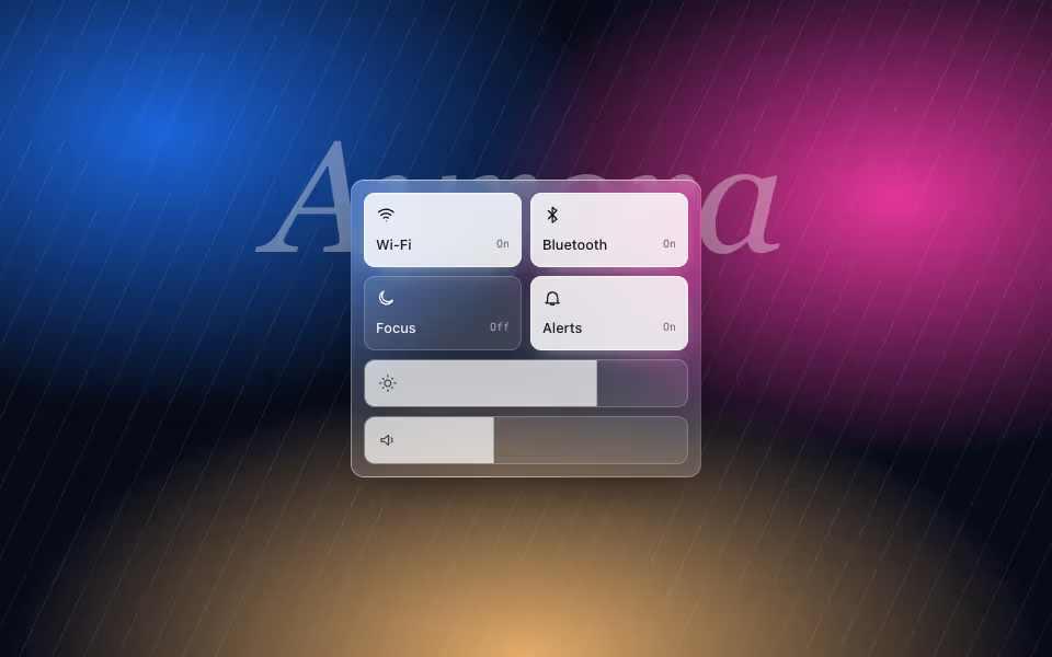
Glass Controls
FreeA control-centre panel: glass toggle tiles and sliders that are real range inputs.
Liquid glass · CSS
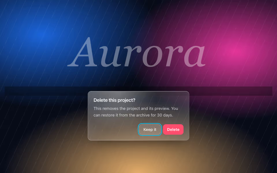
Glass Dialog
FreeA confirmation dialog on glass over a dimmed scrim, with focus kept inside and Escape to cancel.
Liquid glass · CSS