Build Story
A process told by scrolling: steps pin beside an artboard of a website that builds itself, phase by phase.
npx shadcn@latest add @vibebox/build-storyControls
<BuildStory />About
"How it works" sections usually stack numbered cards. Build Story tells the process instead. On wide screens the section pins while the visitor scrolls; a step list with a spectrum rail fills step by step, and an artboard beside it shows a website moving from brief to plan, wireframe, build, review and launch. Clicking a step scrolls to it. On phones, where pinning is tiring, it becomes a stepper. Ported from the VibeBox home page; the steps are now props and the artboard is new. VibeBox's version drew its own plan, quote and photos; the library's is drawn in CSS with skeleton lines, so it suits any project. Pass your own art per step for anything else.
Use it when
- A process has three to eight steps worth explaining.
- The page has room for a tall pinned section.
Skip it when
- The steps are trivial; a short list reads faster.
- The page is already long with another pinned section.
Install
- 1Add the VibeBox registry to
components.json:{ "registries": { "@vibebox": "https://motion.vibeboxph.com/r/{name}.json" } } - 2Add the component with the shadcn CLI:
npx shadcn@latest add @vibebox/build-story - 3Use it:
import { BuildStory } from "@/components/vibebox/build-story";

<BuildStory steps={steps} url="northline-dental.ph" caption="Demo site for illustration." />
Code
3 filescomponents/vibebox/build-story/build-story.client.tsx
/**
 * VibeBox Motion · Build Story
 * Copyright (c) 2026 VibeBox. Licensed under the VibeBox Motion Free License:
 * https://motion.vibeboxph.com/license
 * Use it in unlimited personal, commercial and client projects.
 * Do not sell or redistribute it as a component, kit, template or builder.
 */
"use client";

import { AnimatePresence, LazyMotion, MotionConfig, domAnimation, m, useMotionValueEvent, useScroll, useTransform } from "motion/react";
import { useRef, useState, type ReactNode } from "react";
import { cn } from "@/lib/utils";
import { useMediaQuery, useReducedMotion } from "@/lib/vibebox/hooks";
import { ease } from "@/lib/vibebox/tokens/motion";
import { SiteArtboard, phaseFor } from "./site-artboard";

/* A process told by scrolling. On wide screens the section pins: the step list (with a spectrum
   rail that fills as you go) sits beside an artboard that changes with the active step, and a
   click on a step scrolls to it. On phones it becomes a stepper: step chips, the artboard, the
   step's text, and previous and next buttons. */

export type BuildStep = {
  /** Short number or code shown beside the title, e.g. "01". */
  index: string;
  title: string;
  /** A shorter title for the phone chips. */
  short?: string;
  description: string;
  /** What the step produces, shown as a short list. */
  outputs?: readonly string[];
};

export type BuildStoryProps = {
  steps: readonly BuildStep[];
  /** Draws the art for the active step; defaults to the built-in site artboard. */
  renderArt?: (stage: number) => ReactNode;
  /** Address for the default artboard. */
  url?: string;
  /** Small note under the art, e.g. that the site is a demo. */
  caption?: string;
  /** Scroll distance per step in the pinned layout, in viewport heights. */
  stepHeight?: number;
  /** When the pinned layout applies. */
  pinnedQuery?: string;
  className?: string;
};

export function BuildStory({
  steps,
  renderArt,
  url,
  caption,
  stepHeight = 78,
  pinnedQuery = "(min-width: 1040px)",
  className,
}: BuildStoryProps) {
  const pinned = useMediaQuery(pinnedQuery);
  const art = (stage: number) => renderArt?.(stage) ?? <SiteArtboard phase={phaseFor(stage, steps.length)} url={url} />;
  return (
    <LazyMotion features={domAnimation} strict>
      <MotionConfig reducedMotion="user">
        <div data-vb="build-story" data-layout={pinned ? "pinned" : "stepped"} className={className}>
          {pinned ? (
            <Pinned steps={steps} art={art} caption={caption} stepHeight={stepHeight} />
          ) : (
            <Stepped steps={steps} art={art} caption={caption} />
          )}
        </div>
      </MotionConfig>
    </LazyMotion>
  );
}

type LayoutProps = { steps: readonly BuildStep[]; art: (stage: number) => ReactNode; caption?: string };

function Pinned({ steps, art, caption, stepHeight }: LayoutProps & { stepHeight: number }) {
  const trackRef = useRef<HTMLDivElement>(null);
  const reduced = useReducedMotion();
  const [active, setActive] = useState(0);
  const { scrollYProgress } = useScroll({ target: trackRef, offset: ["start start", "end end"] });
  const railScale = useTransform(scrollYProgress, [0, 1], [0.04, 1]);
  useMotionValueEvent(scrollYProgress, "change", (value) => {
    const next = Math.min(steps.length - 1, Math.max(0, Math.floor(value * steps.length)));
    setActive((current) => (current === next ? current : next));
  });
  const jumpTo = (index: number) => {
    const track = trackRef.current;
    if (!track) return;
    const top = track.getBoundingClientRect().top + window.scrollY;
    const distance = track.offsetHeight - window.innerHeight;
    window.scrollTo({ top: top + ((index + 0.5) / steps.length) * distance, behavior: reduced ? "auto" : "smooth" });
  };
  return (
    <div ref={trackRef} className="relative" style={{ height: `${steps.length * stepHeight}vh` }}>
      <div className="sticky top-0 flex h-screen items-center">
        <div className="mx-auto grid w-full max-w-site grid-cols-[minmax(0,0.78fr)_minmax(0,1.22fr)] items-center gap-[clamp(32px,5vw,80px)] px-10 pt-16">
          <ol aria-label="Steps" className="relative m-0 grid list-none gap-1 py-0 pr-0 pl-7">
            <span aria-hidden="true" className="absolute top-1.5 bottom-1.5 left-0 w-0.5 overflow-hidden rounded-full bg-foreground/10">
              <m.span className="absolute inset-0 origin-top bg-[linear-gradient(180deg,var(--spectrum-1),var(--spectrum-2)_20%,var(--spectrum-3)_45%,var(--spectrum-4)_65%,var(--spectrum-5)_80%,var(--spectrum-7))]" style={{ scaleY: railScale }} />
            </span>
            {steps.map((step, index) => (
              <li key={step.index}>
                <button
                  type="button"
                  aria-current={index === active ? "step" : undefined}
                  onClick={() => jumpTo(index)}
                  className={cn(
                    "grid w-full cursor-pointer grid-cols-[34px_1fr] gap-x-1.5 gap-y-1 border-0 bg-transparent py-3 text-left transition-colors duration-200 ease-expo-out hover:text-foreground",
                    "rounded focus-visible:ring-2 focus-visible:ring-ring focus-visible:outline-none",
                    index === active ? "text-foreground" : index < active ? "text-muted-foreground" : "text-subtle-foreground",
                  )}
                >
                  <span className="pt-1 font-mono text-xs">{step.index}</span>
                  <span className="text-[1.3rem] leading-tight font-semibold tracking-[-0.03em]">{step.title}</span>
                </button>
                {index === active && (
                  <m.div
                    initial={{ opacity: 0, y: 6 }}
                    animate={{ opacity: 1, y: 0 }}
                    transition={{ duration: 0.4, ease: ease.out }}
                    className="grid gap-3 pb-3 pl-10"
                  >
                    <p className="m-0 max-w-[380px] text-[0.98rem] leading-relaxed text-muted-foreground">{step.description}</p>
                    {step.outputs?.length ? (
                      <ul aria-label={`Step ${step.index} outputs`} className="m-0 grid list-none gap-1.5 p-0">
                        {step.outputs.map((output) => (
                          <li key={output} className="flex items-center gap-2.5 text-[0.9rem] text-foreground before:h-0.5 before:w-3 before:shrink-0 before:rounded-full before:bg-spectrum">
                            {output}
                          </li>
                        ))}
                      </ul>
                    ) : null}
                  </m.div>
                )}
              </li>
            ))}
          </ol>
          <div>
            {art(active)}
            {caption && <p className="mt-3.5 mb-0 text-right font-mono text-[0.74rem] text-subtle-foreground">{caption}</p>}
          </div>
        </div>
      </div>
    </div>
  );
}

function Stepped({ steps, art, caption }: LayoutProps) {
  const [active, setActive] = useState(0);
  const step = steps[active] ?? steps[0]!;
  return (
    <div className="mx-auto w-full max-w-site px-gutter">
      <div role="group" aria-label="Steps" className="mb-4.5 flex gap-2 overflow-x-auto pb-1 [scrollbar-width:none] [&::-webkit-scrollbar]:hidden">
        {steps.map((item, index) => (
          <button
            key={item.index}
            type="button"
            aria-pressed={index === active}
            onClick={() => setActive(index)}
            className={cn(
              "min-h-11 shrink-0 cursor-pointer rounded-md border px-3.5 text-[0.88rem] font-semibold whitespace-nowrap focus-visible:ring-2 focus-visible:ring-ring focus-visible:outline-none",
              index === active ? "border-foreground/50 bg-accent text-foreground" : "border-border bg-transparent text-muted-foreground",
            )}
          >
            {item.index} {item.short ?? item.title}
          </button>
        ))}
      </div>
      {art(active)}
      {caption && <p className="mt-2.5 mb-0 font-mono text-[0.72rem] text-subtle-foreground">{caption}</p>}
      <div aria-live="polite" className="mt-5.5 grid gap-3">
        <AnimatePresence mode="wait" initial={false}>
          <m.div key={step.index} initial={{ opacity: 0, y: 6 }} animate={{ opacity: 1, y: 0 }} exit={{ opacity: 0 }} transition={{ duration: 0.3, ease: ease.out }} className="grid gap-3">
            <h3 className="m-0 text-[1.45rem] font-semibold tracking-[-0.03em]">{step.title}</h3>
            <p className="m-0 leading-relaxed text-muted-foreground">{step.description}</p>
          </m.div>
        </AnimatePresence>
        <div className="mt-1.5 flex gap-2">
          {[
            { label: "Previous step", disabled: active === 0, onClick: () => setActive((value) => Math.max(0, value - 1)) },
            { label: "Next step", disabled: active === steps.length - 1, onClick: () => setActive((value) => Math.min(steps.length - 1, value + 1)) },
          ].map((button) => (
            <button
              key={button.label}
              type="button"
              disabled={button.disabled}
              onClick={button.onClick}
              className="min-h-11 cursor-pointer rounded-md border border-border-strong bg-transparent px-4 text-[0.9rem] font-semibold text-foreground focus-visible:ring-2 focus-visible:ring-ring focus-visible:outline-none disabled:cursor-default disabled:opacity-40"
            >
              {button.label}
            </button>
          ))}
        </div>
      </div>
    </div>
  );
}
components/vibebox/build-story/index.tsx
/**
 * VibeBox Motion · Build Story
 * Copyright (c) 2026 VibeBox. Licensed under the VibeBox Motion Free License:
 * https://motion.vibeboxph.com/license
 * Use it in unlimited personal, commercial and client projects.
 * Do not sell or redistribute it as a component, kit, template or builder.
 */
export { BuildStory, type BuildStep, type BuildStoryProps } from "./build-story.client";
export { ARTBOARD_PHASES, SiteArtboard, phaseFor, type ArtboardPhase, type SiteArtboardProps } from "./site-artboard";
components/vibebox/build-story/site-artboard.tsx
/**
 * VibeBox Motion · Build Story
 * Copyright (c) 2026 VibeBox. Licensed under the VibeBox Motion Free License:
 * https://motion.vibeboxph.com/license
 * Use it in unlimited personal, commercial and client projects.
 * Do not sell or redistribute it as a component, kit, template or builder.
 */
import { cn } from "@/lib/utils";

/* A website that builds itself, one phase per step: a brief, a plan, a wireframe, the build, a
   review with pins, and the launch. Drawn in CSS with skeleton lines (no copy, no photos), so it
   illustrates any project. Server-rendered; phase changes cross-fade with transforms only. */

export const ARTBOARD_PHASES = ["brief", "plan", "wireframe", "build", "review", "launch"] as const;
export type ArtboardPhase = (typeof ARTBOARD_PHASES)[number];

/** Maps step `stage` of `count` steps onto the six phases. */
export function phaseFor(stage: number, count: number): number {
  if (count <= 1) return ARTBOARD_PHASES.length - 1;
  return Math.round((Math.min(stage, count - 1) / (count - 1)) * (ARTBOARD_PHASES.length - 1));
}

const CSS = `
[data-vb-sa] [data-sa-layer] { transition: opacity 420ms var(--ease-expo-out, cubic-bezier(0.16, 1, 0.3, 1)), transform 420ms var(--ease-expo-out, cubic-bezier(0.16, 1, 0.3, 1)); }
[data-vb-sa] [data-sa-layer="doc-brief"], [data-vb-sa] [data-sa-layer="doc-plan"], [data-vb-sa] [data-sa-layer="grid"], [data-vb-sa] [data-sa-layer="pins"], [data-vb-sa] [data-sa-layer="phone"] { opacity: 0; transform: translateY(10px); pointer-events: none; }
[data-vb-sa] [data-sa-layer="site"] { opacity: 0; transform: translateY(14px) scale(0.98); }
[data-vb-sa][data-phase="brief"] [data-sa-layer="doc-brief"],
[data-vb-sa][data-phase="plan"] [data-sa-layer="doc-plan"],
[data-vb-sa][data-phase="wireframe"] [data-sa-layer="grid"],
[data-vb-sa][data-phase="review"] [data-sa-layer="pins"],
[data-vb-sa]:is([data-phase="build"], [data-phase="review"], [data-phase="launch"]) [data-sa-layer="phone"] { opacity: 1; transform: none; }
[data-vb-sa]:is([data-phase="wireframe"], [data-phase="build"], [data-phase="review"], [data-phase="launch"]) [data-sa-layer="site"] { opacity: 1; transform: none; }
[data-vb-sa][data-phase="wireframe"] [data-sa-fill] { background: transparent !important; border: 1px dashed color-mix(in oklab, var(--muted-foreground) 55%, transparent); }
[data-vb-sa][data-phase="wireframe"] [data-sa-ink] { background: color-mix(in oklab, var(--muted-foreground) 45%, transparent) !important; }
[data-vb-sa] [data-sa-fill], [data-vb-sa] [data-sa-ink] { transition: background 420ms ease, border-color 420ms ease; }
[data-vb-sa] [data-sa-live] { opacity: 0; transform: scale(0.9); transition: opacity 300ms ease, transform 300ms var(--ease-expo-out, cubic-bezier(0.16, 1, 0.3, 1)); }
[data-vb-sa][data-phase="launch"] [data-sa-live] { opacity: 1; transform: none; }
@keyframes vb-sa-sweep { from { transform: translateX(-100%); } to { transform: translateX(100%); } }
@media (prefers-reduced-motion: no-preference) {
  [data-vb-sa][data-phase="launch"] [data-sa-sweep] { animation: vb-sa-sweep 1.4s var(--ease-expo-out, cubic-bezier(0.16, 1, 0.3, 1)) 1 both; }
}
@media (prefers-reduced-motion: reduce) {
  [data-vb-sa] [data-sa-layer], [data-vb-sa] [data-sa-live] { transition: none; }
}
`;

const bar = "block rounded-full";

function Doc({ phase }: { phase: "brief" | "plan" }) {
  return (
    <div data-sa-layer={`doc-${phase}`} className="absolute inset-0 grid place-items-center p-[6%]">
      <div className="w-[min(78%,420px)] rounded-lg border border-border bg-popover p-[5%] shadow-sm">
        <span className={cn(bar, "h-1.5 w-16 bg-subtle-foreground/50")} />
        <span className={cn(bar, "mt-3 h-3 w-3/5 bg-foreground/85")} />
        {phase === "brief" ? (
          <div className="mt-4 grid gap-2.5">
            {[0.55, 0.7, 0.45, 0.8].map((width, index) => (
              <div key={index} className="flex items-center justify-between gap-4 border-t border-border pt-2.5">
                <span className={cn(bar, "h-1.5 w-1/5 bg-muted-foreground/45")} />
                <span className={cn(bar, "h-2 bg-foreground/70")} style={{ width: `${width * 55}%` }} />
              </div>
            ))}
          </div>
        ) : (
          <div className="mt-4 grid gap-3">
            <div className="flex flex-wrap gap-1.5">
              {[0.3, 0.24, 0.34].map((width, index) => (
                <span key={index} className="h-5 rounded-full border border-border bg-muted" style={{ width: `${width * 100}%` }} />
              ))}
            </div>
            <div className="grid grid-cols-5 gap-1">
              {[1, 2, 3, 4, 5].map((stop) => (
                <span key={stop} className="h-1.5 rounded-full" style={{ background: `var(--spectrum-${stop})`, opacity: 0.75 }} />
              ))}
            </div>
            <div className="flex overflow-hidden rounded-md border border-border">
              <span className="h-6 w-2/5 bg-muted" />
              <span className="h-6 w-3/5" />
            </div>
          </div>
        )}
      </div>
    </div>
  );
}

export type SiteArtboardProps = {
  /** Phase index 0 to 5 (brief, plan, wireframe, build, review, launch). */
  phase: number;
  /** The address shown once the site is built ("staging." is added during build and review). */
  url?: string;
  /** Labels in the address bar for the first three phases. */
  docLabels?: readonly [string, string, string];
  className?: string;
};

export function SiteArtboard({ phase, url = "yourbusiness.com", docLabels = ["project-brief", "plan-and-quote", "sitemap"], className }: SiteArtboardProps) {
  const index = Math.max(0, Math.min(ARTBOARD_PHASES.length - 1, Math.round(phase)));
  const name = ARTBOARD_PHASES[index]!;
  const address = index < 3 ? docLabels[index] : index < 5 ? `staging.${url}` : url;
  return (
    <div
      data-vb-sa=""
      data-phase={name}
      role="img"
      aria-label={`Illustration: a website at the ${name} phase`}
      className={cn("relative w-full overflow-hidden rounded-xl border border-border-strong bg-card shadow-[0_50px_100px_-40px_rgba(0,0,0,0.6)]", className)}
    >
      <style href="vb-site-artboard" precedence="vb">
        {CSS}
      </style>
      <div className="relative grid h-[38px] grid-cols-[70px_1fr_70px] items-center overflow-hidden border-b border-border bg-muted px-3">
        <span className="flex gap-1.5" aria-hidden="true">
          <i className="size-2 rounded-full bg-foreground/20" />
          <i className="size-2 rounded-full bg-foreground/20" />
          <i className="size-2 rounded-full bg-foreground/20" />
        </span>
        <span className="inline-flex h-6 items-center justify-self-center rounded-md bg-foreground/5 px-3 font-mono text-[11px] text-muted-foreground">{address}</span>
        <span data-sa-live="" className="inline-flex items-center gap-1.5 justify-self-end font-mono text-[11px] text-success">
          <i className="size-1.5 rounded-full bg-success" />
          Live
        </span>
        <span data-sa-sweep="" aria-hidden="true" className="pointer-events-none absolute inset-0 -translate-x-full bg-[linear-gradient(90deg,transparent,color-mix(in_oklab,var(--spectrum-3)_30%,transparent),transparent)]" />
      </div>
      <div aria-hidden="true" className="@container relative aspect-[16/10] bg-background">
        <Doc phase="brief" />
        <Doc phase="plan" />
        <div data-sa-layer="grid" className="absolute inset-0 grid grid-cols-12 gap-[2%] px-[5%]">
          {Array.from({ length: 12 }, (_, column) => (
            <i key={column} className="h-full bg-[color-mix(in_oklab,var(--spectrum-2)_7%,transparent)]" />
          ))}
        </div>
        <div data-sa-layer="site" className="absolute inset-0 grid grid-rows-[auto_1fr_auto] gap-[5%] p-[5%]">
          <div className="flex items-center justify-between">
            <span className="flex items-center gap-2">
              <i data-sa-fill="" className="size-3 rounded-sm bg-spectrum-3" />
              <span data-sa-ink="" className={cn(bar, "h-2 w-16 bg-foreground/85")} />
            </span>
            <span className="hidden gap-3 @[420px]:flex">
              {[0, 1, 2].map((item) => (
                <span key={item} data-sa-ink="" className={cn(bar, "h-1.5 w-8 bg-muted-foreground/50")} />
              ))}
            </span>
            <span data-sa-fill="" className="h-5 w-12 rounded-md bg-primary" />
          </div>
          <div className="grid grid-cols-[1.1fr_0.9fr] items-center gap-[6%]">
            <div className="grid gap-2">
              <span data-sa-ink="" className={cn(bar, "h-3.5 w-11/12 bg-foreground/90")} />
              <span data-sa-ink="" className={cn(bar, "h-3.5 w-3/5 bg-foreground/90")} />
              <span data-sa-ink="" className={cn(bar, "mt-1.5 h-1.5 w-4/5 bg-muted-foreground/55")} />
              <span data-sa-ink="" className={cn(bar, "h-1.5 w-3/5 bg-muted-foreground/55")} />
              <span className="mt-2 flex gap-2">
                <span data-sa-fill="" className="h-6 w-20 rounded-md bg-primary" />
                <span data-sa-fill="" className="h-6 w-20 rounded-md border border-border-strong bg-muted" />
              </span>
            </div>
            <div
              data-sa-fill=""
              className="aspect-[4/3] rounded-lg"
              style={{ background: "linear-gradient(135deg, var(--spectrum-1), var(--spectrum-3) 55%, var(--spectrum-5))" }}
            />
          </div>
          <div className="grid grid-cols-3 gap-[3%]">
            {[1, 4, 6].map((stop) => (
              <div key={stop} data-sa-fill="" className="grid gap-1.5 rounded-md border border-border bg-card p-[8%]">
                <i data-sa-fill="" className="size-3 rounded-sm" style={{ background: `var(--spectrum-${stop})` }} />
                <span data-sa-ink="" className={cn(bar, "h-1.5 w-3/5 bg-foreground/80")} />
                <span data-sa-ink="" className={cn(bar, "h-1 w-4/5 bg-muted-foreground/45")} />
              </div>
            ))}
          </div>
        </div>
        <div data-sa-layer="pins" className="absolute inset-0">
          {[
            { top: "18%", left: "38%" },
            { top: "44%", left: "62%" },
            { top: "74%", left: "22%" },
          ].map((pin, number) => (
            <span
              key={number}
              className="absolute grid size-6 -translate-x-1/2 -translate-y-1/2 place-items-center rounded-full bg-spectrum-4 font-mono text-[11px] font-semibold text-white shadow-[0_0_0_4px_color-mix(in_oklab,var(--spectrum-4)_25%,transparent)]"
              style={pin}
            >
              {number + 1}
            </span>
          ))}
        </div>
        <div data-sa-layer="phone" className="absolute right-[4%] bottom-[6%] w-[16%] rounded-[12px] bg-[#11141c] p-[0.6%] shadow-md">
          <div className="grid aspect-[9/17] content-start gap-1.5 rounded-[9px] bg-background p-[12%]">
            <span className={cn(bar, "mt-[18%] h-1.5 w-11/12 bg-foreground/85")} />
            <span className={cn(bar, "h-1.5 w-3/5 bg-foreground/85")} />
            <span className="mt-1 aspect-[4/3] rounded-sm" style={{ background: "linear-gradient(135deg, var(--spectrum-1), var(--spectrum-5))" }} />
            <span className="h-2.5 w-3/5 rounded-sm bg-primary" />
          </div>
        </div>
      </div>
    </div>
  );
}
Props
| Prop | Type | Default | Description |
|---|---|---|---|
| steps * | readonly BuildStep[] | — | Each step's index, title, short title, description and outputs. |
| renderArt | (stage: number) => ReactNode | — | Art for the active step; defaults to the built-in site artboard. |
| url | string | "yourbusiness.com" | Address for the default artboard. |
| caption | string | — | Small note under the art. |
| stepHeight | number | 78 | Scroll distance per step in viewport heights. |
| pinnedQuery | string | "(min-width: 1040px)" | When the pinned layout applies. |
| className | string | — | Merged with cn(). |
Accessibility and motion
- Keyboard
- Steps are buttons (Tab, Enter): in the pinned layout they scroll to the step; on phones they switch it. Previous and next buttons on phones.
- Screen readers
- An ordered list with aria-current="step"; phone chips use aria-pressed and the step text is a polite live region; the artboard is a labelled image.
- Touch
- Phone chips and buttons are 44 px tall; the stepper replaces pinning on small screens.
- Reduced motion
- Steps and artboard phases switch without movement; jumps are instant.
Edge cases and limits
- More than eight steps make the pinned track very long; split the process.
- Custom
renderArtshould keep a stable size across stages to avoid layout shift.
Related
Scroll Rail
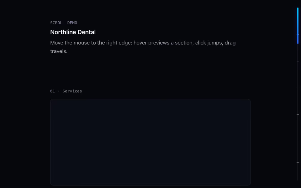
FreeThe page scrollbar redrawn: a spectrum thumb, section ticks, and a readout that names where you are.
Scroll · Motion