Liquid Before/After
A before-and-after slider whose edge is a wobbling liquid seam; drag, tap or use the arrow keys.
Controls
<LiquidBeforeAfter />About
A comparison that feels physical. The "before" image fills the left of the seam and the "after" image the right; the seam ripples with three slow waves, lenses the pixels beside it like a meniscus, carries a glossy rim, and sloshes when it is dragged quickly before settling back to a gentle ripple. Press anywhere on the picture to move the seam there and drag; vertical swipes still scroll on phones. Underneath sits a native range input, so the arrow keys and screen readers work as they do for any slider. Without hardware WebGL2, or until the images reach the GPU, the same component is a clean CSS slider with identical controls. Original to VibeBox Motion.
Use it when
- Renovations, redesigns, detailing, dental and beauty work want to show the change.
- A case study needs one striking comparison.
Skip it when
- The two images are not aligned shots of the same thing; the comparison then misleads.
- The images are cross-origin without CORS (the CSS slider still works, without the liquid seam).
Install
The demo above is live today. Installing Pro items opens with VibeBox Motion Pro; join the waitlist to hear first.
Code
The source is part of VibeBox Motion Pro.
Licensed per seat; it installs with the same shadcn command once Pro opens.
See Pro and join the waitlistProps
| Prop | Type | Default | Description |
|---|---|---|---|
| before * | string | — | The image before the change (same origin, a data URL, or served with CORS). |
| after * | string | — | The image after the change. |
| beforeAlt * | string | — | What the before image shows. |
| afterAlt * | string | — | What the after image shows. |
| beforeLabel | string | "Before" | The badge and spoken name for the left side. |
| afterLabel | string | "After" | The badge and spoken name for the right side. |
| initial | number | 50 | Where the seam starts, 0 to 100 (percent from the left). |
| className | string | — | Merged with cn(); it is 16:10 unless you set a size. |
Accessibility and motion
- Keyboard
- A native range slider: arrows, Home, End, Page Up and Down move the seam; the picture shows a focus ring.
- Screen readers
- Both images are described up front; the slider reads its value as "40% before, 60% after".
- Touch
- Press anywhere to move the seam and drag; vertical swipes still scroll the page.
- Reduced motion
- A straight, still seam that follows the slider; no ripple or slosh.
Edge cases and limits
- Images with different aspect ratios are both cover-fitted, so their edges may crop differently.
- Cross-origin images need CORS headers for the liquid seam; the CSS slider works regardless.
Related
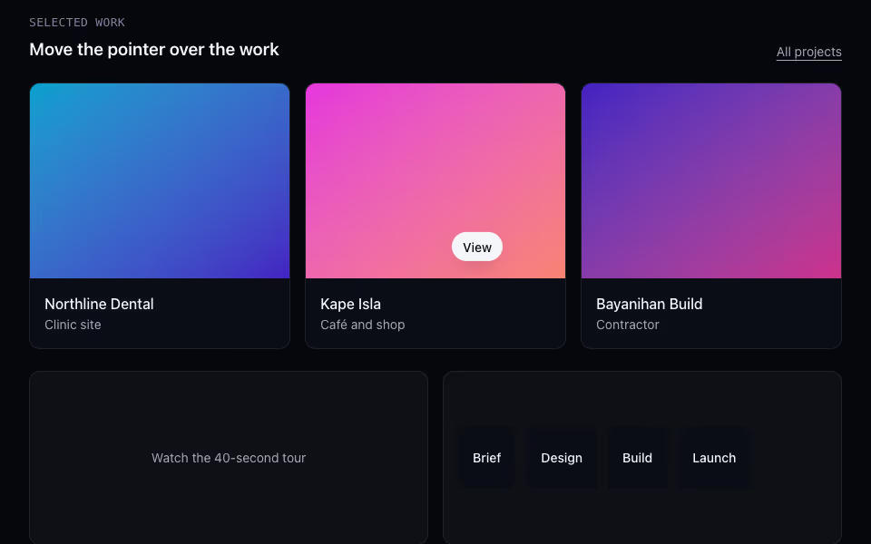
Context Cursor
FreeA cursor label that says what a click will do ("View", "Play", "Drag") and changes with the target. Fine pointers only.
Cursor and touch · Motion
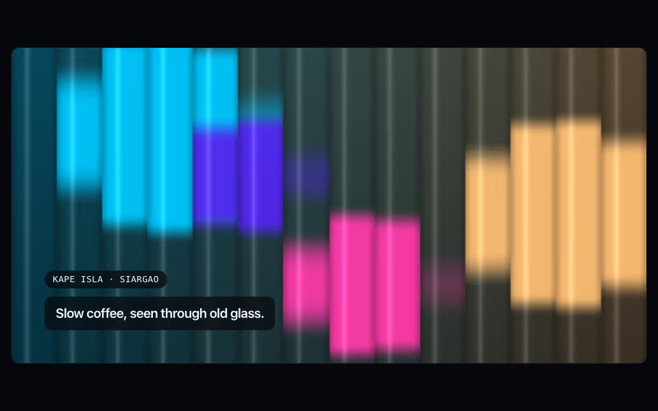
Fluted Glass
ProReeded-glass refraction over an image or spectrum art; the flutes slide with scroll and lean with the pointer.
Backgrounds · WebGL2
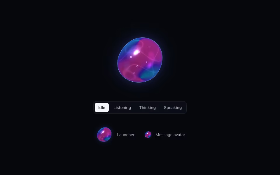
Liquid Orb
ProA living liquid drop for an AI assistant: it listens, thinks and speaks, dents under touch and morphs between shapes.
3D · WebGL2