About
Each card is absolutely placed at a fixed offset along the fan and rotated about a pivot well below its bottom edge, so the rotation reads as a hand held from beneath. State is two indexes: the card hot under the pointer or focus (lifted, scaled and straightened a little) and the chosen one (brought to the front, straightened, scaled up), with the others nudged sideways away from it. All motion is a CSS transition on transform.
Use it when
- A menu, a set of offers or tiers presented as a hand.
- A team or testimonial set that should feel physical.
- A game or quiz page.
Skip it when
- More than about nine cards: they overlap into a strip.
- Long content on the cards: show a detail view when one is chosen.
Install
- 1Add the VibeBox registry to
components.json:{ "registries": { "@vibebox": "https://motion.vibeboxph.com/r/{name}.json" } } - 2Add the component with the shadcn CLI:
npx shadcn@latest add @vibebox/card-fan - 3Use it:
import { CardFan } from "@/components/vibebox/card-fan";

<CardFan
  className="max-w-3xl"
  cards={[
    { id: "tasting", label: "Tasting menu", children: <div className="size-full bg-amber-500 p-4">Tasting menu</div> },
    { id: "pairing", label: "Wine pairing", children: <div className="size-full bg-violet-700 p-4 text-white">Wine pairing</div> },
  ]}
/>
Code
2 filescomponents/vibebox/card-fan/card-fan.client.tsx
/**
 * VibeBox Motion · Card Fan
 * Copyright (c) 2026 VibeBox. Licensed under the VibeBox Motion Free License:
 * https://motion.vibeboxph.com/license
 * Use it in unlimited personal, commercial and client projects.
 * Do not sell or redistribute it as a component, kit, template or builder.
 */
"use client";

import { useState, type CSSProperties, type KeyboardEvent, type ReactNode } from "react";
import { cn } from "@/lib/utils";

export type FanCard = {
  id: string;
  /** The card's name, read out and used as its button's label. */
  label: string;
  /** What the card shows. */
  children: ReactNode;
};

export type CardFanProps = {
  cards: readonly FanCard[];
  /** The angle between neighbouring cards, in degrees (default 9). */
  spread?: number;
  /** Called when a card is brought forward. */
  onSelect?: (id: string) => void;
  label?: string;
  className?: string;
};

/*
 * A hand of cards. At rest they sit in a shallow fan; the card under the pointer lifts, and a
 * tap or Enter brings one forward and straightens it, with its neighbours stepping aside. Every
 * card is a real button, the fan is a toolbar, and the arrow keys move between them.
 */
export function CardFan({ cards, spread = 9, onSelect, label = "Cards", className }: CardFanProps) {
  const [chosen, setChosen] = useState<number | null>(null);
  const [hot, setHot] = useState<number | null>(null);
  const count = cards.length;
  const mid = (count - 1) / 2;
  // Cards are sized by the fan's own width, so a hand of any size fits a narrow stage: five cards
  // take 28% each, and more cards get narrower rather than spilling out.
  const cardWidth = `min(${(140 / Math.max(count, 5)).toFixed(1)}cqw, 240px)`;

  const onKeyDown = (event: KeyboardEvent<HTMLDivElement>) => {
    const items = Array.from(event.currentTarget.querySelectorAll<HTMLButtonElement>("button"));
    const index = items.indexOf(document.activeElement as HTMLButtonElement);
    if (event.key === "ArrowRight" && index < items.length - 1) {
      event.preventDefault();
      items[index + 1]?.focus();
    } else if (event.key === "ArrowLeft" && index > 0) {
      event.preventDefault();
      items[index - 1]?.focus();
    }
  };

  return (
    <div
      role="toolbar"
      aria-label={label}
      aria-orientation="horizontal"
      data-vb="card-fan"
      onKeyDown={onKeyDown}
      className={cn("@container relative mx-auto aspect-[16/10] w-full [perspective:1200px]", className)}
    >
      {cards.map((card, index) => {
        const offset = index - mid;
        const lifted = hot === index;
        const picked = chosen === index;
        const aside = chosen !== null && !picked ? Math.sign(index - chosen) * 9 : 0;
        const style: CSSProperties = {
          left: `calc(50% + ${offset} * ${cardWidth} * 0.28)`,
          width: cardWidth,
          zIndex: picked ? 40 : lifted ? 30 : index,
          transform: picked
            ? "translate(-50%, -62%) rotate(0deg) scale(1.14)"
            : `translate(calc(-50% + ${aside}%), ${lifted ? -58 : -50 + Math.abs(offset) * 3}%) rotate(${offset * spread + (lifted ? -offset * 2 : 0)}deg) scale(${lifted ? 1.06 : 1})`,
          transformOrigin: "50% 120%",
        };
        return (
          <button
            key={card.id}
            type="button"
            aria-pressed={picked}
            aria-label={card.label}
            onClick={() => {
              setChosen(picked ? null : index);
              if (!picked) onSelect?.(card.id);
            }}
            onPointerEnter={() => setHot(index)}
            onPointerLeave={() => setHot(null)}
            onFocus={() => setHot(index)}
            onBlur={() => setHot(null)}
            className="@container absolute top-1/2 aspect-[2.5/3.5] cursor-pointer overflow-hidden rounded-[6%/4.3%] text-left shadow-[0_24px_44px_-22px_rgb(0_0_0/0.6)] transition-transform duration-500 ease-expo-out focus-visible:outline-2 focus-visible:outline-offset-4 focus-visible:outline-ring motion-reduce:transition-none"
            style={style}
          >
            {card.children}
          </button>
        );
      })}
    </div>
  );
}
components/vibebox/card-fan/index.tsx
/**
 * VibeBox Motion · Card Fan
 * Copyright (c) 2026 VibeBox. Licensed under the VibeBox Motion Free License:
 * https://motion.vibeboxph.com/license
 * Use it in unlimited personal, commercial and client projects.
 * Do not sell or redistribute it as a component, kit, template or builder.
 */
export { CardFan, type CardFanProps, type FanCard } from "./card-fan.client";
Props
| Prop | Type | Default | Description |
|---|---|---|---|
| cards * | FanCard[] | — | The cards: { id, label, children }. |
| spread | number | 9 | The angle between neighbouring cards, in degrees. |
| onSelect | (id: string) => void | — | Called when a card is brought forward. |
| label | string | "Cards" | Accessible name of the toolbar. |
| className | string | — | Merged with cn(); give it a max width. |
Accessibility and motion
- Keyboard
- Arrow keys move focus between cards; Enter or Space brings one forward and again sends it back.
- Screen readers
- A toolbar of buttons, each named by its
label, with its pressed state. - Touch
- Tap a card to bring it forward and tap again to put it back.
- Reduced motion
- Cards still fan and straighten, with no transition.
Edge cases and limits
- Cards are 2.5:3.5; wide content should be cropped to fit.
- With one card there is no fan: it just sits in the middle.
- Nested interactive elements inside a card are invalid inside a button: keep faces to text and images.
Related
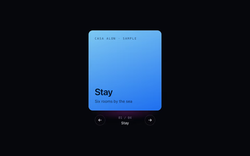
Cube Carousel
FreeContent on the faces of a turning prism: arrows, keys and drag, a face at a time. Pure CSS 3D.
3D · CSS
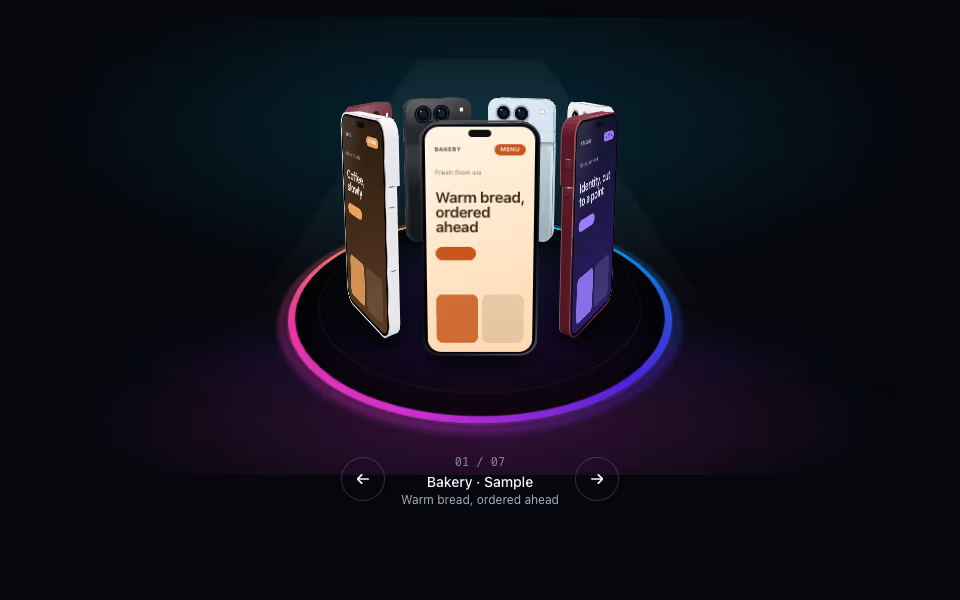
Phone Ring
FreePhones on a turntable: drag to spin with inertia, tap an arrow, keyboard-friendly. Pure CSS 3D.
3D · CSS
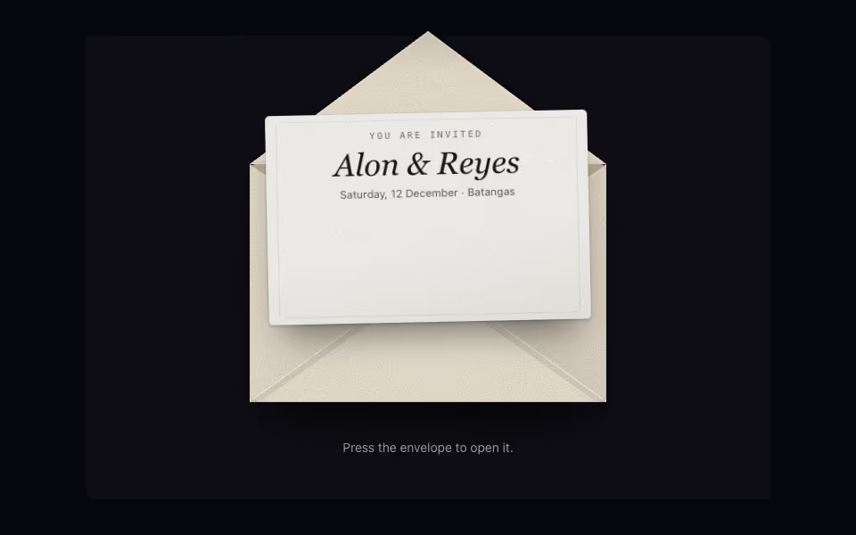
Envelope
FreeAn envelope that opens on a press: the flap swings back, the card rises out and comes forward.
3D · CSS