About
Faces are placed at rotateY(i * 360/n) translateZ(r) where r = width / 2 / tan(PI / n), so adjacent faces meet edge to edge for any n. The prism itself is pushed back by r so the front face sits on the page plane, and turned by -index * step (plus the live drag offset), with a long expo-out transition. A drag measures the pointer's travel in face widths and settles on the nearest face on release. Faces behind the front one are aria-hidden.
Use it when
- A set of rooms, services or plans that should read as one object.
- A hero side-piece that shows several states.
- A mobile-friendly alternative to a flat carousel.
Skip it when
- More than about six faces of dense content.
- Content that must all be visible at once.
Install
- 1Add the VibeBox registry to
components.json:{ "registries": { "@vibebox": "https://motion.vibeboxph.com/r/{name}.json" } } - 2Add the component with the shadcn CLI:
npx shadcn@latest add @vibebox/cube-carousel - 3Use it:
import { CubeCarousel } from "@/components/vibebox/cube-carousel";

<CubeCarousel
  faces={[
    { id: "stay", label: "Stay", children: <div className="size-full bg-sky-600 p-6 text-white">Stay</div> },
    { id: "eat", label: "Eat", children: <div className="size-full bg-orange-500 p-6">Eat</div> },
    { id: "swim", label: "Swim", children: <div className="size-full bg-emerald-600 p-6 text-white">Swim</div> },
  ]}
/>
Code
2 filescomponents/vibebox/cube-carousel/cube-carousel.client.tsx
/**
 * VibeBox Motion · Cube Carousel
 * Copyright (c) 2026 VibeBox. Licensed under the VibeBox Motion Free License:
 * https://motion.vibeboxph.com/license
 * Use it in unlimited personal, commercial and client projects.
 * Do not sell or redistribute it as a component, kit, template or builder.
 */
"use client";

import { useEffect, useRef, useState, type CSSProperties, type KeyboardEvent, type PointerEvent as ReactPointerEvent, type ReactNode } from "react";
import { cn } from "@/lib/utils";

export type CubeFace = { id: string; label: string; children: ReactNode };

export type CubeCarouselProps = {
  /** Three to eight faces; four make a cube, others a prism. */
  faces: readonly CubeFace[];
  /** Turn by itself, a face at a time. */
  autoplay?: boolean;
  /** Seconds each face stays in front. */
  interval?: number;
  /** The width of a face in px (default 280). */
  size?: number;
  label?: string;
  className?: string;
};

/*
 * A prism of content. Faces stand around a vertical axis; the whole turns by one face on the
 * arrows, a key, or after a few seconds, and by hand with a drag. Only the face in front is
 * exposed to assistive technology, so what is read is what is seen.
 */
export function CubeCarousel({ faces, autoplay = true, interval = 4, size = 280, label = "A rotating set of cards", className }: CubeCarouselProps) {
  const count = Math.min(8, Math.max(3, faces.length));
  const list = faces.slice(0, count);
  const step = 360 / count;
  const [index, setIndex] = useState(0);
  const [drag, setDrag] = useState<{ x: number; base: number } | null>(null);
  const [offset, setOffset] = useState(0);
  const idle = useRef(0);
  const radius = size / 2 / Math.tan(Math.PI / count);

  useEffect(() => {
    if (!autoplay) return;
    const reduced = window.matchMedia("(prefers-reduced-motion: reduce)").matches;
    if (reduced) return;
    const timer = window.setInterval(() => {
      if (document.hidden || drag || performance.now() - idle.current < 6000) return;
      setIndex((value) => value + 1);
    }, Math.max(1.5, interval) * 1000);
    return () => window.clearInterval(timer);
  }, [autoplay, interval, drag]);

  const go = (delta: number) => {
    idle.current = performance.now();
    setIndex((value) => value + delta);
  };
  const onKeyDown = (event: KeyboardEvent<HTMLDivElement>) => {
    if (event.key === "ArrowRight") {
      event.preventDefault();
      go(1);
    } else if (event.key === "ArrowLeft") {
      event.preventDefault();
      go(-1);
    }
  };
  const onDown = (event: ReactPointerEvent<HTMLDivElement>) => {
    idle.current = performance.now();
    setDrag({ x: event.clientX, base: index });
    event.currentTarget.setPointerCapture(event.pointerId);
  };
  const onMove = (event: ReactPointerEvent<HTMLDivElement>) => {
    if (!drag) return;
    setOffset(((event.clientX - drag.x) / size) * -1);
  };
  const onUp = (event: ReactPointerEvent<HTMLDivElement>) => {
    if (!drag) return;
    if (event.currentTarget.hasPointerCapture(event.pointerId)) event.currentTarget.releasePointerCapture(event.pointerId);
    setIndex(drag.base + Math.round(offset));
    setDrag(null);
    setOffset(0);
  };

  const front = ((index % count) + count) % count;
  const angle = -(index + (drag ? offset : 0)) * step;
  const style = { width: size, height: size * 1.1, perspective: size * 4 } as CSSProperties;

  return (
    <div className={cn("mx-auto flex flex-col items-center gap-4", className)} data-vb="cube-carousel" data-front={front}>
      <div
        role="group"
        aria-roledescription="carousel"
        aria-label={label}
        tabIndex={0}
        onKeyDown={onKeyDown}
        onPointerDown={onDown}
        onPointerMove={onMove}
        onPointerUp={onUp}
        onPointerCancel={onUp}
        className="relative cursor-grab touch-pan-y select-none focus-visible:outline-2 focus-visible:outline-offset-8 focus-visible:outline-ring active:cursor-grabbing"
        style={style}
      >
        <div
          className="absolute inset-0 [transform-style:preserve-3d]"
          style={{
            transform: `translateZ(${-radius}px) rotateY(${angle}deg)`,
            transition: drag ? "none" : "transform 800ms cubic-bezier(0.16, 1, 0.3, 1)",
          }}
        >
          {list.map((face, i) => (
            <div
              key={face.id}
              aria-hidden={i === front ? undefined : true}
              role="group"
              aria-label={face.label}
              className="absolute inset-0 overflow-hidden rounded-[16px] [backface-visibility:hidden]"
              style={{ transform: `rotateY(${i * step}deg) translateZ(${radius}px)` }}
            >
              {face.children}
            </div>
          ))}
        </div>
      </div>
      <div className="flex items-center gap-3">
        <button type="button" onClick={() => go(-1)} aria-label="Previous" className="grid size-10 place-items-center rounded-full border border-border-strong transition-colors duration-150 hover:bg-accent focus-visible:outline-2 focus-visible:outline-offset-2 focus-visible:outline-ring">
          <svg viewBox="0 0 16 16" aria-hidden="true" className="size-4" fill="none" stroke="currentColor" strokeWidth="1.7" strokeLinecap="round" strokeLinejoin="round">
            <path d="M13.5 8h-11M7 3.5 2.5 8 7 12.5" />
          </svg>
        </button>
        <p aria-live="polite" className="min-w-[8rem] text-center text-small">
          <span className="font-mono text-caption text-subtle-foreground">{String(front + 1).padStart(2, "0")} / {String(count).padStart(2, "0")}</span>
          <span className="block font-medium">{list[front]?.label}</span>
        </p>
        <button type="button" onClick={() => go(1)} aria-label="Next" className="grid size-10 place-items-center rounded-full border border-border-strong transition-colors duration-150 hover:bg-accent focus-visible:outline-2 focus-visible:outline-offset-2 focus-visible:outline-ring">
          <svg viewBox="0 0 16 16" aria-hidden="true" className="size-4" fill="none" stroke="currentColor" strokeWidth="1.7" strokeLinecap="round" strokeLinejoin="round">
            <path d="M2.5 8h11M9 3.5 13.5 8 9 12.5" />
          </svg>
        </button>
      </div>
    </div>
  );
}
components/vibebox/cube-carousel/index.tsx
/**
 * VibeBox Motion · Cube Carousel
 * Copyright (c) 2026 VibeBox. Licensed under the VibeBox Motion Free License:
 * https://motion.vibeboxph.com/license
 * Use it in unlimited personal, commercial and client projects.
 * Do not sell or redistribute it as a component, kit, template or builder.
 */
export { CubeCarousel, type CubeCarouselProps, type CubeFace } from "./cube-carousel.client";
Props
| Prop | Type | Default | Description |
|---|---|---|---|
| faces * | CubeFace[] | — | Three to eight faces: { id, label, children }. |
| autoplay | boolean | true | Turn by itself, a face at a time. |
| interval | number | 4 | Seconds each face stays in front. |
| size | number | 280 | The width of a face in px. |
| label | string | "A rotating set of cards" | Accessible name. |
| className | string | — | Merged with cn(). |
Accessibility and motion
- Keyboard
- Focusable: Left and Right arrows turn it by a face; previous and next are real buttons.
- Screen readers
- A carousel named by
label; only the front face is exposed and the face's number and name are announced politely. - Touch
- Drag to turn (vertical scrolling stays available); tap an arrow for a step.
- Reduced motion
- It does not turn by itself; the arrows, keys and drag still turn it, with the settle shortened to a cut.
Edge cases and limits
- Faces have no scrolling: keep content short.
- Very wide faces on phones need a smaller
sizeor they clip. - With three faces the prism is a triangle: it needs a larger
sizeto feel solid.
Related
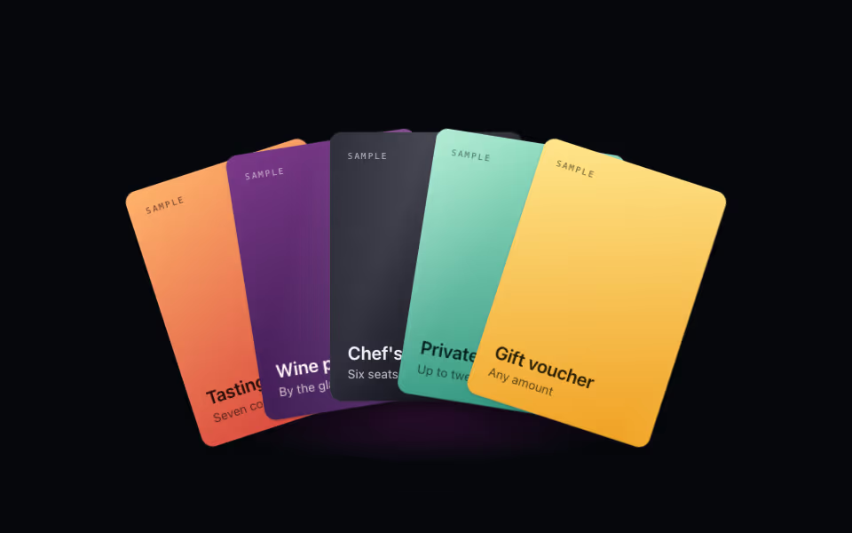
Card Fan
FreeA hand of cards: lift one on hover, bring it forward on tap, arrow keys between them. Pure CSS 3D.
3D · CSS
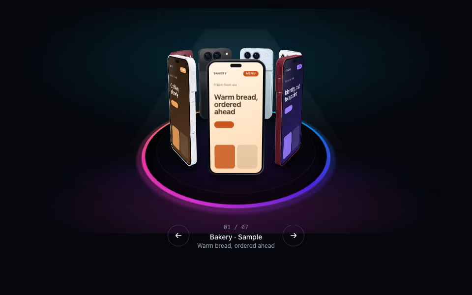
Phone Ring
FreePhones on a turntable: drag to spin with inertia, tap an arrow, keyboard-friendly. Pure CSS 3D.
3D · CSS
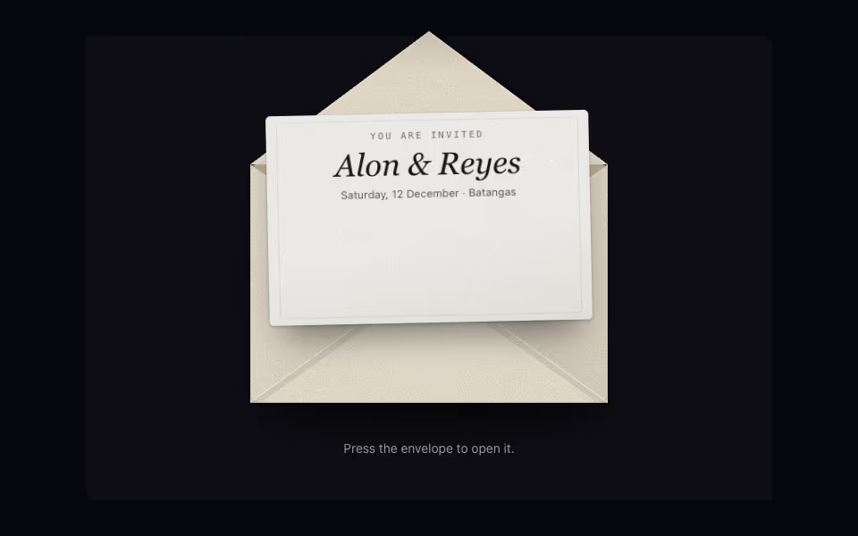
Envelope
FreeAn envelope that opens on a press: the flap swings back, the card rises out and comes forward.
3D · CSS