About
Layers in a perspective box: the back of the envelope and its inside, the card, the pocket (the front, cut as a V from the two sides and the bottom with a clip-path) and the flap, a triangle hinged at the top edge that rotates 180 degrees about X. The card translates up and forward while the flap swings, with a short delay so the order reads: flap, then card. The seal sits on the join and fades. Everything is transforms and opacity; the whole envelope is one button with aria-expanded.
Use it when
- A wedding, party or event page wants the invitation to be opened.
- A voucher, gift card or thank-you page wants a small ceremony.
- A newsletter or letter-from-the-founder page wants a quiet reveal.
Skip it when
- The content must be visible without an interaction on first view (it is readable, but partly covered while closed).
- The page is already full of motion.
Install
- 1Add the VibeBox registry to
components.json:{ "registries": { "@vibebox": "https://motion.vibeboxph.com/r/{name}.json" } } - 2Add the component with the shadcn CLI:
npx shadcn@latest add @vibebox/envelope - 3Use it:
import { Envelope } from "@/components/vibebox/envelope";

const colors = { paper: "#f6d8d8", inside: "#e8b9bb", card: "#fffaf6", seal: "#8c2f4a" };

<Envelope seal="A" colors={colors}>
  <p className="text-center font-serif text-2xl">You are invited</p>
</Envelope>
Code
2 filescomponents/vibebox/envelope/envelope.client.tsx
/**
 * VibeBox Motion · Envelope
 * Copyright (c) 2026 VibeBox. Licensed under the VibeBox Motion Free License:
 * https://motion.vibeboxph.com/license
 * Use it in unlimited personal, commercial and client projects.
 * Do not sell or redistribute it as a component, kit, template or builder.
 */
"use client";

import { useId, useState, type CSSProperties, type ReactNode } from "react";
import { cn } from "@/lib/utils";

export type EnvelopeProps = {
  /** What is on the card inside (an invitation, a voucher, a note). */
  children: ReactNode;
  /** The envelope's colours: its paper, the darker inside of the flap, and the card. */
  colors?: { paper?: string; inside?: string; card?: string; seal?: string };
  /** A short mark on the wax seal (one or two characters). */
  seal?: string;
  /** Starts opened. */
  defaultOpen?: boolean;
  /** Called after it opens or closes. */
  onToggle?: (open: boolean) => void;
  /** Words for the button. */
  openLabel?: string;
  closeLabel?: string;
  className?: string;
};

/*
 * An envelope that opens on a press: the flap swings back in 3D, the card rises out of the
 * pocket and settles in front of the envelope. It is one button, so keyboard and touch work the
 * same; the card's content is always in the page, so nothing is hidden from search or readers.
 */
export function Envelope({
  children,
  colors,
  seal = "V",
  defaultOpen = false,
  onToggle,
  openLabel = "Open the envelope",
  closeLabel = "Close the envelope",
  className,
}: EnvelopeProps) {
  const [open, setOpen] = useState(defaultOpen);
  const id = useId();
  const toggle = () => {
    setOpen((value) => {
      onToggle?.(!value);
      return !value;
    });
  };
  const paper = colors?.paper ?? "#f1e6d4";
  const inside = colors?.inside ?? "#d9c7a8";
  const card = colors?.card ?? "#fffdf8";
  const wax = colors?.seal ?? "#b3262e";
  const style = {
    "--env-paper": paper,
    "--env-inside": inside,
    "--env-card": card,
    "--env-seal": wax,
  } as CSSProperties;

  return (
    <div data-vb="envelope" data-open={open ? "true" : "false"} className={cn("relative mx-auto w-full max-w-[520px]", className)} style={style}>
      <div className="relative aspect-[3/2] w-full [perspective:1400px]">
        {/* The back of the envelope and its inside. */}
        <span aria-hidden="true" className="absolute inset-0 rounded-[6px] shadow-[0_30px_60px_-30px_rgb(0_0_0/0.55)]" style={{ background: "var(--env-inside)" }} />

        {/* The card: it rises out of the pocket and comes forward. */}
        <div
          id={`${id}-card`}
          className="absolute inset-x-[7%] bottom-[8%] top-[10%] overflow-hidden rounded-[4px] p-[5%] text-neutral-900 shadow-[0_8px_22px_-10px_rgb(0_0_0/0.45)] transition-transform duration-700 ease-[cubic-bezier(0.16,1,0.3,1)] motion-reduce:transition-none"
          style={{
            background: "var(--env-card)",
            transform: open ? "translateY(-40%) translateZ(30px) scale(1.03)" : "translateY(0) translateZ(0)",
            transitionDelay: open ? "220ms" : "0ms",
            zIndex: open ? 3 : 1,
          }}
        >
          {children}
        </div>

        {/* The pocket: the envelope's front, cut as a V from the two sides and the bottom. */}
        <span
          aria-hidden="true"
          className="pointer-events-none absolute inset-0 z-[2] rounded-[6px]"
          style={{
            background: "linear-gradient(160deg, color-mix(in srgb, var(--env-paper), #fff 12%), var(--env-paper) 55%, color-mix(in srgb, var(--env-paper), #000 8%))",
            clipPath: "polygon(0 0, 50% 52%, 100% 0, 100% 100%, 0 100%)",
          }}
        />
        <span
          aria-hidden="true"
          className="pointer-events-none absolute inset-0 z-[2] rounded-[6px]"
          style={{
            background: "linear-gradient(90deg, rgb(0 0 0 / 0.1), transparent 30%, transparent 70%, rgb(0 0 0 / 0.08))",
            clipPath: "polygon(0 0, 50% 52%, 100% 0, 100% 100%, 0 100%)",
          }}
        />

        {/* The flap: hinged at the top edge. Its two faces are separate, so the paper shows going up and the inside shows once it has turned over. */}
        <span
          aria-hidden="true"
          className="pointer-events-none absolute inset-x-0 top-0 h-[56%] origin-top transition-transform duration-700 ease-[cubic-bezier(0.16,1,0.3,1)] motion-reduce:transition-none [transform-style:preserve-3d]"
          style={{
            transform: open ? "rotateX(180deg)" : "rotateX(0deg)",
            zIndex: open ? 0 : 4,
            transitionDelay: open ? "0ms" : "280ms",
          }}
        >
          <span
            className="absolute inset-0 [backface-visibility:hidden]"
            style={{
              background: "linear-gradient(180deg, color-mix(in srgb, var(--env-paper), #fff 14%), var(--env-paper) 70%, color-mix(in srgb, var(--env-paper), #000 10%))",
              clipPath: "polygon(0 0, 100% 0, 50% 100%)",
            }}
          />
          <span
            className="absolute inset-0 [backface-visibility:hidden]"
            style={{
              background: "linear-gradient(180deg, color-mix(in srgb, var(--env-inside), #000 12%), var(--env-inside))",
              clipPath: "polygon(0 0, 100% 0, 50% 100%)",
              // Turned about its own vertical axis (the triangle is symmetric), so once the flap
              // has swung over its apex points up, away from the envelope.
              transform: "rotateY(180deg)",
            }}
          />
        </span>

        {/* The wax seal sits where the flap meets the pocket and goes with the flap. */}
        <span
          aria-hidden="true"
          className="pointer-events-none absolute left-1/2 top-[49%] z-[5] grid aspect-square w-[15%] -translate-x-1/2 -translate-y-1/2 place-items-center rounded-full font-serif text-[clamp(0.8rem,2.4vw,1.35rem)] font-semibold text-white/90 shadow-[0_3px_8px_rgb(0_0_0/0.4)] transition-[opacity,transform] duration-300 motion-reduce:transition-none"
          style={{
            background: "radial-gradient(circle at 35% 30%, color-mix(in srgb, var(--env-seal), #fff 35%), var(--env-seal) 55%, color-mix(in srgb, var(--env-seal), #000 35%))",
            opacity: open ? 0 : 1,
            transform: `translate(-50%, -50%) scale(${open ? 0.7 : 1})`,
          }}
        >
          {seal}
        </span>

        {/* The whole envelope is the button. */}
        <button
          type="button"
          onClick={toggle}
          aria-expanded={open}
          aria-controls={`${id}-card`}
          className="absolute inset-0 z-[6] cursor-pointer rounded-[6px] focus-visible:outline-2 focus-visible:outline-offset-4 focus-visible:outline-ring"
        >
          <span className="sr-only">{open ? closeLabel : openLabel}</span>
        </button>
      </div>
    </div>
  );
}
components/vibebox/envelope/index.tsx
/**
 * VibeBox Motion · Envelope
 * Copyright (c) 2026 VibeBox. Licensed under the VibeBox Motion Free License:
 * https://motion.vibeboxph.com/license
 * Use it in unlimited personal, commercial and client projects.
 * Do not sell or redistribute it as a component, kit, template or builder.
 */
export { Envelope, type EnvelopeProps } from "./envelope.client";
Props
| Prop | Type | Default | Description |
|---|---|---|---|
| children * | ReactNode | — | What is on the card. |
| colors | { paper?: string; inside?: string; card?: string; seal?: string } | — | The envelope's paper, the inside of the flap, the card and the wax seal. |
| seal | string | "V" | A short mark on the wax seal. |
| defaultOpen | boolean | false | Starts opened. |
| onToggle | (open: boolean) => void | — | Called after it opens or closes. |
| openLabel | string | "Open the envelope" | The button's name while it is closed. |
| closeLabel | string | "Close the envelope" | The button's name while it is open. |
| className | string | — | Merged with cn(). |
Accessibility and motion
- Keyboard
- Focusable button; Enter or Space opens and closes it.
- Screen readers
- A button that says whether it will open or close the envelope (
aria-expanded); the card's content is always readable. - Touch
- Tap to open and tap to close.
- Reduced motion
- It opens and closes at once, with no swing or slide.
Edge cases and limits
- The card is about two thirds of the envelope's height: keep the content short.
- Opened, the card rises above the envelope: leave room above it.
- The wax seal is decoration; do not put information on it.
Related
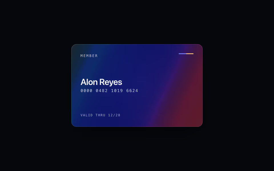
Holo Card
FreeA holographic card: it leans to the pointer, a glare follows, and a band of spectrum foil slides with the angle.
3D · CSS
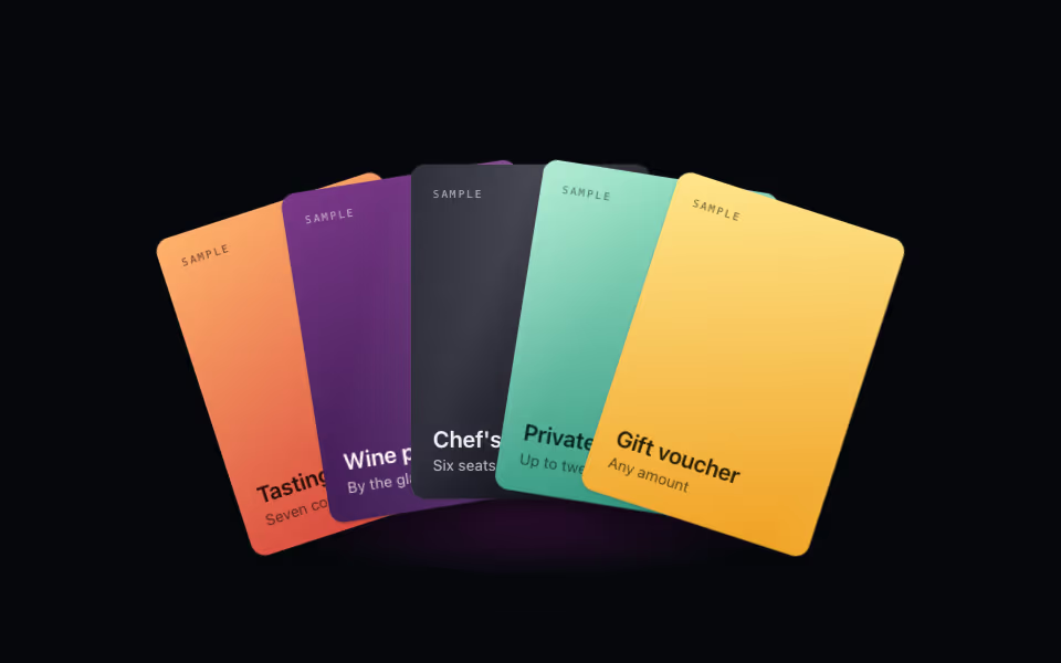
Card Fan
FreeA hand of cards: lift one on hover, bring it forward on tap, arrow keys between them. Pure CSS 3D.
3D · CSS
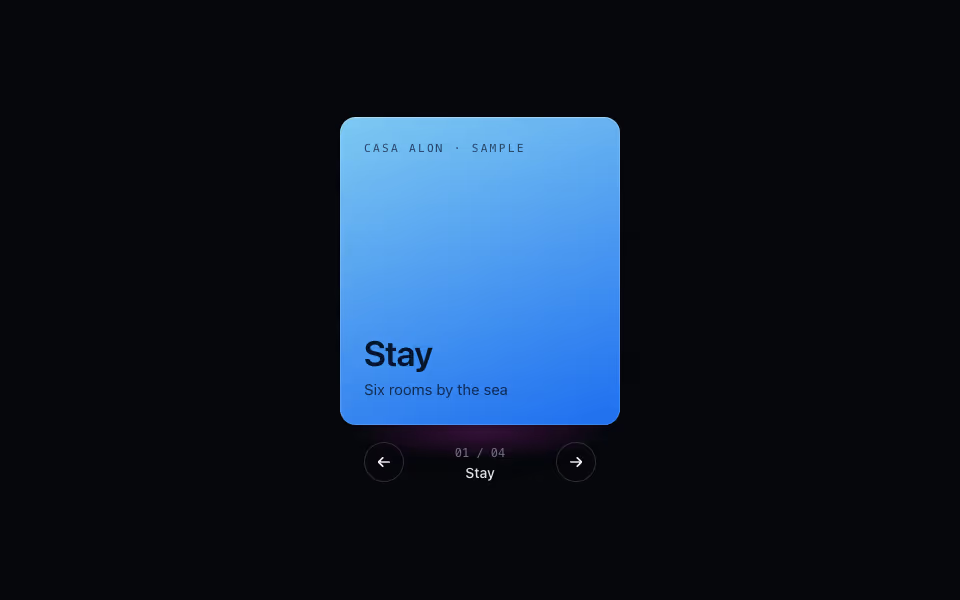
Cube Carousel
FreeContent on the faces of a turning prism: arrows, keys and drag, a face at a time. Pure CSS 3D.
3D · CSS