About
Six absolutely positioned faces in a preserve-3d box. Each face is centred on the box and moved out along its own axis by half the opposite dimension (front and back by half the depth, sides by half the width, top and bottom by half the height); backface-visibility: hidden hides the inside. Width, height and depth are three custom properties, so the box is sized by one length and a shape ratio. A fixed shade per face stands in for a light: faces turned away from the key are darkened. Spin is a rAF loop that applies a rotation to the box element through a ref, with a throw and a gentle return of the tilt; it runs only while visible.
Use it when
- A food, drink, beauty or consumer brand wants its pack as an object on the page.
- A store wants a product page hero without a 3D model.
- A launch or subscription page wants a box to turn.
Skip it when
- The product is not a box: a bottle or a can needs a real model.
- You only have a flat product photo and no art for the sides: use a card.
Install
- 1Add the VibeBox registry to
components.json:{ "registries": { "@vibebox": "https://motion.vibeboxph.com/r/{name}.json" } } - 2Add the component with the shadcn CLI:
npx shadcn@latest add @vibebox/product-box - 3Use it:
import { ProductBox } from "@/components/vibebox/product-box";

const faces = {
  front: <img src="/pack/front.png" alt="Morning Green Tea" className="size-full object-cover" />,
  back: <img src="/pack/back.png" alt="" className="size-full object-cover" />,
  left: <div className="size-full bg-emerald-700" />,
  right: <div className="size-full bg-emerald-700" />,
};

<ProductBox width="180px" faces={faces} />
Code
2 filescomponents/vibebox/product-box/index.tsx
/**
 * VibeBox Motion · Product Box
 * Copyright (c) 2026 VibeBox. Licensed under the VibeBox Motion Free License:
 * https://motion.vibeboxph.com/license
 * Use it in unlimited personal, commercial and client projects.
 * Do not sell or redistribute it as a component, kit, template or builder.
 */
export { ProductBox, type BoxFace, type ProductBoxProps } from "./product-box.client";
components/vibebox/product-box/product-box.client.tsx
/**
 * VibeBox Motion · Product Box
 * Copyright (c) 2026 VibeBox. Licensed under the VibeBox Motion Free License:
 * https://motion.vibeboxph.com/license
 * Use it in unlimited personal, commercial and client projects.
 * Do not sell or redistribute it as a component, kit, template or builder.
 */
"use client";

import { useCallback, useEffect, useRef, type CSSProperties, type KeyboardEvent, type PointerEvent as ReactPointerEvent, type ReactNode } from "react";
import { cn } from "@/lib/utils";

export type BoxFace = "front" | "back" | "left" | "right" | "top" | "bottom";

export type ProductBoxProps = {
  /** What each face shows: art, an image, or any markup. A face left out is a plain card colour. */
  faces?: Partial<Record<BoxFace, ReactNode>>;
  /** The box's width as any CSS length; its height and depth follow `shape`. */
  width?: string;
  /** Height and depth as a multiple of the width (default 1.4 and 0.5: a tall carton). */
  shape?: { height?: number; depth?: number };
  /** Turn slowly until someone touches it (default true). */
  autoRotate?: boolean;
  /** Accessible name of the whole box. */
  label?: string;
  className?: string;
};

/* How much a face is darkened: a fixed key light from above and the front. */
const SHADE: Record<BoxFace, number> = { front: 0, back: 0.34, right: 0.16, left: 0.26, top: -0.1, bottom: 0.5 };
const FACES: BoxFace[] = ["front", "back", "right", "left", "top", "bottom"];
const REST = { x: -14, y: -30 };

export function ProductBox({ faces = {}, width = "clamp(130px, 18vw, 210px)", shape, autoRotate = true, label = "A product box; drag to turn it", className }: ProductBoxProps) {
  const height = shape?.height ?? 1.4;
  const depth = shape?.depth ?? 0.5;
  const boxRef = useRef<HTMLDivElement>(null);
  const state = useRef({ x: REST.x, y: REST.y, vx: 0, vy: 0, dragging: false, lastX: 0, lastY: 0, lastInput: -9999, raf: 0, last: 0, visible: true });
  const reduced = useRef(false);

  const rootRef = useRef<HTMLDivElement>(null);
  const apply = useCallback(() => {
    const s = state.current;
    if (boxRef.current) boxRef.current.style.transform = `rotateX(${s.x}deg) rotateY(${s.y}deg)`;
    // Which face is toward the viewer (a positive turn brings the left face round to the front).
    const facing = (["front", "left", "back", "right"] as const)[((Math.round(s.y / 90) % 4) + 4) % 4]!;
    if (rootRef.current && rootRef.current.dataset.facing !== facing) rootRef.current.dataset.facing = facing;
  }, []);

  const frame = useCallback(
    (time: number) => {
      const s = state.current;
      const dt = Math.min(0.05, (time - s.last) / 1000 || 0.016);
      s.last = time;
      if (!s.dragging) {
        s.y += s.vy * dt;
        s.x += s.vx * dt;
        s.vy *= Math.exp(-dt * 2.4);
        s.vx *= Math.exp(-dt * 2.4);
        // Tilt eases back toward a resting angle; the turn carries on by itself when idle.
        s.x += (REST.x - s.x) * (1 - Math.exp(-dt * 1.6));
        const idle = performance.now() - s.lastInput > 2200;
        if (autoRotate && !reduced.current && idle && s.visible) s.y += dt * 14;
      }
      s.x = Math.max(-70, Math.min(70, s.x));
      apply();
      const live = s.dragging || Math.abs(s.vx) > 0.02 || Math.abs(s.vy) > 0.02 || Math.abs(s.x - REST.x) > 0.05 || (autoRotate && !reduced.current && s.visible);
      s.raf = live ? requestAnimationFrame(frame) : 0;
    },
    [apply, autoRotate],
  );

  const wake = useCallback(() => {
    const s = state.current;
    if (!s.raf) {
      s.last = performance.now();
      s.raf = requestAnimationFrame(frame);
    }
  }, [frame]);

  useEffect(() => {
    reduced.current = window.matchMedia("(prefers-reduced-motion: reduce)").matches;
    apply();
    const root = rootRef.current;
    const observer = new IntersectionObserver(([entry]) => {
      state.current.visible = Boolean(entry?.isIntersecting);
      if (state.current.visible) wake();
    });
    if (root) observer.observe(root);
    wake();
    return () => {
      observer.disconnect();
      cancelAnimationFrame(state.current.raf);
      state.current.raf = 0;
    };
  }, [apply, wake]);

  const onPointerDown = (event: ReactPointerEvent<HTMLDivElement>) => {
    const s = state.current;
    s.dragging = true;
    s.lastX = event.clientX;
    s.lastY = event.clientY;
    s.vx = 0;
    s.vy = 0;
    s.lastInput = performance.now();
    event.currentTarget.setPointerCapture(event.pointerId);
    wake();
  };
  const onPointerMove = (event: ReactPointerEvent<HTMLDivElement>) => {
    const s = state.current;
    if (!s.dragging) return;
    const dx = event.clientX - s.lastX;
    const dy = event.clientY - s.lastY;
    s.lastX = event.clientX;
    s.lastY = event.clientY;
    s.y += dx * 0.55;
    s.x -= dy * 0.4;
    s.vy = dx * 0.55 * 60 * 0.5;
    s.vx = -dy * 0.4 * 60 * 0.4;
    s.lastInput = performance.now();
    wake();
  };
  const onPointerUp = (event: ReactPointerEvent<HTMLDivElement>) => {
    const s = state.current;
    s.dragging = false;
    s.lastInput = performance.now();
    if (event.currentTarget.hasPointerCapture(event.pointerId)) event.currentTarget.releasePointerCapture(event.pointerId);
    wake();
  };
  const onKeyDown = (event: KeyboardEvent<HTMLDivElement>) => {
    const s = state.current;
    const turn: Record<string, [number, number]> = { ArrowLeft: [0, -90], ArrowRight: [0, 90], ArrowUp: [-18, 0], ArrowDown: [18, 0] };
    const step = turn[event.key];
    if (!step) return;
    event.preventDefault();
    // An impulse that decays at the same rate as a throw: it travels exactly this far.
    s.vx += step[0] * 2.4;
    s.vy += step[1] * 2.4;
    s.lastInput = performance.now();
    wake();
  };

  const style = {
    "--w": width,
    "--h": `calc(var(--w) * ${height})`,
    "--d": `calc(var(--w) * ${depth})`,
  } as CSSProperties;

  /* Each face is placed on the box by its own transform; the two sizes differ by the pair of axes. */
  const place: Record<BoxFace, CSSProperties> = {
    front: { width: "var(--w)", height: "var(--h)", transform: "translateZ(calc(var(--d) / 2))" },
    back: { width: "var(--w)", height: "var(--h)", transform: "rotateY(180deg) translateZ(calc(var(--d) / 2))" },
    right: { width: "var(--d)", height: "var(--h)", transform: "rotateY(90deg) translateZ(calc(var(--w) / 2))" },
    left: { width: "var(--d)", height: "var(--h)", transform: "rotateY(-90deg) translateZ(calc(var(--w) / 2))" },
    top: { width: "var(--w)", height: "var(--d)", transform: "rotateX(90deg) translateZ(calc(var(--h) / 2))" },
    bottom: { width: "var(--w)", height: "var(--d)", transform: "rotateX(-90deg) translateZ(calc(var(--h) / 2))" },
  };

  return (
    <div ref={rootRef} data-vb="product-box" data-facing="front" className={cn("relative grid place-items-center", className)} style={style}>
      <div
        role="group"
        aria-roledescription="3D product box"
        aria-label={label}
        tabIndex={0}
        onKeyDown={onKeyDown}
        onPointerDown={onPointerDown}
        onPointerMove={onPointerMove}
        onPointerUp={onPointerUp}
        onPointerCancel={onPointerUp}
        className="relative grid cursor-grab touch-pan-y place-items-center select-none focus-visible:outline-2 focus-visible:outline-offset-8 focus-visible:outline-ring active:cursor-grabbing"
        style={{ width: "calc(var(--w) * 2)", height: "calc(var(--h) * 1.25)", perspective: "calc(var(--w) * 5)" }}
      >
        <span
          aria-hidden="true"
          className="pointer-events-none absolute bottom-[6%] left-1/2 h-[7%] w-[78%] -translate-x-1/2 rounded-[50%] bg-black/55 blur-xl"
        />
        <div ref={boxRef} className="relative [transform-style:preserve-3d]" style={{ width: "var(--w)", height: "var(--h)", transform: `rotateX(${REST.x}deg) rotateY(${REST.y}deg)` }}>
          {FACES.map((face) => (
            <div
              key={face}
              data-face={face}
              className="absolute top-1/2 left-1/2 overflow-hidden bg-card text-card-foreground [backface-visibility:hidden]"
              style={{ ...place[face], translate: "-50% -50%" }}
            >
              {faces[face]}
              <span
                aria-hidden="true"
                className="pointer-events-none absolute inset-0"
                style={{ background: SHADE[face] >= 0 ? `rgb(0 0 0 / ${SHADE[face]})` : `rgb(255 255 255 / ${-SHADE[face]})` }}
              />
            </div>
          ))}
        </div>
      </div>
    </div>
  );
}
Props
| Prop | Type | Default | Description |
|---|---|---|---|
| faces | Partial<Record<BoxFace, ReactNode>> | — | What each face shows: front, back, left, right, top, bottom. |
| width | string | "clamp(120px, 16vw, 190px)" | The box's width as any CSS length. |
| shape | { height?: number; depth?: number } | { height: 1.4, depth: 0.5 } | Height and depth as a multiple of the width. |
| autoRotate | boolean | true | Turns slowly until someone touches it. |
| label | string | — | Accessible name of the whole box. |
| className | string | — | Merged with cn(). |
Accessibility and motion
- Keyboard
- Focusable; left and right turn it a side at a time, up and down tilt it.
- Screen readers
- A group named by
label; each face's content is in the page in reading order (front, back, right, left, top, bottom). - Touch
- Drag to turn it; vertical scrolling stays available.
- Reduced motion
- The box rests at a three-quarter angle and does not turn by itself; dragging and the arrow keys still turn it.
Edge cases and limits
- A face you leave out is the card colour: give the top and bottom something.
- Images on faces should be sized to the face's aspect ratio (front and back are width by height).
- It is CSS 3D: very large boxes on low-end phones may show jagged edges while turning.
Related
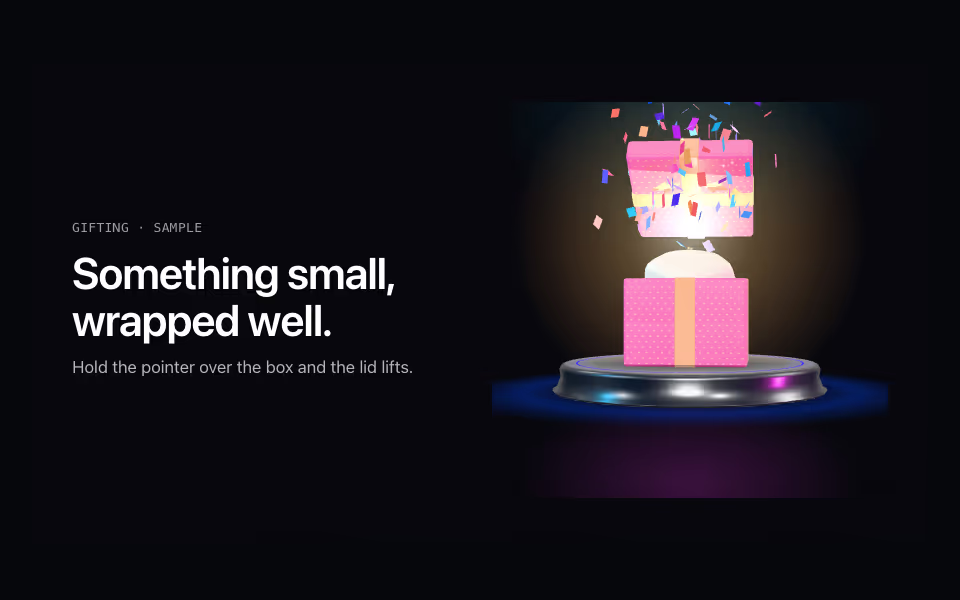
Gift Box
FreeA wrapped gift whose lid swings open on hover, with a warm light and a burst of confetti.
3D · three.js
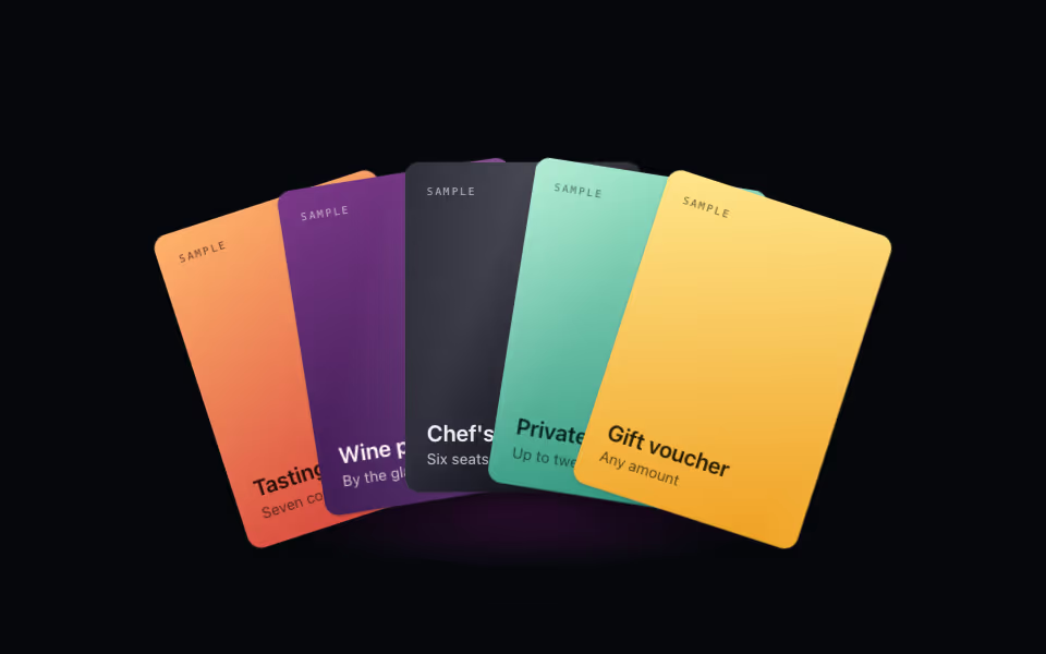
Card Fan
FreeA hand of cards: lift one on hover, bring it forward on tap, arrow keys between them. Pure CSS 3D.
3D · CSS
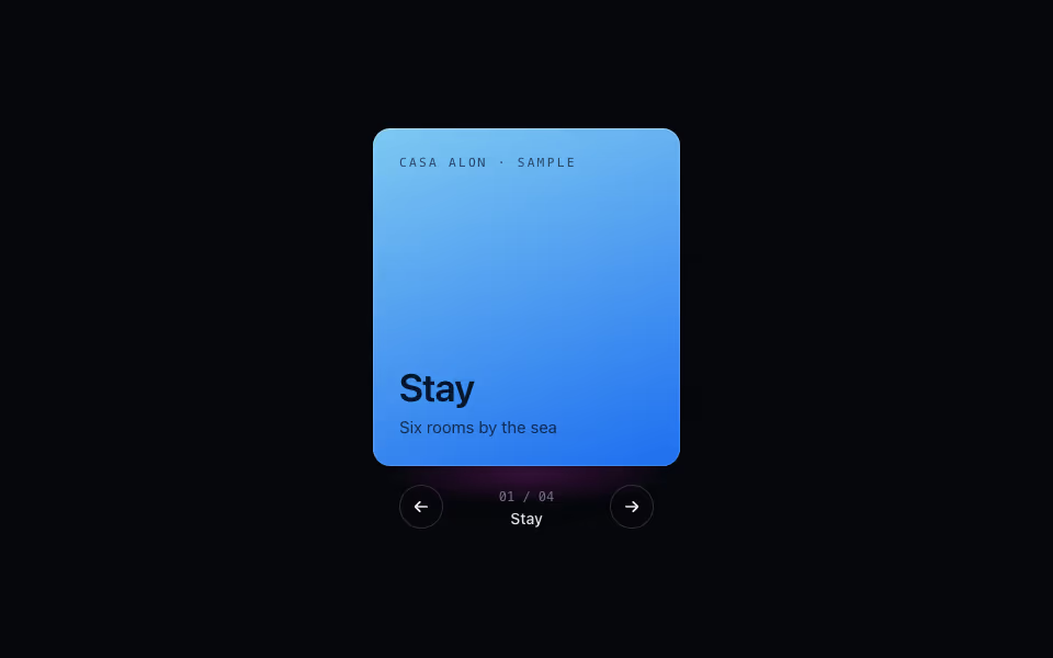
Cube Carousel
FreeContent on the faces of a turning prism: arrows, keys and drag, a face at a time. Pure CSS 3D.
3D · CSS