Thinking Indicator
An honest working line for AI chats: a small orb, a status that advances in stages, and a spectrum comet.
npx shadcn@latest add @vibebox/thinking-indicatorControls
<ThinkingIndicator />About
The moment between a question and the first word of an answer. Instead of three bouncing dots, a small orb with three circling droplets sits beside a status line that names what the assistant is doing ("Checking the packages"), then moves through honest stages ("Drafting the answer", "Writing it up") while the wait continues. A hairline below carries a travelling spectrum comet that says "working" without pretending to know a percentage. Ported from the VibeBox assistant, where the avatar is the Liquid Orb; here the default avatar is a CSS orb and any avatar can be passed in.
Use it when
- An AI or server reply takes more than a moment.
- The server can say what it is doing (searching, checking, comparing).
Skip it when
- The wait is under about 300 ms; show nothing.
- Real progress is known (an upload); show a real progress bar.
Install
- 1Add the VibeBox registry to
components.json:{ "registries": { "@vibebox": "https://motion.vibeboxph.com/r/{name}.json" } } - 2Add the component with the shadcn CLI:
npx shadcn@latest add @vibebox/thinking-indicator - 3Use it:
import { ThinkingIndicator } from "@/components/vibebox/thinking-indicator";

{status === "thinking" && <ThinkingIndicator label={serverStatus ?? "Thinking"} />}
Code
2 filescomponents/vibebox/thinking-indicator/index.tsx
/**
 * VibeBox Motion · Thinking Indicator
 * Copyright (c) 2026 VibeBox. Licensed under the VibeBox Motion Free License:
 * https://motion.vibeboxph.com/license
 * Use it in unlimited personal, commercial and client projects.
 * Do not sell or redistribute it as a component, kit, template or builder.
 */
export { ThinkingIndicator, ThinkingOrb, type ThinkingIndicatorProps } from "./thinking-indicator.client";
components/vibebox/thinking-indicator/thinking-indicator.client.tsx
/**
 * VibeBox Motion · Thinking Indicator
 * Copyright (c) 2026 VibeBox. Licensed under the VibeBox Motion Free License:
 * https://motion.vibeboxph.com/license
 * Use it in unlimited personal, commercial and client projects.
 * Do not sell or redistribute it as a component, kit, template or builder.
 */
"use client";

import { AnimatePresence, LazyMotion, MotionConfig, domAnimation, m } from "motion/react";
import { useEffect, useState, type ReactNode } from "react";
import { cn } from "@/lib/utils";
import { duration, ease } from "@/lib/vibebox/tokens/motion";

/* While an assistant prepares a reply: an avatar (a small CSS orb by default) and a shimmering
   status line that advances through honest stages, over a hairline with a spectrum comet. The
   comet says "working", never a fake percentage. */

const CSS = `
@keyframes vb-ti-shimmer { from { background-position: 100% 0; } to { background-position: -100% 0; } }
@keyframes vb-ti-comet { from { transform: translateX(-100%); } to { transform: translateX(260%); } }
@keyframes vb-ti-orbit { to { transform: rotate(360deg); } }
@keyframes vb-ti-breathe { 50% { transform: scale(0.92); } }
[data-vb-ti-label] {
  color: transparent;
  background: linear-gradient(90deg, var(--subtle-foreground) 0%, var(--subtle-foreground) 35%, var(--foreground) 50%, var(--subtle-foreground) 65%, var(--subtle-foreground) 100%);
  background-size: 200% 100%;
  -webkit-background-clip: text;
  background-clip: text;
}
[data-vb-ti-comet]::after {
  position: absolute; inset: 0; width: 40%; content: ""; border-radius: 2px; background: var(--vb-gradient-spectrum);
}
@media (prefers-reduced-motion: no-preference) {
  [data-vb-ti-label] { animation: vb-ti-shimmer 1.8s linear infinite; }
  [data-vb-ti-comet]::after { animation: vb-ti-comet 1.4s var(--ease-expo-in-out, cubic-bezier(0.65, 0, 0.35, 1)) infinite; }
  [data-vb-ti-orbit] { animation: vb-ti-orbit 2.4s linear infinite; }
  [data-vb-ti-core] { animation: vb-ti-breathe 1.8s ease-in-out infinite; }
}
@media (prefers-reduced-motion: reduce) {
  [data-vb-ti-label] { color: var(--muted-foreground); background: none; }
  [data-vb-ti-comet]::after { width: 100%; opacity: 0.5; }
}
`;

/** The default avatar: a small spectrum orb with three droplets circling it, in CSS. */
export function ThinkingOrb({ size = 44 }: { size?: number }) {
  return (
    <span aria-hidden="true" className="relative inline-block shrink-0" style={{ width: size, height: size }}>
      <span
        data-vb-ti-core=""
        className="absolute inset-[18%] rounded-full"
        style={{
          background:
            "radial-gradient(circle at 32% 30%, color-mix(in oklab, white 70%, transparent) 0%, transparent 34%), radial-gradient(circle at 50% 55%, var(--spectrum-3), var(--spectrum-1) 70%)",
          boxShadow: "0 0 24px color-mix(in oklab, var(--spectrum-3) 45%, transparent)",
        }}
      />
      <span data-vb-ti-orbit="" className="absolute inset-0">
        {[1, 4, 6].map((stop, index) => (
          <span
            key={stop}
            className="absolute size-[18%] rounded-full"
            style={{
              top: `${50 + 41 * Math.sin((index * 2 * Math.PI) / 3) - 9}%`,
              left: `${50 + 41 * Math.cos((index * 2 * Math.PI) / 3) - 9}%`,
              background: `var(--spectrum-${stop})`,
            }}
          />
        ))}
      </span>
    </span>
  );
}

const DEFAULT_STAGES = ["Drafting the answer", "Writing it up"] as const;
const DEFAULT_DELAYS = [1700, 4200] as const;

export type ThinkingIndicatorProps = {
  /** What the assistant is doing right now, for example "Checking the menu". */
  label: string;
  /** Lines that follow the label while the wait goes on. */
  stages?: readonly string[];
  /** Milliseconds before each stage appears, counted from the latest label. */
  stageDelays?: readonly number[];
  /** Replaces the default orb (for example the Liquid Orb). */
  avatar?: ReactNode;
  className?: string;
};

export function ThinkingIndicator({
  label,
  stages = DEFAULT_STAGES,
  stageDelays = DEFAULT_DELAYS,
  avatar,
  className,
}: ThinkingIndicatorProps) {
  const [stage, setStage] = useState(0);

  // Start over whenever the label changes (the assistant is looking at something new). Keyed on
  // the arrays' contents, so callers can pass inline arrays without resetting the timers.
  const stageKey = stages.join("\u0000");
  const delayKey = stageDelays.join(",");
  useEffect(() => {
    setStage(0);
    const delays = delayKey.split(",").map(Number);
    const timers = stageKey
      .split("\u0000")
      .map((_, index) => window.setTimeout(() => setStage(index + 1), delays[index] ?? 1700 * (index + 1)));
    return () => timers.forEach((timer) => window.clearTimeout(timer));
  }, [label, stageKey, delayKey]);

  const text = stage === 0 ? label : (stages[stage - 1] ?? label);

  return (
    <LazyMotion features={domAnimation} strict>
      <MotionConfig reducedMotion="user">
      <div data-vb="thinking-indicator" role="status" aria-live="polite" className={cn("flex min-h-14 items-center gap-3", className)}>
        <style href="vb-thinking-indicator" precedence="vb">
          {CSS}
        </style>
        {avatar ?? <ThinkingOrb />}
        <div className="grid min-w-0 gap-1.5">
          <AnimatePresence mode="wait" initial={false}>
            <m.span
              key={text}
              data-vb-ti-label=""
              className="font-mono text-caption whitespace-nowrap"
              initial={{ opacity: 0, y: 4 }}
              animate={{ opacity: 1, y: 0 }}
              exit={{ opacity: 0, y: -4 }}
              transition={{ duration: duration.reveal * 0.7, ease: ease.out }}
            >
              {text}
            </m.span>
          </AnimatePresence>
          <span data-vb-ti-comet="" aria-hidden="true" className="relative h-0.5 w-33 overflow-hidden rounded-full bg-foreground/10" />
        </div>
      </div>
      </MotionConfig>
    </LazyMotion>
  );
}
Props
| Prop | Type | Default | Description |
|---|---|---|---|
| label * | string | — | What the assistant is doing now, e.g. "Checking the menu". |
| stages | readonly string[] | ["Drafting the answer", "Writing it up"] | Lines that follow the label while the wait goes on. |
| stageDelays | readonly number[] | [1700, 4200] | Milliseconds before each stage, counted from the latest label. |
| avatar | ReactNode | — | Replaces the default CSS orb. |
| className | string | — | Merged with cn(). |
Accessibility and motion
- Keyboard
- Not focusable; it has no actions.
- Screen readers
- role="status" with aria-live="polite": each stage is announced once; the orb and comet are hidden.
- Touch
- Nothing to touch.
- Reduced motion
- A still orb, the status in muted text, and a full, faint hairline.
Edge cases and limits
- Long labels do not wrap; they are clipped by the container.
- An empty
stageslist keeps the label until it changes.
Related
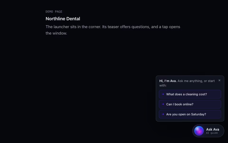
The front of an AI chat: a magnetic launcher with a question teaser, a window or phone sheet, and a quick menu.
AI and chat · Motion
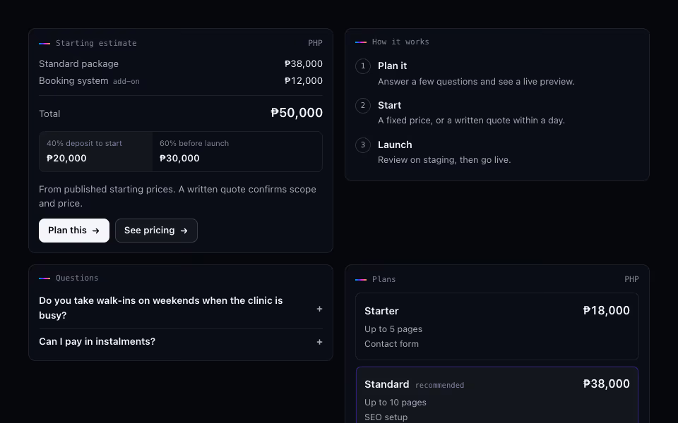
Rich Reply Cards
FreeTyped cards for AI chat replies: links, steps, plans, estimates, projects and FAQs, rendered from data.
AI and chat · Server
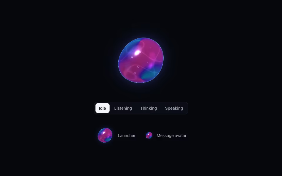
Liquid Orb
ProA living liquid drop for an AI assistant: it listens, thinks and speaks, dents under touch and morphs between shapes.
3D · WebGL2