Chat Launcher Kit
The front of an AI chat: a magnetic launcher with a question teaser, a window or phone sheet, and a quick menu.
npx shadcn@latest add @vibebox/chat-launcher-kitControls
<HTMLButtonElement />About
Everything around an assistant except the assistant. ChatLauncher is a frosted pill on wide screens ("Ask Ava · AI guide") and a round button with a slow spectrum ripple on phones. It leans up to 6 px toward a nearby cursor, offers two or three questions after a delay, names itself once on phones, and brings the questions back on a long press. ChatWindow is a floating panel on wide screens and a full-screen sheet on phones, with real dialog behaviour. QuickMenu is the composer's "+" menu with real menu keyboard support. Your code owns the conversation, the API, storage and analytics. Ported from the VibeBox assistant dock, separated from its knowledge base and API.
Use it when
- A site has an assistant, live chat or a question helper.
Skip it when
- The page is a checkout or a form; a floating launcher competes with the task.
Install
- 1Add the VibeBox registry to
components.json:{ "registries": { "@vibebox": "https://motion.vibeboxph.com/r/{name}.json" } } - 2Add the component with the shadcn CLI:
npx shadcn@latest add @vibebox/chat-launcher-kit - 3Use it:
"use client";
const [open, setOpen] = useState(false);
const launcher = useRef<HTMLButtonElement>(null);

<ChatLauncher ref={launcher} name="Ava" open={open} onOpen={() => setOpen(true)} questions={questions} onAsk={(q) => { setOpen(true); send(q.prompt); }} controls="chat" />
<ChatWindow id="chat" open={open} onClose={() => setOpen(false)} title="Ava" returnFocusRef={launcher} footer={<Composer />}>
  <Messages />
</ChatWindow>
Code
5 filescomponents/vibebox/chat-launcher-kit/chat-launcher.client.tsx
/**
* VibeBox Motion · Chat Launcher Kit
* Copyright (c) 2026 VibeBox. Licensed under the VibeBox Motion Free License:
* https://motion.vibeboxph.com/license
* Use it in unlimited personal, commercial and client projects.
* Do not sell or redistribute it as a component, kit, template or builder.
*/
"use client";
import { AnimatePresence, LazyMotion, MotionConfig, domAnimation, m, useMotionValue, useSpring } from "motion/react";
import { forwardRef, useCallback, useEffect, useRef, useState, type ReactNode } from "react";
import { cn } from "@/lib/utils";
import { useFinePointer, useMediaQuery, useReducedMotion } from "@/lib/vibebox/hooks";
import { ease } from "@/lib/vibebox/tokens/motion";
import { ArrowIcon, CloseIcon, DefaultAvatar, type QuickQuestion } from "./shared";
/* The chat launcher: a frosted pill on wide screens ("Ask {name}"), a round button with a
spectrum ripple on phones. It leans up to 6px toward a nearby cursor, a teaser offers a few
questions after a delay, a label slides out once on phones, and a long press on the round
button brings the questions back. It hides while the chat window is open. */
const CSS = `
@keyframes vb-clk-ripple { 0% { opacity: 0.7; transform: scale(1); } 38%, 100% { opacity: 0; transform: scale(1.55); } }
@media (prefers-reduced-motion: no-preference) and (max-width: 640px) {
[data-vb-clk-ripple] { animation: vb-clk-ripple 5.5s var(--ease-expo-out, cubic-bezier(0.16, 1, 0.3, 1)) 1.2s infinite; }
}
`;
const MAGNET_PX = 6;
const MAGNET_RANGE = 120;
const LONG_PRESS_MS = 450;
export type ChatLauncherProps = {
/** The assistant's name: the pill reads "Ask {name}". */
name: string;
/** A short line under the name, e.g. "AI guide". */
subtitle?: string;
avatar?: ReactNode;
/** The chat window is open; the launcher steps aside. */
open: boolean;
onOpen: () => void;
/** Questions for the teaser (two or three read best). */
questions?: readonly QuickQuestion[];
/** A teaser question was tapped: open the window and send `question.prompt`. */
onAsk?: (question: QuickQuestion) => void;
/** When and how long the teaser shows; `false` turns it off. Show it once per visit by passing false after onTeaserDismiss. */
teaser?: false | { delayMs?: number; hideAfterMs?: number; intro?: ReactNode };
onTeaserDismiss?: () => void;
/** The phone label that slides out once; `false` turns it off. */
hint?: false | string;
/** Id of the chat window, for aria-controls. */
controls?: string;
className?: string;
};
export const ChatLauncher = forwardRef<HTMLButtonElement, ChatLauncherProps>(function ChatLauncher(
{ name, subtitle = "AI guide", avatar, open, onOpen, questions = [], onAsk, teaser = {}, onTeaserDismiss, hint = "tap to talk", controls, className },
ref,
) {
const reduced = useReducedMotion();
const fine = useFinePointer();
const phone = useMediaQuery("(max-width: 640px)");
const [teaserOpen, setTeaserOpen] = useState(false);
const [hintOpen, setHintOpen] = useState(false);
const slotRef = useRef<HTMLDivElement>(null);
const press = useRef({ timer: 0, long: false });
const delay = teaser ? (teaser.delayMs ?? 9000) : 0;
const hideAfter = teaser ? (teaser.hideAfterMs ?? 14000) : 0;
const canTease = teaser !== false && questions.length > 0;
const dismissTeaser = useCallback(() => {
setTeaserOpen(false);
onTeaserDismiss?.();
}, [onTeaserDismiss]);
// The teaser arrives once, after a delay, while the window is closed.
useEffect(() => {
if (!canTease || open) return;
const timer = window.setTimeout(() => setTeaserOpen(true), phone && hint ? Math.max(delay, 7800) : delay);
return () => window.clearTimeout(timer);
}, [canTease, open, delay, phone, hint]);
useEffect(() => {
if (!teaserOpen || !hideAfter) return;
const timer = window.setTimeout(dismissTeaser, hideAfter);
return () => window.clearTimeout(timer);
}, [teaserOpen, hideAfter, dismissTeaser]);
useEffect(() => {
if (open) setTeaserOpen(false);
}, [open]);
// Phones: name the round launcher once.
useEffect(() => {
if (!phone || !hint || open) return;
const show = window.setTimeout(() => setHintOpen(true), 1400);
const hide = window.setTimeout(() => setHintOpen(false), 7400);
return () => {
window.clearTimeout(show);
window.clearTimeout(hide);
};
}, [phone, hint, open]);
// Magnetic lean toward a nearby cursor.
const magnetX = useMotionValue(0);
const magnetY = useMotionValue(0);
const x = useSpring(magnetX, { stiffness: 320, damping: 22, mass: 0.5 });
const y = useSpring(magnetY, { stiffness: 320, damping: 22, mass: 0.5 });
useEffect(() => {
magnetX.set(0);
magnetY.set(0);
if (open || reduced || !fine) return;
let frame = 0;
let px = 0;
let py = 0;
const pull = () => {
frame = 0;
const slot = slotRef.current;
if (!slot) return;
const rect = slot.getBoundingClientRect();
const dx = px - (rect.left + rect.width / 2);
const dy = py - (rect.top + rect.height / 2);
const distance = Math.hypot(dx, dy);
const reach = Math.max(rect.width, rect.height) / 2 + MAGNET_RANGE;
const strength = distance > 0 && distance < reach ? 1 - distance / reach : 0;
magnetX.set(strength ? (dx / distance) * MAGNET_PX * strength : 0);
magnetY.set(strength ? (dy / distance) * MAGNET_PX * strength : 0);
};
const onMove = (event: PointerEvent) => {
px = event.clientX;
py = event.clientY;
if (!frame) frame = requestAnimationFrame(pull);
};
window.addEventListener("pointermove", onMove, { passive: true });
return () => {
window.removeEventListener("pointermove", onMove);
cancelAnimationFrame(frame);
};
}, [open, reduced, fine, magnetX, magnetY]);
const cancelPress = () => window.clearTimeout(press.current.timer);
return (
<LazyMotion features={domAnimation} strict>
<MotionConfig reducedMotion="user">
<style href="vb-chat-launcher" precedence="vb">
{CSS}
</style>
<AnimatePresence>
{!open && (
<m.div
key="launcher"
ref={slotRef}
data-vb="chat-launcher-kit"
className={cn("fixed right-4 bottom-[max(16px,env(safe-area-inset-bottom))] z-(--vb-z-header) sm:bottom-6", className)}
initial={{ opacity: 0, y: 12, scale: 0.92 }}
animate={{ opacity: 1, y: 0, scale: 1 }}
exit={{ opacity: 0, scale: 0.9, transition: { duration: 0.14 } }}
transition={{ duration: 0.4, ease: ease.out }}
>
<AnimatePresence>
{teaserOpen && (
<m.div
key="teaser"
role="group"
aria-label={`Questions for ${name}`}
className="absolute right-0 bottom-[calc(100%+12px)] grid w-[min(288px,calc(100vw-32px))] gap-2.5 rounded-lg border border-border-strong bg-popover p-3 text-[0.84rem] leading-snug text-muted-foreground shadow-md"
initial={{ opacity: 0, y: 8 }}
animate={{ opacity: 1, y: 0 }}
exit={{ opacity: 0, y: 6, transition: { duration: 0.16 } }}
transition={{ duration: 0.36, ease: ease.out }}
>
<p className="m-0 pr-6 pl-0.5">
{teaser && teaser.intro ? (
teaser.intro
) : (
<>
<strong className="font-semibold text-foreground">Hi, I'm {name}.</strong> Ask me anything, or start with:
</>
)}
</p>
<div className="grid gap-1.5">
{questions.slice(0, 3).map((question) => (
<button
key={question.id}
type="button"
onClick={() => {
dismissTeaser();
onAsk?.(question);
}}
className="group flex min-h-9 cursor-pointer items-center gap-2 rounded-md border border-[color-mix(in_oklab,var(--spectrum-3)_32%,transparent)] bg-[color-mix(in_oklab,var(--spectrum-3)_8%,transparent)] px-2.5 py-1.5 text-left text-[0.82rem] leading-tight font-medium text-foreground transition-colors duration-(--vb-duration-micro) hover:bg-[color-mix(in_oklab,var(--spectrum-3)_16%,transparent)] focus-visible:ring-2 focus-visible:ring-ring focus-visible:outline-none pointer-coarse:min-h-[42px]"
>
<span className="text-spectrum-3 transition-transform duration-200 group-hover:translate-x-0.5">
<ArrowIcon />
</span>
{question.label}
</button>
))}
</div>
<button
type="button"
aria-label="Dismiss"
onClick={dismissTeaser}
className="absolute top-1.5 right-1.5 grid size-[26px] cursor-pointer place-items-center rounded-md text-subtle-foreground hover:bg-accent hover:text-foreground focus-visible:ring-2 focus-visible:ring-ring focus-visible:outline-none"
>
<CloseIcon size={12} />
</button>
</m.div>
)}
</AnimatePresence>
<AnimatePresence>
{hintOpen && !teaserOpen && (
<m.div
key="hint"
aria-hidden="true"
className="pointer-events-none absolute top-1/2 right-[calc(100%+10px)] grid -translate-y-1/2 gap-px rounded-xl border border-border-strong bg-popover py-2 pr-3 pl-3.5 whitespace-nowrap text-foreground shadow-md sm:hidden"
initial={{ opacity: 0, x: 10 }}
animate={{ opacity: 1, x: 0 }}
exit={{ opacity: 0, x: 6 }}
transition={{ duration: 0.36, ease: ease.out }}
>
<strong className="text-[0.88rem] font-semibold tracking-[-0.01em]">Ask {name}</strong>
<span className="font-mono text-[0.64rem] text-subtle-foreground">
{subtitle} · {hint}
</span>
</m.div>
)}
</AnimatePresence>
<m.div style={{ x, y }}>
<button
ref={ref}
type="button"
aria-label={`Ask ${name}, ${subtitle}`}
aria-haspopup="dialog"
aria-expanded={false}
aria-controls={controls}
onClick={() => {
if (press.current.long) {
press.current.long = false;
return;
}
setHintOpen(false);
onOpen();
}}
onPointerDown={(event) => {
if (event.pointerType === "mouse" || !canTease) return;
cancelPress();
press.current = {
long: false,
timer: window.setTimeout(() => {
press.current.long = true;
setHintOpen(false);
setTeaserOpen(true);
}, LONG_PRESS_MS),
};
}}
onPointerUp={cancelPress}
onPointerLeave={cancelPress}
onContextMenu={(event) => {
if (canTease) event.preventDefault();
}}
className={cn(
"relative inline-flex h-[54px] cursor-pointer items-center gap-2.5 rounded-full border border-border-strong bg-popover/90 py-0 pr-5 pl-[7px] text-foreground shadow-md backdrop-blur-md select-none [-webkit-touch-callout:none]",
"focus-visible:ring-2 focus-visible:ring-ring focus-visible:ring-offset-2 focus-visible:ring-offset-background focus-visible:outline-none",
"max-sm:size-[60px] max-sm:justify-center max-sm:p-0",
)}
>
<span
data-vb-clk-ripple=""
aria-hidden="true"
className="pointer-events-none absolute -inset-[3px] -z-10 hidden rounded-full opacity-0 max-sm:block"
style={{
background: "conic-gradient(from 200deg, var(--spectrum-1), var(--spectrum-2), var(--spectrum-3), var(--spectrum-4), var(--spectrum-5), var(--spectrum-6), var(--spectrum-7), var(--spectrum-1))",
mask: "radial-gradient(farthest-side, transparent calc(100% - 2px), #000 calc(100% - 2px))",
WebkitMask: "radial-gradient(farthest-side, transparent calc(100% - 2px), #000 calc(100% - 2px))",
}}
/>
{avatar ?? <DefaultAvatar />}
<span className="grid text-left leading-[1.15] max-sm:sr-only">
<span className="text-[0.92rem] font-semibold tracking-[-0.01em]">Ask {name}</span>
<span className="font-mono text-[0.64rem] text-subtle-foreground">{subtitle}</span>
</span>
</button>
</m.div>
</m.div>
)}
</AnimatePresence>
</MotionConfig>
</LazyMotion>
);
});components/vibebox/chat-launcher-kit/chat-window.client.tsx
/**
 * VibeBox Motion · Chat Launcher Kit
 * Copyright (c) 2026 VibeBox. Licensed under the VibeBox Motion Free License:
 * https://motion.vibeboxph.com/license
 * Use it in unlimited personal, commercial and client projects.
 * Do not sell or redistribute it as a component, kit, template or builder.
 */
"use client";

import { AnimatePresence, LazyMotion, MotionConfig, domAnimation, m } from "motion/react";
import { useEffect, useId, useRef, type KeyboardEvent, type ReactNode, type RefObject } from "react";
import { cn } from "@/lib/utils";
import { useMediaQuery } from "@/lib/vibebox/hooks";
import { ease } from "@/lib/vibebox/tokens/motion";
import { CloseIcon, DefaultAvatar } from "./shared";

/* The chat window: a floating panel on wide screens and a full-screen sheet on phones that sits
   above the keyboard. Escape closes it and focus returns to the launcher; on phones the page
   behind stops scrolling and Tab stays inside the sheet. The conversation is yours to render. */

const FOCUSABLE = 'a[href], button:not([disabled]), textarea:not([disabled]), input:not([disabled]), select:not([disabled]), [tabindex]:not([tabindex="-1"])';

export type ChatWindowProps = {
  open: boolean;
  onClose: () => void;
  /** The assistant's name, shown in the header and naming the dialog. */
  title: string;
  subtitle?: string;
  avatar?: ReactNode;
  /** Header buttons before the close button (new chat, expand). */
  actions?: ReactNode;
  /** The conversation. */
  children: ReactNode;
  /** The composer. */
  footer?: ReactNode;
  id?: string;
  /** Focus returns here when the window closes (usually the launcher). */
  returnFocusRef?: RefObject<HTMLElement | null>;
  className?: string;
};

export function ChatWindow({ open, onClose, title, subtitle, avatar, actions, children, footer, id, returnFocusRef, className }: ChatWindowProps) {
  const phone = useMediaQuery("(max-width: 640px)");
  const panelRef = useRef<HTMLDivElement>(null);
  const titleId = useId();

  // Move focus in on open; give it back on close.
  useEffect(() => {
    if (!open) return;
    const previous = document.activeElement as HTMLElement | null;
    const frame = requestAnimationFrame(() => {
      const panel = panelRef.current;
      const target = panel?.querySelector<HTMLElement>("textarea, input") ?? panel?.querySelector<HTMLElement>(FOCUSABLE);
      target?.focus({ preventScroll: true });
    });
    return () => {
      cancelAnimationFrame(frame);
      const back = returnFocusRef?.current ?? previous;
      requestAnimationFrame(() => back?.focus?.({ preventScroll: true }));
    };
  }, [open, returnFocusRef]);

  // Phones: the page behind the sheet stops scrolling.
  useEffect(() => {
    if (!open || !phone) return;
    const root = document.documentElement;
    const previous = root.style.overflow;
    root.style.overflow = "hidden";
    return () => {
      root.style.overflow = previous;
    };
  }, [open, phone]);

  const onKeyDown = (event: KeyboardEvent<HTMLDivElement>) => {
    if (event.key === "Escape" && !event.defaultPrevented) {
      event.stopPropagation();
      onClose();
      return;
    }
    if (event.key !== "Tab" || !phone || !panelRef.current) return;
    const focusable = [...panelRef.current.querySelectorAll<HTMLElement>(FOCUSABLE)].filter((el) => el.offsetParent !== null);
    const first = focusable[0];
    const last = focusable[focusable.length - 1];
    if (!first || !last) return;
    if (event.shiftKey && document.activeElement === first) {
      event.preventDefault();
      last.focus();
    } else if (!event.shiftKey && document.activeElement === last) {
      event.preventDefault();
      first.focus();
    }
  };

  return (
    <LazyMotion features={domAnimation} strict>
      <MotionConfig reducedMotion="user">
      <AnimatePresence>
        {open && (
          <m.div
            key="window"
            ref={panelRef}
            id={id}
            data-vb="chat-window"
            role="dialog"
            aria-modal={phone || undefined}
            aria-labelledby={titleId}
            onKeyDown={onKeyDown}
            className={cn(
              "fixed z-(--vb-z-modal) flex flex-col overflow-hidden border border-border-strong bg-popover text-popover-foreground shadow-md",
              "inset-0 h-dvh sm:inset-auto sm:right-6 sm:bottom-6 sm:h-[min(640px,calc(100dvh-48px))] sm:w-[400px] sm:rounded-xl",
              className,
            )}
            initial={phone ? { y: "100%" } : { opacity: 0, y: 16, scale: 0.96 }}
            animate={phone ? { y: 0 } : { opacity: 1, y: 0, scale: 1 }}
            exit={phone ? { y: "100%" } : { opacity: 0, y: 12, scale: 0.97 }}
            transition={{ duration: phone ? 0.42 : 0.32, ease: phone ? ease.drawer : ease.out }}
            style={{ transformOrigin: "bottom right" }}
          >
            <header className="flex items-center gap-3 border-b border-border px-4 py-3">
              {avatar ?? <DefaultAvatar size={36} />}
              <div className="grid min-w-0 flex-1 leading-tight">
                <h2 id={titleId} className="m-0 truncate text-base font-semibold text-foreground">
                  {title}
                </h2>
                {subtitle && <span className="font-mono text-[0.68rem] text-subtle-foreground">{subtitle}</span>}
              </div>
              {actions}
              <button
                type="button"
                aria-label="Close chat"
                onClick={onClose}
                className="grid size-9 cursor-pointer place-items-center rounded-md text-muted-foreground hover:bg-accent hover:text-foreground focus-visible:ring-2 focus-visible:ring-ring focus-visible:outline-none"
              >
                <CloseIcon />
              </button>
            </header>
            <div className="min-h-0 flex-1 overflow-y-auto overscroll-contain px-4 py-4">{children}</div>
            {footer && <div className="border-t border-border p-3 pb-[max(12px,env(safe-area-inset-bottom))]">{footer}</div>}
          </m.div>
        )}
      </AnimatePresence>
      </MotionConfig>
    </LazyMotion>
  );
}
components/vibebox/chat-launcher-kit/index.tsx
/**
 * VibeBox Motion · Chat Launcher Kit
 * Copyright (c) 2026 VibeBox. Licensed under the VibeBox Motion Free License:
 * https://motion.vibeboxph.com/license
 * Use it in unlimited personal, commercial and client projects.
 * Do not sell or redistribute it as a component, kit, template or builder.
 */
export { ChatLauncher, type ChatLauncherProps } from "./chat-launcher.client";
export { ChatWindow, type ChatWindowProps } from "./chat-window.client";
export { QuickMenu, type QuickMenuProps } from "./quick-menu.client";
export { DefaultAvatar, type QuickQuestion } from "./shared";
components/vibebox/chat-launcher-kit/quick-menu.client.tsx
/**
 * VibeBox Motion · Chat Launcher Kit
 * Copyright (c) 2026 VibeBox. Licensed under the VibeBox Motion Free License:
 * https://motion.vibeboxph.com/license
 * Use it in unlimited personal, commercial and client projects.
 * Do not sell or redistribute it as a component, kit, template or builder.
 */
"use client";

import { AnimatePresence, LazyMotion, MotionConfig, domAnimation, m } from "motion/react";
import { useEffect, useId, useRef, useState, type KeyboardEvent } from "react";
import { cn } from "@/lib/utils";
import { ease } from "@/lib/vibebox/tokens/motion";
import { PlusIcon, type QuickQuestion } from "./shared";

/* The composer's "+" menu: this page's question first, then a short list, each with a one-line
   hint. A real menu: arrow keys move between items (two columns, one under 360px), Home and End
   jump, Escape closes the menu alone, and it closes on pick, on outside click, and while busy. */

export type QuickMenuProps = {
  items: readonly QuickQuestion[];
  onPick: (item: QuickQuestion) => void;
  /** A question about the current page, shown first. */
  pageItem?: QuickQuestion;
  /** The assistant is replying; the menu stays closed. */
  disabled?: boolean;
  label?: string;
  className?: string;
};

export function QuickMenu({ items, onPick, pageItem, disabled = false, label = "Quick questions", className }: QuickMenuProps) {
  const [open, setOpen] = useState(false);
  const rootRef = useRef<HTMLDivElement>(null);
  const triggerRef = useRef<HTMLButtonElement>(null);
  const itemRefs = useRef<Array<HTMLButtonElement | null>>([]);
  const menuId = useId();
  const all = pageItem ? [pageItem, ...items.filter((item) => item.id !== pageItem.id)] : [...items];

  useEffect(() => {
    if (disabled) setOpen(false);
  }, [disabled]);

  useEffect(() => {
    if (!open) return;
    const frame = requestAnimationFrame(() => itemRefs.current[0]?.focus());
    const onDown = (event: PointerEvent) => {
      if (!rootRef.current?.contains(event.target as Node)) setOpen(false);
    };
    document.addEventListener("pointerdown", onDown);
    return () => {
      cancelAnimationFrame(frame);
      document.removeEventListener("pointerdown", onDown);
    };
  }, [open]);

  const close = (focusTrigger = true) => {
    setOpen(false);
    if (focusTrigger) requestAnimationFrame(() => triggerRef.current?.focus());
  };

  const columns = () => (typeof window !== "undefined" && window.matchMedia("(max-width: 359px)").matches ? 1 : 2);

  const onMenuKey = (event: KeyboardEvent<HTMLDivElement>) => {
    const index = itemRefs.current.findIndex((item) => item === document.activeElement);
    const count = all.length;
    const step = columns();
    let next = -1;
    if (event.key === "ArrowDown") next = Math.min(count - 1, index + step);
    else if (event.key === "ArrowUp") next = index - step >= 0 ? index - step : index;
    else if (event.key === "ArrowRight") next = Math.min(count - 1, index + 1);
    else if (event.key === "ArrowLeft") next = Math.max(0, index - 1);
    else if (event.key === "Home") next = 0;
    else if (event.key === "End") next = count - 1;
    else if (event.key === "Escape") {
      // Close the menu only; the chat window must not see this Escape.
      event.preventDefault();
      event.stopPropagation();
      close();
      return;
    } else if (event.key === "Tab") {
      close(false);
      return;
    }
    if (next >= 0) {
      event.preventDefault();
      itemRefs.current[next]?.focus();
    }
  };

  return (
    <LazyMotion features={domAnimation} strict>
      <MotionConfig reducedMotion="user">
      <div ref={rootRef} data-vb="quick-menu" className={cn("relative", className)}>
        <button
          ref={triggerRef}
          type="button"
          aria-label={label}
          aria-haspopup="menu"
          aria-expanded={open}
          aria-controls={open ? menuId : undefined}
          disabled={disabled}
          onClick={() => setOpen((value) => !value)}
          className="grid size-9 cursor-pointer place-items-center rounded-md border border-border-strong bg-muted text-foreground transition-colors duration-(--vb-duration-micro) hover:bg-accent focus-visible:ring-2 focus-visible:ring-ring focus-visible:outline-none disabled:cursor-not-allowed disabled:opacity-50 aria-expanded:bg-accent"
        >
          <m.span animate={{ rotate: open ? 45 : 0 }} transition={{ duration: 0.2, ease: ease.out }} className="grid">
            <PlusIcon />
          </m.span>
        </button>
        <AnimatePresence>
          {open && (
            <m.div
              key="menu"
              id={menuId}
              role="menu"
              aria-label={label}
              onKeyDown={onMenuKey}
              className="absolute bottom-[calc(100%+8px)] left-0 z-10 grid w-[min(360px,calc(100vw-32px))] grid-cols-2 gap-1 rounded-lg border border-border-strong bg-popover p-1.5 shadow-md max-[359px]:grid-cols-1"
              initial={{ opacity: 0, y: 6, scale: 0.98 }}
              animate={{ opacity: 1, y: 0, scale: 1 }}
              exit={{ opacity: 0, y: 4, transition: { duration: 0.12 } }}
              transition={{ duration: 0.22, ease: ease.out }}
              style={{ transformOrigin: "bottom left" }}
            >
              {all.map((item, index) => (
                <button
                  key={item.id}
                  ref={(el) => {
                    itemRefs.current[index] = el;
                  }}
                  type="button"
                  role="menuitem"
                  tabIndex={-1}
                  onClick={() => {
                    close(false);
                    onPick(item);
                  }}
                  className={cn(
                    "grid cursor-pointer grid-cols-[auto_1fr] items-start gap-x-2 rounded-md px-2.5 py-2 text-left hover:bg-accent focus-visible:bg-accent focus-visible:outline-none",
                    pageItem && index === 0 && "col-span-full border border-border",
                  )}
                >
                  <span aria-hidden="true" className="mt-0.5 text-spectrum-3">
                    {item.icon ?? "›"}
                  </span>
                  <span className="grid">
                    {pageItem && index === 0 && <span className="font-mono text-[0.62rem] text-subtle-foreground">On this page</span>}
                    <span className="text-[0.82rem] leading-tight font-semibold text-foreground">{item.label}</span>
                    {item.hint && <span className="mt-0.5 text-[0.72rem] leading-snug text-muted-foreground">{item.hint}</span>}
                  </span>
                </button>
              ))}
            </m.div>
          )}
        </AnimatePresence>
      </div>
      </MotionConfig>
    </LazyMotion>
  );
}
components/vibebox/chat-launcher-kit/shared.tsx
/**
 * VibeBox Motion · Chat Launcher Kit
 * Copyright (c) 2026 VibeBox. Licensed under the VibeBox Motion Free License:
 * https://motion.vibeboxph.com/license
 * Use it in unlimited personal, commercial and client projects.
 * Do not sell or redistribute it as a component, kit, template or builder.
 */
import type { ReactNode } from "react";

/** A question the visitor can ask in one tap. `prompt` is what gets sent. */
export type QuickQuestion = { id: string; label: string; prompt: string; hint?: string; icon?: ReactNode };

export function ArrowIcon({ size = 12 }: { size?: number }) {
  return (
    <svg width={size} height={size} viewBox="0 0 16 16" fill="none" aria-hidden="true" className="shrink-0">
      <path d="M3 8h10M9 4l4 4-4 4" stroke="currentColor" strokeWidth="1.7" strokeLinecap="round" strokeLinejoin="round" />
    </svg>
  );
}

export function CloseIcon({ size = 14 }: { size?: number }) {
  return (
    <svg width={size} height={size} viewBox="0 0 16 16" fill="none" aria-hidden="true">
      <path d="M4 4l8 8M12 4l-8 8" stroke="currentColor" strokeWidth="1.7" strokeLinecap="round" />
    </svg>
  );
}

export function PlusIcon({ size = 16 }: { size?: number }) {
  return (
    <svg width={size} height={size} viewBox="0 0 16 16" fill="none" aria-hidden="true">
      <path d="M8 3v10M3 8h10" stroke="currentColor" strokeWidth="1.7" strokeLinecap="round" />
    </svg>
  );
}

/** The default avatar: a small spectrum sphere. Pass your own (for example the Liquid Orb). */
export function DefaultAvatar({ size = 40 }: { size?: number }) {
  return (
    <span
      aria-hidden="true"
      className="block shrink-0 rounded-full"
      style={{
        width: size,
        height: size,
        background:
          "radial-gradient(circle at 32% 28%, color-mix(in oklab, white 75%, transparent) 0%, transparent 30%), radial-gradient(circle at 55% 60%, var(--spectrum-4), var(--spectrum-3) 45%, var(--spectrum-1) 85%)",
        boxShadow: "inset 0 -6px 12px color-mix(in oklab, black 25%, transparent), 0 0 18px color-mix(in oklab, var(--spectrum-3) 40%, transparent)",
      }}
    />
  );
}
Props
| Prop | Type | Default | Description |
|---|---|---|---|
| name * | string | — | ChatLauncher: the assistant's name ("Ask {name}"). |
| open * | boolean | — | ChatLauncher and ChatWindow: whether the window is open. |
| onOpen * | () => void | — | ChatLauncher: open the window. |
| questions | readonly QuickQuestion[] | — | ChatLauncher: questions for the teaser. |
| onAsk | (question) => void | — | ChatLauncher: a teaser question was tapped. |
| teaser | false | { delayMs, hideAfterMs, intro } | { delayMs: 9000, hideAfterMs: 14000 } | ChatLauncher: when the teaser shows. |
| onClose * | () => void | — | ChatWindow: close the window. |
| title * | string | — | ChatWindow: the header title and dialog name. |
| items * | readonly QuickQuestion[] | — | QuickMenu: the questions. |
| onPick * | (item) => void | — | QuickMenu: a question was picked. |
| className | string | — | Each part: merged with cn(). |
Accessibility and motion
- Keyboard
- The launcher is a button (aria-haspopup=dialog). The window traps Tab on phones and closes with Escape, returning focus. The menu uses arrow keys, Home, End and Escape.
- Screen readers
- The window is a labelled dialog (modal on phones); the teaser is a named group; the menu has menu and menuitem roles.
- Touch
- Teaser questions are 42 px tall on coarse pointers; a 450 ms press on the round launcher shows the questions; the lean is mouse only.
- Reduced motion
- The launcher, teaser, window and menu appear and leave without movement; no ripple or lean.
Edge cases and limits
- The launcher sits above page content at
--vb-z-header; move it withclassNameif a cookie banner or scroll rail shares the corner. - The window locks page scroll only on phones.
Related
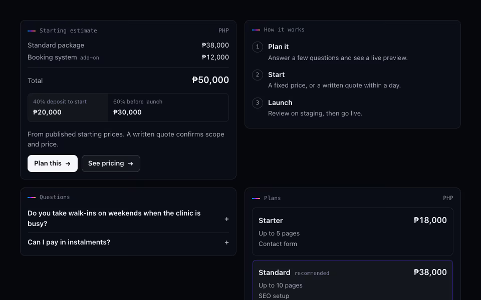
Rich Reply Cards
FreeTyped cards for AI chat replies: links, steps, plans, estimates, projects and FAQs, rendered from data.
AI and chat · Server
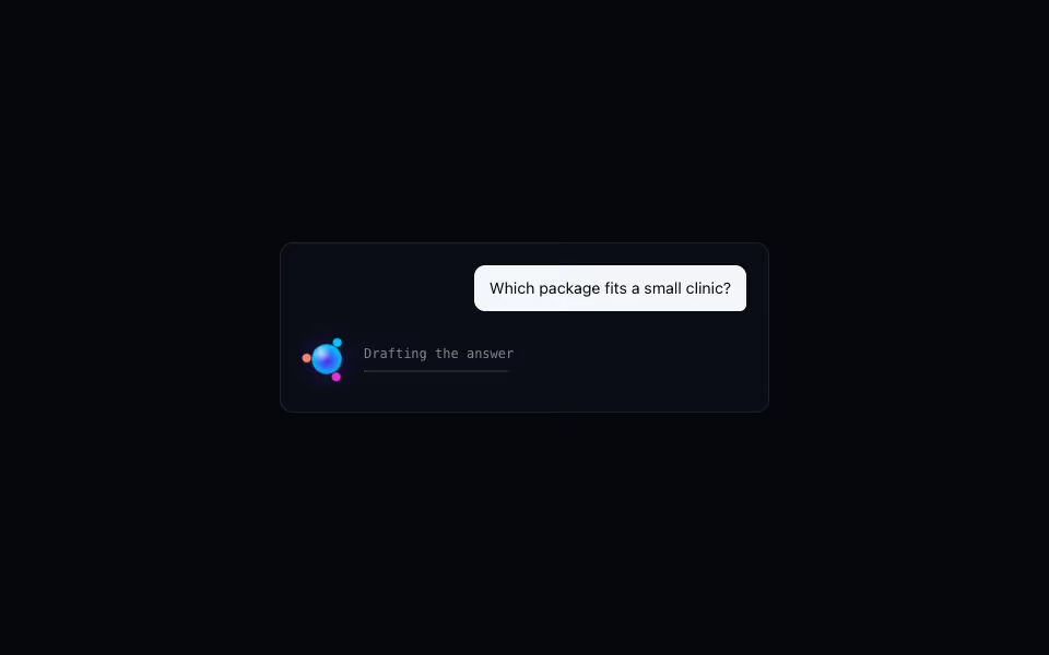
An honest working line for AI chats: a small orb, a status that advances in stages, and a spectrum comet.
AI and chat · Motion
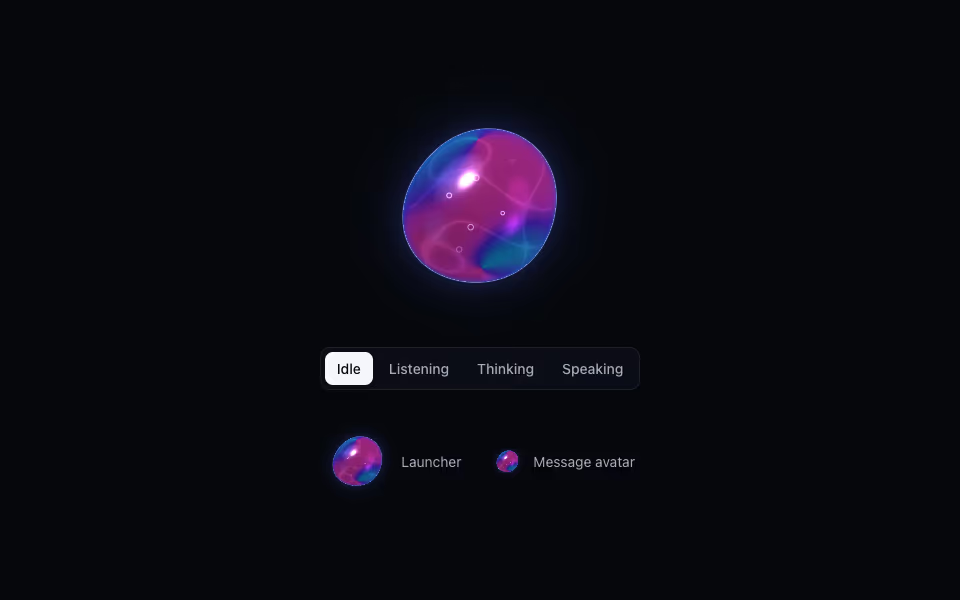
Liquid Orb
ProA living liquid drop for an AI assistant: it listens, thinks and speaks, dents under touch and morphs between shapes.
3D · WebGL2