About
A card in a 900 px perspective, rotated about two axes by the pointer's position over it, with its content lifted 30 px off its face so the lean gives parallax. Two layers sit on top: a foil of repeating spectrum bands (and a fine dot pattern) whose background position follows the pointer under color-dodge, so it reads as light bending in a film, and a radial glare under soft-light. All three effects read the same two properties, --hx and --hy, so one event updates everything.
Use it when
- A membership, loyalty, gift or access card on a page.
- A pricing or tier card that should feel precious.
- A badge or certificate.
Skip it when
- The card carries long text.
- The audience is mostly on desktop without pointers: the lean needs touch or a mouse.
Install
- 1Add the VibeBox registry to
components.json:{ "registries": { "@vibebox": "https://motion.vibeboxph.com/r/{name}.json" } } - 2Add the component with the shadcn CLI:
npx shadcn@latest add @vibebox/holo-card - 3Use it:
import { HoloCard } from "@/components/vibebox/holo-card";

<HoloCard className="w-full max-w-[460px]" kicker="Gold tier" title="Casa Alon" detail="Member since 2024" footer="Priority booking" />
Code
2 filescomponents/vibebox/holo-card/holo-card.client.tsx
/**
 * VibeBox Motion · Holo Card
 * Copyright (c) 2026 VibeBox. Licensed under the VibeBox Motion Free License:
 * https://motion.vibeboxph.com/license
 * Use it in unlimited personal, commercial and client projects.
 * Do not sell or redistribute it as a component, kit, template or builder.
 */
"use client";

import { useRef, type CSSProperties, type PointerEvent as ReactPointerEvent, type ReactNode } from "react";
import { cn } from "@/lib/utils";

export type HoloCardProps = {
  /** A small label at the top (a tier, a type). */
  kicker?: string;
  /** The main line (a name, a value). */
  title?: string;
  /** The line under it (a number, a date). */
  detail?: string;
  /** The foot line at the left. */
  footer?: string;
  /** Anything else, laid over the card's face. */
  children?: ReactNode;
  /** The card's base colour and its text colour (any CSS colours). */
  colors?: { base?: string; ink?: string };
  /** How far it leans, in degrees (default 14). */
  tilt?: number;
  /** How strong the holographic foil is, 0 to 1.5. */
  foil?: number;
  /** Accessible name. */
  label?: string;
  className?: string;
};

/*
 * A card of foil. The pointer is a light: the card leans toward it, a glare follows it, and a
 * band of spectrum slides across the foil the way a hologram does as the angle changes. The
 * lean, the glare and the foil are three custom properties set from the pointer, so the card
 * costs one style update per move and nothing while it is still.
 */
export function HoloCard({ kicker = "Member", title = "Alon Reyes", detail = "0000 0482 1019 6624", footer = "Valid thru 12/28", children, colors, tilt = 14, foil = 1, label, className }: HoloCardProps) {
  const ref = useRef<HTMLDivElement>(null);
  const set = (x: number, y: number, active: number) => {
    const el = ref.current;
    if (!el) return;
    el.style.setProperty("--hx", String(x));
    el.style.setProperty("--hy", String(y));
    el.style.setProperty("--ha", String(active));
  };
  const onMove = (event: ReactPointerEvent<HTMLDivElement>) => {
    if (event.pointerType === "touch" && event.buttons === 0) return;
    const rect = event.currentTarget.getBoundingClientRect();
    set((event.clientX - rect.left) / rect.width, (event.clientY - rect.top) / rect.height, 1);
  };
  const base = colors?.base ?? "#0e1424";
  const ink = colors?.ink ?? "#f5f6fa";
  const style = {
    "--hx": 0.5,
    "--hy": 0.5,
    "--ha": 0,
    "--tilt": `${tilt}deg`,
    "--foil": foil,
    "--base": base,
    "--ink": ink,
  } as CSSProperties;

  return (
    <div className={cn("[perspective:900px]", className)} data-vb="holo-card" style={style}>
      <div
        ref={ref}
        role="img"
        aria-label={label ?? `${kicker}: ${title}`}
        onPointerMove={onMove}
        onPointerDown={onMove}
        onPointerLeave={() => set(0.5, 0.5, 0)}
        onPointerUp={(event) => event.pointerType === "touch" && set(0.5, 0.5, 0)}
        className="relative aspect-[1.586/1] w-full touch-pan-y overflow-hidden rounded-[18px] [transform-style:preserve-3d] [transition:transform_220ms_var(--ease-expo-out)]"
        style={{
          background: "var(--base)",
          color: "var(--ink)",
          transform: "rotateY(calc((var(--hx) - 0.5) * var(--tilt) * 2 * var(--ha))) rotateX(calc((0.5 - var(--hy)) * var(--tilt) * 2 * var(--ha)))",
          boxShadow: "0 30px 60px -28px rgb(0 0 0 / 0.65), 0 0 0 1px color-mix(in oklab, var(--ink) 10%, transparent) inset",
        }}
      >
        {/* The foil: spectrum bands that slide with the angle, masked to a pattern of fine rings. */}
        <span
          aria-hidden="true"
          className="pointer-events-none absolute inset-0 [mix-blend-mode:color-dodge]"
          style={{
            opacity: "calc(0.18 + 0.4 * var(--foil) * (0.35 + 0.65 * var(--ha)))",
            backgroundImage:
              "repeating-linear-gradient(115deg, var(--spectrum-1) 0%, var(--spectrum-3) 8%, var(--spectrum-4) 16%, var(--spectrum-6) 24%, var(--spectrum-7) 32%, var(--spectrum-1) 40%), radial-gradient(circle at 20% 20%, rgb(255 255 255 / 0.5) 0 1px, transparent 2px)",
            backgroundSize: "300% 300%, 14px 14px",
            backgroundPosition: "calc(var(--hx) * 100%) calc(var(--hy) * 100%), 0 0",
          }}
        />
        {/* The glare: a soft white that follows the pointer. */}
        <span
          aria-hidden="true"
          className="pointer-events-none absolute inset-0"
          style={{
            opacity: "calc(0.12 + 0.5 * var(--ha))",
            background: "radial-gradient(circle at calc(var(--hx) * 100%) calc(var(--hy) * 100%), rgb(255 255 255 / 0.7), transparent 52%)",
            mixBlendMode: "soft-light",
          }}
        />
        <div className="relative flex size-full flex-col justify-between p-[7%] [transform:translateZ(30px)]">
          <div className="flex items-start justify-between">
            <span className="font-mono text-[clamp(0.6rem,1.3vw,0.78rem)] tracking-[0.22em] uppercase opacity-80">{kicker}</span>
            <span aria-hidden="true" className="size-[13%] rounded-full" style={{ background: "conic-gradient(from 210deg, var(--spectrum-1), var(--spectrum-4), var(--spectrum-7), var(--spectrum-1))" }} />
          </div>
          <div className="flex flex-col gap-[0.35em]">
            <span className="text-[clamp(1.1rem,3.2vw,1.9rem)] leading-none font-semibold tracking-tight">{title}</span>
            <span className="font-mono text-[clamp(0.62rem,1.5vw,0.9rem)] tracking-[0.14em] opacity-80">{detail}</span>
          </div>
          <div className="flex items-end justify-between">
            <span className="font-mono text-[clamp(0.55rem,1.2vw,0.72rem)] tracking-[0.16em] uppercase opacity-70">{footer}</span>
            {children}
          </div>
        </div>
      </div>
    </div>
  );
}
components/vibebox/holo-card/index.tsx
/**
 * VibeBox Motion · Holo Card
 * Copyright (c) 2026 VibeBox. Licensed under the VibeBox Motion Free License:
 * https://motion.vibeboxph.com/license
 * Use it in unlimited personal, commercial and client projects.
 * Do not sell or redistribute it as a component, kit, template or builder.
 */
export { HoloCard, type HoloCardProps } from "./holo-card.client";
Props
| Prop | Type | Default | Description |
|---|---|---|---|
| kicker | string | "Member" | A small label at the top. |
| title | string | "Alon Reyes" | The main line (a name, a value). |
| detail | string | — | The line under it (a number, a date). |
| footer | string | — | The foot line at the left. |
| children | ReactNode | — | Anything else, laid at the bottom right of the face. |
| colors | { base?: string; ink?: string } | — | The card's base colour and its text colour. |
| tilt | number | 14 | How far it leans, in degrees. |
| foil | number | 1 | How strong the holographic foil is, 0 to 1.5. |
| label | string | — | Accessible name. |
| className | string | — | Merged with cn(); give it a width (the card is 1.586:1). |
Accessibility and motion
- Keyboard
- Not focusable; the card is an illustration. Put real actions beside it.
- Screen readers
- An image named by
label(by default its kicker and title). - Touch
- A press and drag leans the card; vertical scrolling is never blocked.
- Reduced motion
- The card does not lean and the foil rests at its middle angle.
Edge cases and limits
color-dodgeis bright on light base colours: use dark bases.- Safari clips
mix-blend-modeinside roundedoverflow: hiddenboxes sometimes; the card is isolated to avoid it. - The card is 1.586:1; give it a width, not a height.
Related
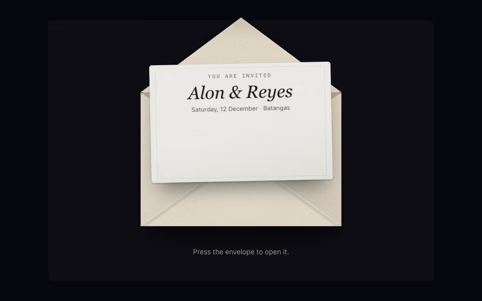
Envelope
FreeAn envelope that opens on a press: the flap swings back, the card rises out and comes forward.
3D · CSS
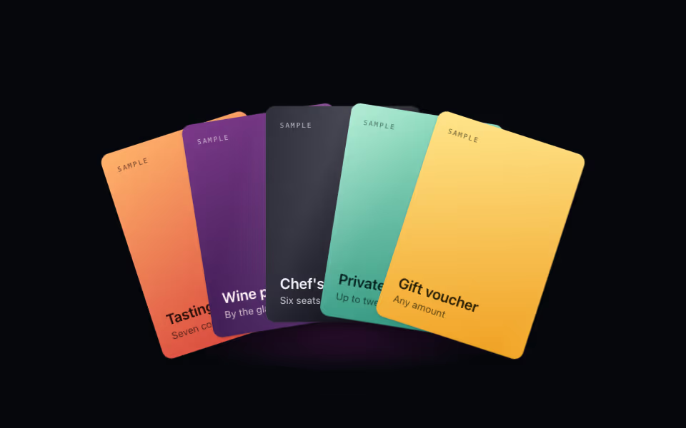
Card Fan
FreeA hand of cards: lift one on hover, bring it forward on tap, arrow keys between them. Pure CSS 3D.
3D · CSS
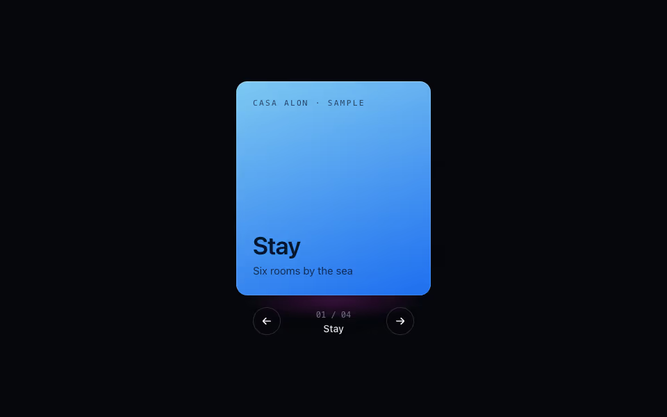
Cube Carousel
FreeContent on the faces of a turning prism: arrows, keys and drag, a face at a time. Pure CSS 3D.
3D · CSS